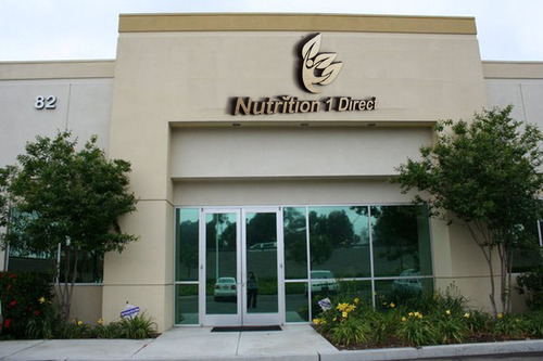
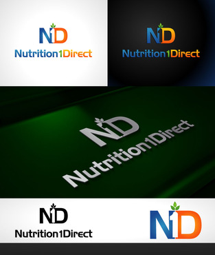
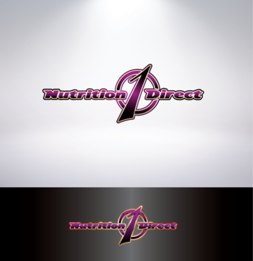
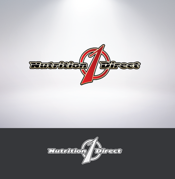
Logo for Nutrition company
Nutrition 1 Direct
|
Contest Holder
ginger99967
?
Last Logged in : 2142days18hrs ago |
Concepts Submitted
182 |
Guaranteed Prize
200 |
Winner(s) | A Logo, Monogram, or Icon |
|
Live Project
Deciding
Project Finalized


Creative Brief
Logo for Nutrition company
Nutrition 1 Direct
No
Name of the company. Logo to convey Health & Vitality (Nutrition) confidence (1), simplicity and imply savings (direct) for the consumer. Need to create a strong brand with this logo.
Health
Logo Type
![]()
Illustrative
![]()
not sure
Related Contests


