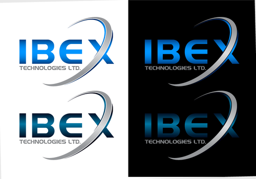
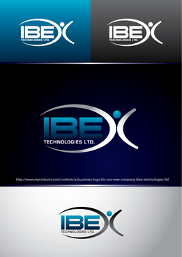
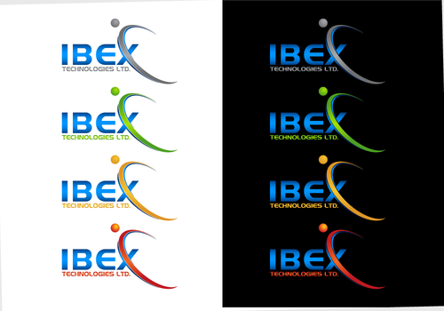
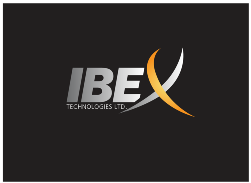
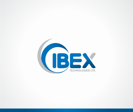
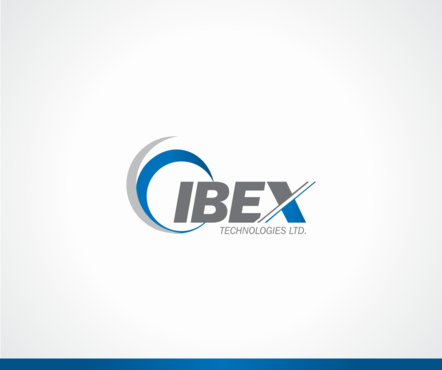
A bussiness logo for our new company - IBEX Technologies ltd.
IBEX Technologies ltd.
|
Contest Holder
raphael2011
?
Last Logged in : 5360days11hrs ago |
Concepts Submitted
88 |
Guaranteed Prize
199 |
Winner(s) | A Logo, Monogram, or Icon |
|
Live Project
Deciding
Project Finalized

Creative Brief
A bussiness logo for our new company - IBEX Technologies ltd.
IBEX Technologies ltd.
Technologies ltd.
Yes
Our company specializes in the development and manufacture of injection molds for precise technical plastic parts. Our customers are from the automotive industry, medical devices, aerospace and homeland security industry.
We are a leading supplier with high quality and customer-oriented.
Industrial Supplies
Logo Type
![]()
Symbolic
![]()
Abstract Mark
![]()
Character
![]()
Clean/Simple
Modern
High Tech
Serious
I am not sure.
not sure
There are few nice logos which represents very closly our logo idea - It should be clean & simple with some kind of simple Ibex horns or ibex illustrated elements.
Related Contests