SALES / SUPPORT : +1-877-525-5646   |  


Adelphi Automation Logo Icon Design

PLEASE READ DESCRIPTION

Contest Holder pstout ?

Last Logged in : 4704days5hrs ago

Concepts Submitted

88

Guaranteed Prize
250
Winner(s)

1

A Logo, Monogram, or Icon veildAll design entries can be viewed by other designers.
tick_gray

Live Project

tick_gray

Deciding

tick_blue

Project Finalized


Project: Adelphi Automation Logo Icon Desi ...
Industry: Engineering Logo
Contest Launched: May 24, 2011
Selected: 1 winning design from 88 concepts
Winning Design by: seldesign
Close Date: Jun 03, 2011


Adelphi Automation Logo Icon Design  - Engineering


Awarded as a winner
Project Report    

Sort by:


#39

#21

#80

#12


Creative Brief


Adelphi Automation Logo Icon Design

PLEASE READ DESCRIPTION

real solutions for the real world

No

Adelphi Automation

After several years as a sole trader using the company name ‘Acensys Ltd’ we are now a larger engineering, software and automation company wishing to re-brand and re-launch. After some consideration we have taken the name ‘Adelphi Automation’. We are also happy with the fonts (ITC-Binary Adelphi.AUTOMATION) we have selected for the company name, but now wish to have an appropriate, complementary company logo.

About Us
Name: Adelphi Automation
Business: Robotics, Automation, Control Systems, Industrial Software, Light Engineering
Industry type: Industrial Automation
Core Values: reliable, technological, dynamic, creative, partnership, adaptable, knowledgeable
Clients: Sharp Electronics, Kingspan, Airbus, Unipart
Comment: As an expanding company we will be venturing into other areas other than just automation for example telecommunication so we do not wish to have an icon which would restrict the expansion.

Engineering

Web 2.0
Web 2.0


Unique/Creative
Sophisticated
Modern
Industry Oriented
Abstract

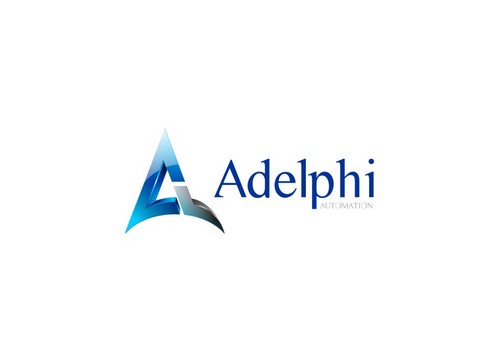
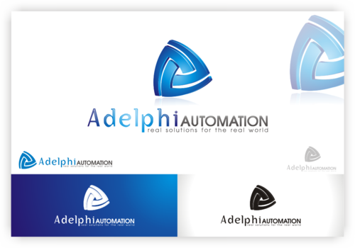
This is our website wish is currently under development http://www.wavemonkey.net/adelphi-web/index.html But we are still not quite happy with the 'twisted ball' logo icon and need something different

3

Logo Style: smooth, flowing, contemporary
Colour: electric blue /white /deep blue
Logo Type: Abstract
Desirable Attributes: still strong using b/w or greyscale, still identifiable when used as a small favicon. Still strong/distinct when printed
Design Suggestions: triangular, circles, 3d, flowing, twisting, overlapping, movement
Comment: As an expanding company we will be venturing into other areas other than just automation for example telecommunication so we do not wish to have an icon which would restrict the expansion.

Related Contests


ROBUR
$250
Prize Money
108
Concepts
Custom illustration to use as a logo for robotics lab
$200
Prize Money
81
Concepts
Modern logo for engineering company.
$300
Prize Money
181
Concepts
LOGO  FOR HEAT TREATING METALLURGY SERVICES COMPANY
$400
Prize Money
570
Concepts

Discussion


Comments

  • May 31, 2011 4:27 AM
    pstout pstout
      Project Holder
    PS For your information: the font we're used for the company logo is ITC Binary.Please use it if possible as we can then see how your icon suggestion works in conjunction. Hope this helps.

    Like Icon 0   DislikeIcon 0
  • May 31, 2011 4:24 AM
    pstout pstout
      Project Holder
    Hi, Although I'm very impressed by all the designs and in many cases you are really on the money, I get the impression that some designers might wish to use an accent color to make the icon 'pop'. If this is the case we use orange as the accent colour in the web site, so orange we feel would be good for the logo icon also(but please, please use it very sparingly). Thanks, regards, good luck.

    Like Icon 0   DislikeIcon 0
  • May 28, 2011 12:11 PM
    pstout pstout
      Project Holder
    Hi, you designers are now hitting your stride with designs and are getting the feel of the task. Just to Keep things rolling and those juices flowing I've uploaded a jpg of some ideas from myself. Hope they kick off your own thoughts

    Like Icon 0   DislikeIcon 0
  • May 27, 2011 8:49 AM
    pstout pstout
      Project Holder
    We see that the recent comments we've made have been successful in clarifying the brief. Design drafts #1, #2 and now #14, have really picked up on what we are needing. Ultimately, we don't need designers to spend time considering anything other than the logo icon. Thank for you interest.

    Like Icon 0   DislikeIcon 0
  • May 26, 2011 9:41 AM
    pstout pstout
      Project Holder
    Currently we feel that the draft designs #9, #2, 1 are approaching to something we are looking for and draft # 1 and #2 are closest to addressing the brief (as it uses the our agreed company font ITC Binary)

    Like Icon 0   DislikeIcon 0
  • May 26, 2011 9:35 AM
    pstout pstout
      Project Holder
    We have reviewed the draft designs currently submitted and it is appearent that the design brief has not fully conveyed our needs. We are not looking for a complete company logo design (this has already been selected and agreed) but simply a logo icon. So we don't need different options of font, colour, size but just a triangle, circle, ball, ribbon based company icon (mid blue/light blue/electrc blue). The web site we provided in the design brief give a better understanding of our under construction website.

    Like Icon 0   DislikeIcon 0