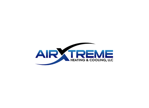
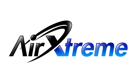
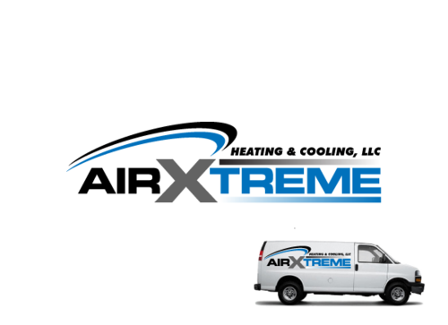
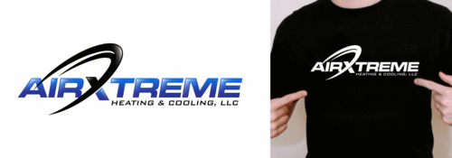
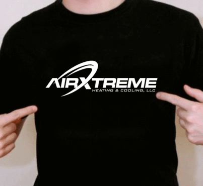
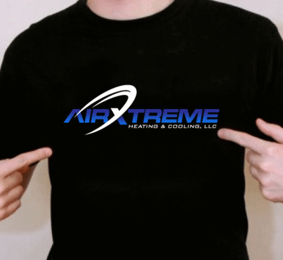
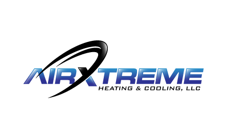
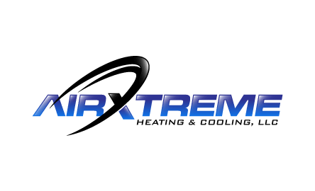
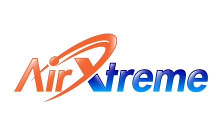
AirXtreme Logo
AirXtreme Heating & Cooling, LLC
|
Contest Holder
roseanne
?
Last Logged in : 3844days10hrs ago |
Concepts Submitted
321 |
Guaranteed Prize
175 |
Winner(s) | A Logo, Monogram, or Icon |
|
Live Project
Deciding
Project Finalized


Creative Brief
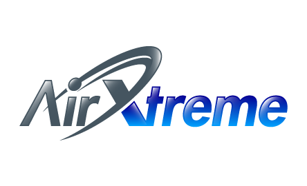
AirXtreme Logo
AirXtreme Heating & Cooling, LLC
Yes
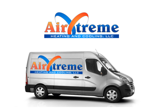
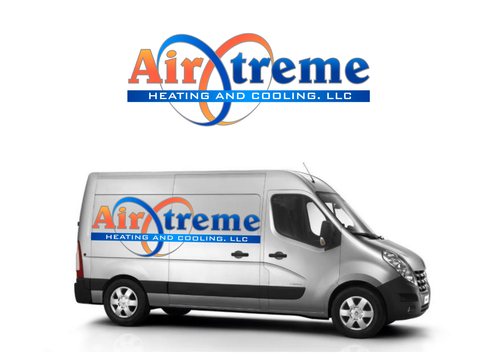
HVAC start up company. Logo will be used for work vehicles and also marketing materials (business cards, stationary, uniforms, etc.)
Construction
Symbolic
![]()
Abstract Mark
![]()
Web 2.0
![]()
Cutting-Edge
Unique/Creative
Clean/Simple
Modern
Industry Oriented
High Tech
Serious
Masculine
Abstract
First choice is blue/black/silver, blue/orange, blue/yellow, orange/black, yellow/black
2
Looking for something bold and unique. Would like to avoid red and blue, and blue and green combinations.
Related Contests


