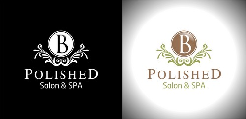
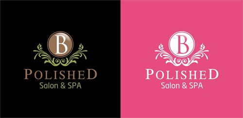
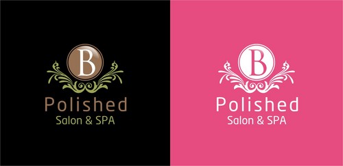
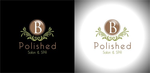
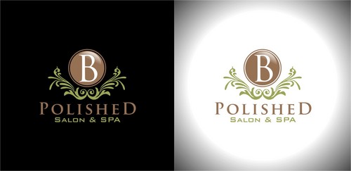
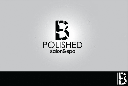
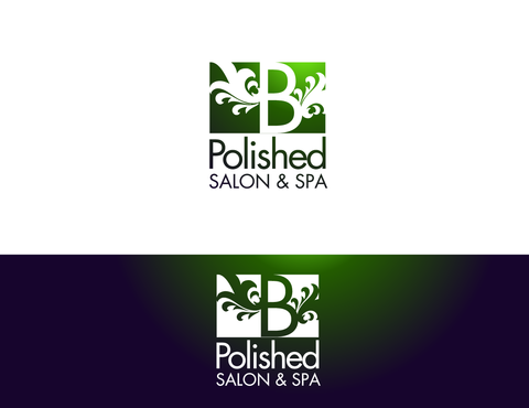
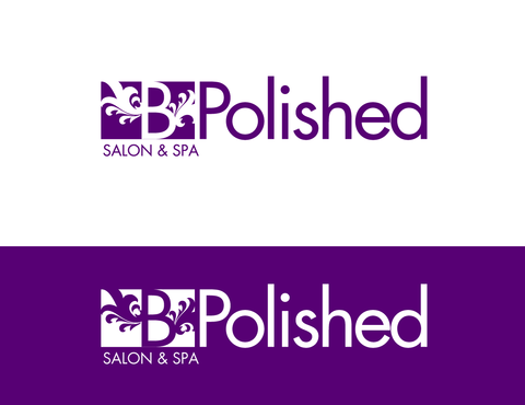
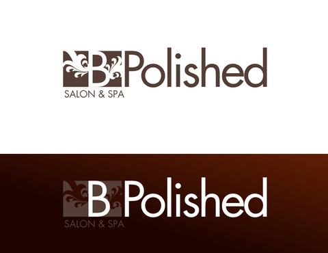
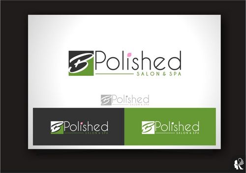
B Polished Salon & Spa
B Polished
|
Contest Holder
kscelba
?
Last Logged in : 4043days11hrs ago |
Concepts Submitted
143 |
Guaranteed Prize
250 |
Winner(s) | A Logo, Monogram, or Icon |
|
Live Project
Deciding
Project Finalized


Creative Brief
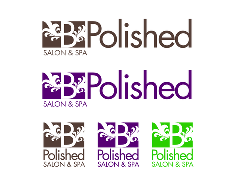
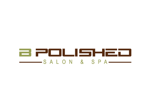
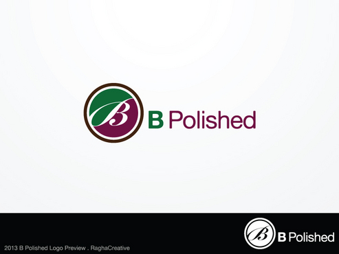
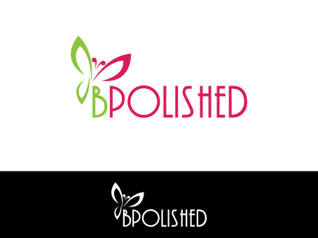
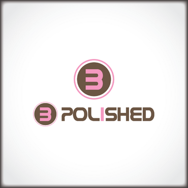
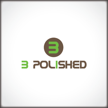
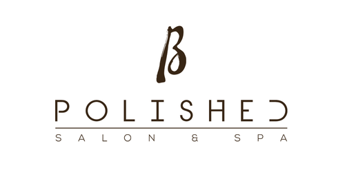
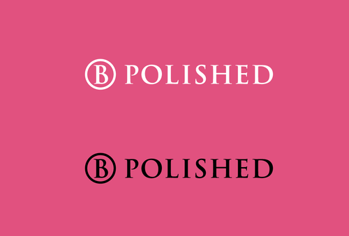
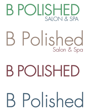
B Polished Salon & Spa
B Polished
Salon & Spa
No
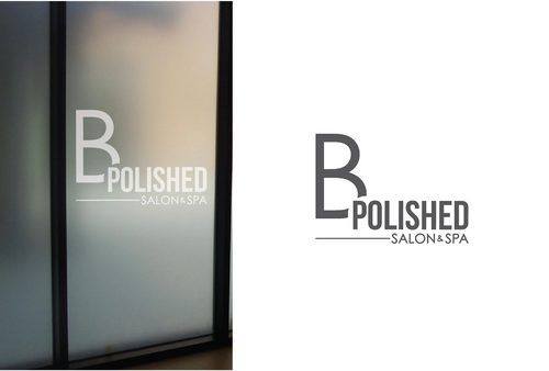
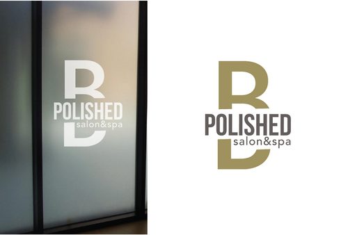
this logo is for a high end nail salon & spa located in an affluent community in Northern New Jersey. Clientele will include celebrities and high net worth individuals from the local market. It must be symbolic as well as hip/.trendy with today's fashion/beauty industries. They do not want an image with graphics such as flowers or symbols such as Wella Beauty products, the logo must be of the name and variations with and without "salon and spa."
Salon & Spa
Logo Type
![]()
Abstract Mark
![]()
Feminine
Modern
Sophisticated
main logo colors can include earth tones such as tope, brown, and possihly green secondary colors can include abstract colors such as pinks, purple, and possibly bright green
3
we will provide a word document with screenshots of logos that we would like top have variations based off of as an example.
We would also like a variation where the logo appears to be closed in on the top and bottom such as Paul Mitchel
Related Contests