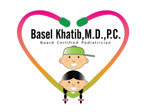
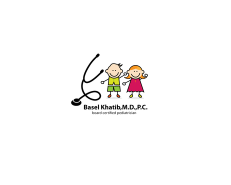
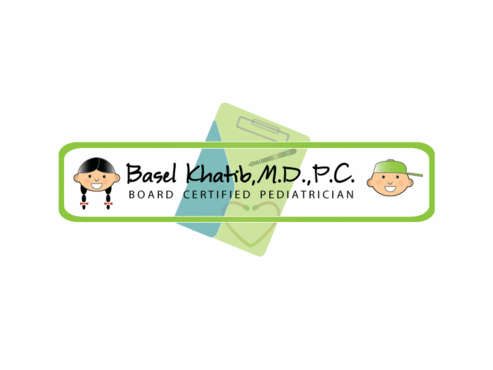
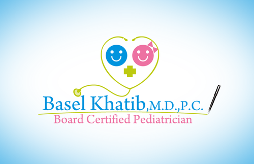
Basel Khatib,M.D.,P.C.
Basel Khatib,M.D.,P.C. Board Certified Pediatrician
|
Contest Holder
baseelo
?
Last Logged in : 5305days6hrs ago |
Concepts Submitted
101 |
Guaranteed Prize
450 |
Winner(s) | A Logo, Monogram, or Icon |
|
Live Project
Deciding
Project Finalized


Creative Brief
Basel Khatib,M.D.,P.C.
Basel Khatib,M.D.,P.C. Board Certified Pediatrician
Yes
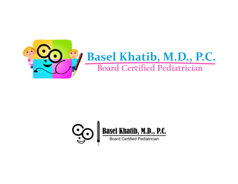
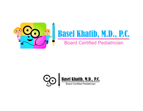
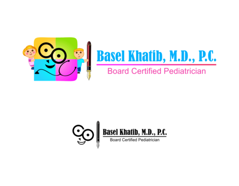
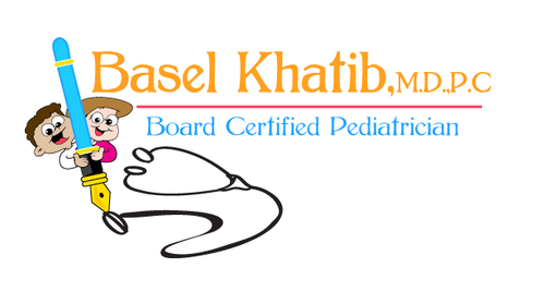
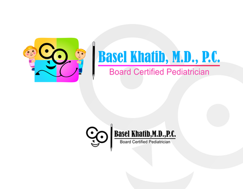
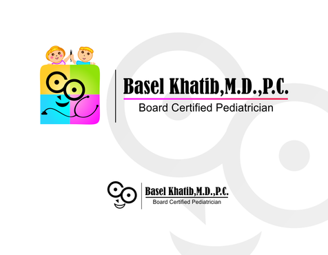
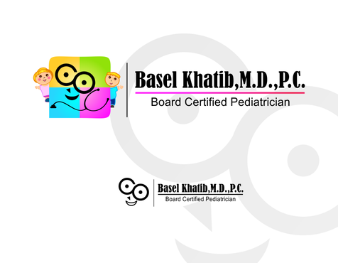
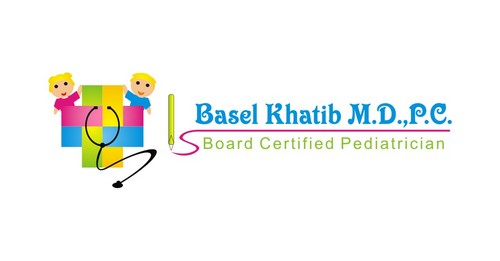
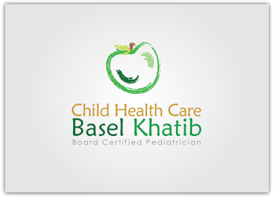
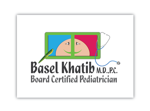
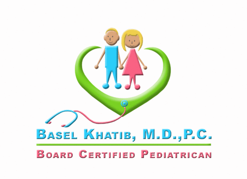
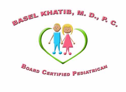
This is a design of a logo of my pediatiric office.
It Should express in very simple lines "Child health care"
It should express happiness in a lively way.
Like two smiling children (boy and girl) In very simple lines. plus something to express health care like a stethoscope, and a pen (because I always write medical articles published in the local newspaper)
It should be simple,colorful and expressive.
It should give a family who sees it that they can trust the care of their kids to this office.
We are open to any creative idea of a designer.
Health
Illustrative
![]()
Cutting-Edge
Unique/Creative
Clean/Simple
Modern
Playful/Cartoonish
I like the coloros in this link. http://orders.logodesignguru.com/contests/business-logo-jonesboro-pediatric-dental-group/users/olithedesigner
not sure
I love nice simple lines. Childish, not complicated, but yet expressive and distinctive. I need the person who sees it to know that this symbolizes my office even if he or she doesn't see any writing or names on it.
Related Contests


