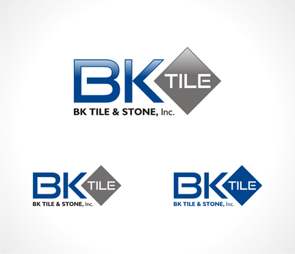
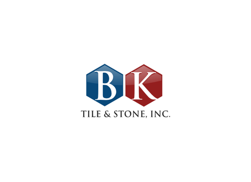
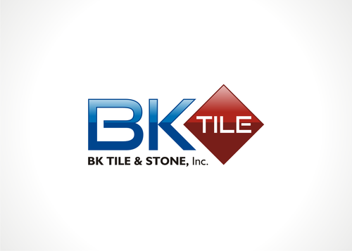
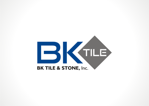
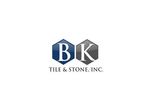
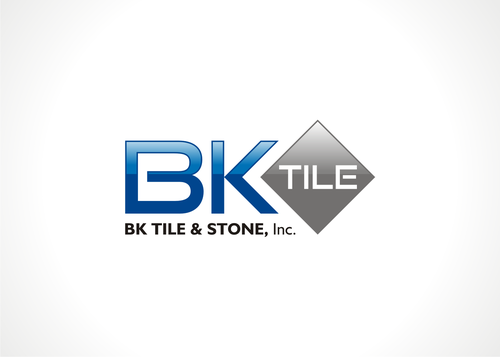
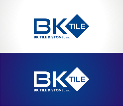
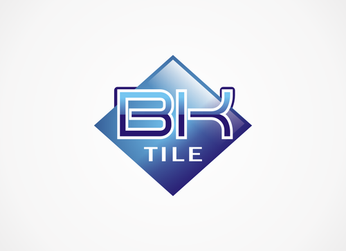
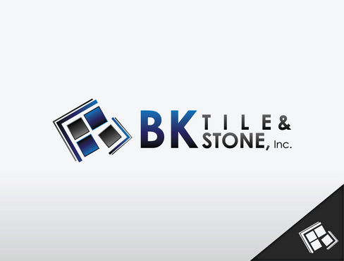
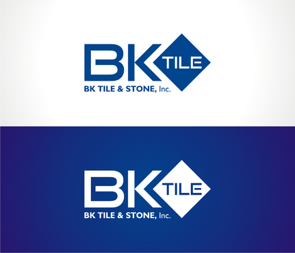
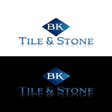
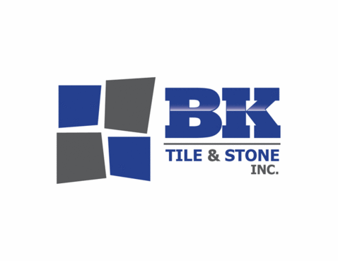
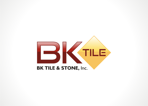
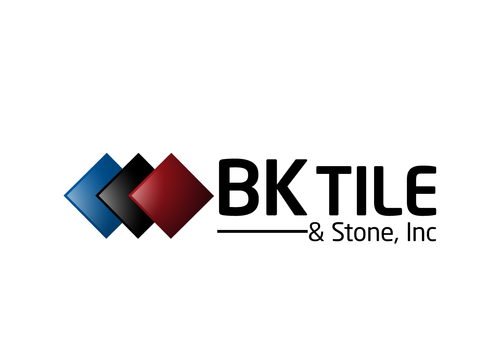
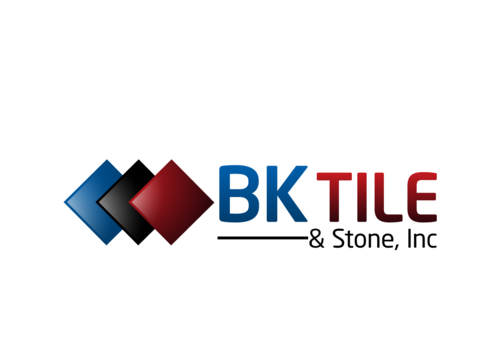
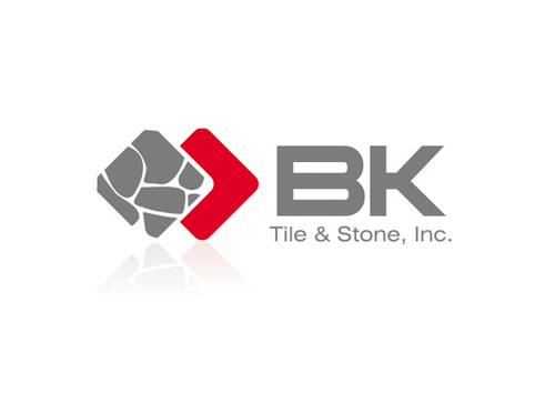
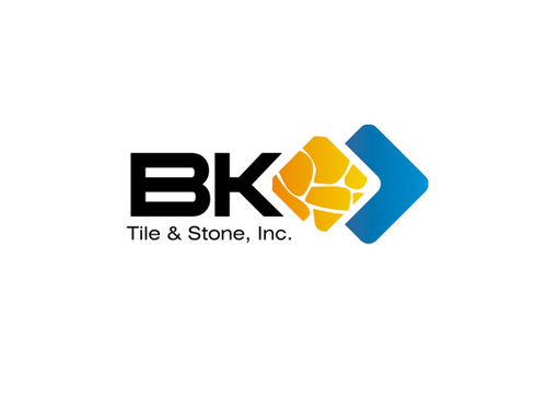
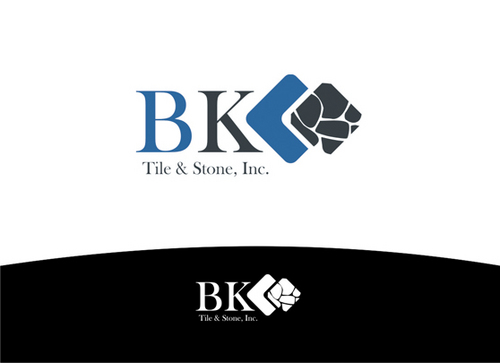
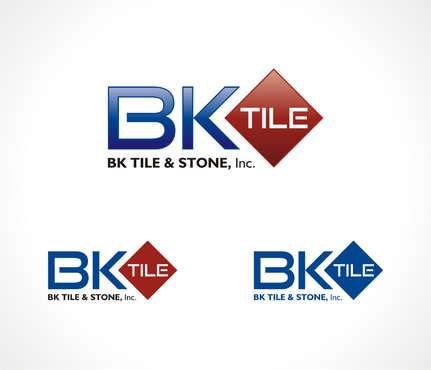
SALES / SUPPORT : +1-877-525-5646   |  


BK TILE

BK Tile & Stone, Inc.

Contest Holder bkryan ?

Last Logged in : 4850days7hrs ago

Concepts Submitted

114

Guaranteed Prize
160
Winner(s)

1

A Logo, Monogram, or Icon veildAll design entries can be viewed by other designers.
tick_gray

Live Project

tick_gray

Deciding

tick_blue

Project Finalized


Project: BK TILE
Industry: Construction Logo
Contest Launched: Dec 23, 2010
Selected: 1 winning design from 114 concepts
Winning Design by: AEREY
Close Date: Jan 02, 2011


BK TILE - Construction


Awarded as a winner
Project Report    

Sort by:


#114

#111

#106

#103

#100

#97

#96

#95

#92

#88

#87

#84

#8

#50

#30

#27

#26

#25

#24

#23

#14

#43

#40

#10

#113

#112

#110

#109

#108

#107


Creative Brief


BK TILE

BK Tile & Stone, Inc.

No

Ceramic tile contactor looking for new logo. We perform mostly commercial and union work.

Construction

Logo Type
Logo Type

Symbolic
Symbolic

Abstract Mark
Abstract Mark

Initials
Initials


Cutting-Edge
Unique/Creative
Clean/Simple
Corporate
Serious
Illustrative

not sure

Can either incorporate full company name or just use the BK Tile portion. Would like to see design ideas using both. Looking to a multi-use logo that will work will from business cards, email signatures, stationary, etc.

Related Contests


Logo Update
$225
Prize Money
122
Concepts
A logo for a home builder
$350
Prize Money
523
Concepts
Logo for Custom Homebuilder
$199
Prize Money
9
Concepts
Secondary Logo For Flooring Refinishing Company
$199
Prize Money
62
Concepts

Discussion


Comments

  • January 04, 2011 6:16 PM
    AEREY AEREY
     
    @langitBiru : Thank you bro :)

    Like Icon 0   DislikeIcon 0
  • January 04, 2011 1:41 PM
    langitBiru langitBiru
     
    congrats bro..

    Like Icon 0   DislikeIcon 0
  • January 01, 2011 9:02 PM
    bkryan bkryan
      Project Holder
    #103 please show solid color screen print design of this draft.

    Like Icon 0   DislikeIcon 0
  • December 30, 2010 10:46 PM
    bkryan bkryan
      Project Holder
    #8 and #88 - really like both of these....however, not crazy of the horizontal line in the middle with the shade change.....yet #8 and #88 look more unique compared to #87. Any other design ideas that could show a gradient but not have a distinct line in the middle? Maybe something more gradual? Looking for other ideas here. Thanks again for all of your hard work!

    Like Icon 0   DislikeIcon 0
  • December 30, 2010 10:43 PM
    bkryan bkryan
      Project Holder
    #88 - can you show another draft of this with solid red and solid blue similar to the changes made in #87, no gradient.

    Like Icon 0   DislikeIcon 0
  • December 30, 2010 12:25 PM
    bkryan bkryan
      Project Holder
    #8 show with a red background in the currently gray "tile" area. similar red to #79

    Like Icon 0   DislikeIcon 0
  • December 30, 2010 6:55 AM
    bkryan bkryan
      Project Holder
    aerey - can you show #51 similar to #8 please

    Like Icon 0   DislikeIcon 0
  • December 29, 2010 3:19 PM
    bkryan bkryan
      Project Holder
    #39 can you show this design without the BK on each of the 3 tiles? maybe other color options? also a solid color version? thanks!

    Like Icon 0   DislikeIcon 0
  • December 29, 2010 12:41 PM
    bkryan bkryan
      Project Holder
    #37 PLEASE SHOW WITH SOLID COLOR OPTION AS WELL.

    Like Icon 0   DislikeIcon 0
  • December 29, 2010 9:51 AM
    bkryan bkryan
      Project Holder
    #14 can you show this same one with a bit more space between the B and the K?

    Like Icon 0   DislikeIcon 0
  • December 29, 2010 9:46 AM
    bkryan bkryan
      Project Holder
    #23 thru #26 - really like all of the options you have shown...thank you! the one thing i am not crazy about is the spacing with the word T I L E. I do understand why you did it so things would line up. Any other ideas similar to this that would make the font spacing look more normal and not stretched out?

    Like Icon 0   DislikeIcon 0
  • December 29, 2010 9:43 AM
    bkryan bkryan
      Project Holder
    #30 and #27 - please show as solid color also for screen printing....thanks!

    Like Icon 0   DislikeIcon 0
  • December 27, 2010 2:19 PM
    bkryan bkryan
      Project Holder
    #8 - would like to see rendering in one solid color for screen printing applications. like this one the best so far!

    Like Icon 0   DislikeIcon 0
  • December 27, 2010 2:18 PM
    bkryan bkryan
      Project Holder
    like to see #6 with some different font options

    Like Icon 0   DislikeIcon 0