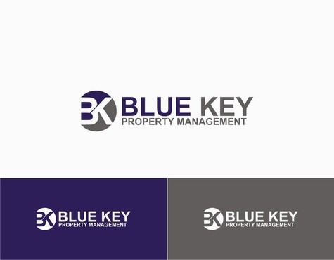
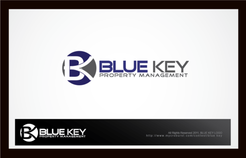
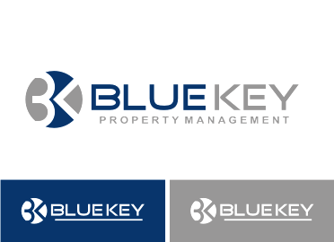
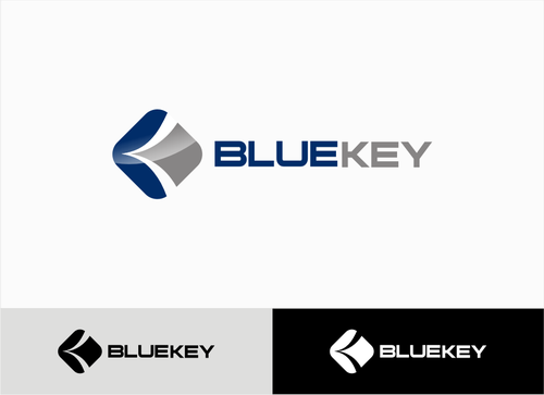
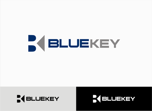
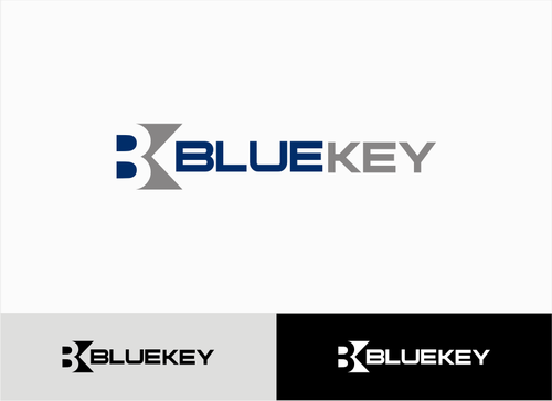
Blue Key Property Management - Company Logo
Blue Key Property Management
|
Contest Holder
bluekey22
?
Last Logged in : 3934days5hrs ago |
Concepts Submitted
270 |
Guaranteed Prize
300 |
Winner(s) | A Logo, Monogram, or Icon |
|
Live Project
Deciding
Project Finalized


Creative Brief
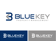
Blue Key Property Management - Company Logo
Blue Key Property Management
Yes
Our company leases single-family homes, townhomes and condos for individual investors. We manage tenants, rents, expenses and repairs on their income producing real estate units. We also locate new investors to represent and new tenants to rent to.
Real Estate
Symbolic
![]()
Abstract Mark
![]()
Clean/Simple
Sophisticated
Corporate
Modern
Serious
Abstract
Geometric
Blue and Grey/White
2
No roof lines or house shapes, please.
Please refer to this URL for samples of 9 logos that we like. http://www.holmgren.us/logos.htm
Related Contests


