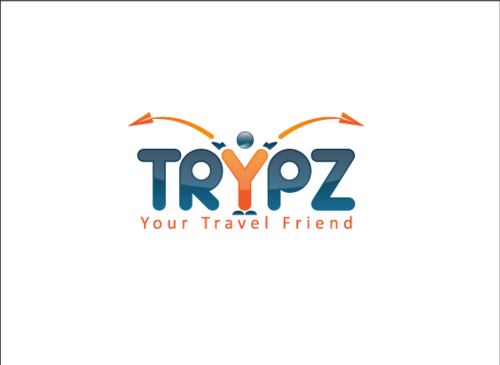
Business Logo
TRYPZ
|
Contest Holder
jdm338
?
Last Logged in : 5323days1hr ago |
Concepts Submitted
204 |
Prize Money
250
|
Winner(s) | A Logo, Monogram, or Icon |
|
Live Project
Deciding
Project Finalized


Creative Brief
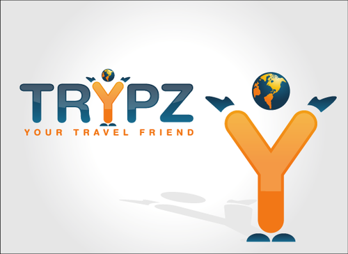
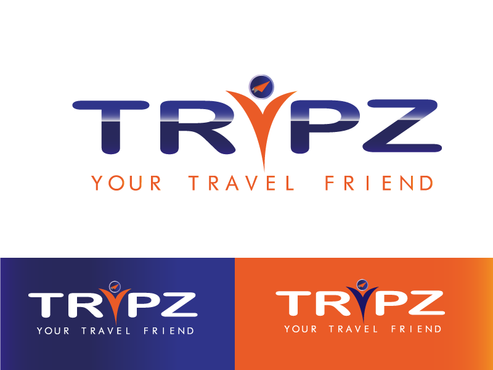
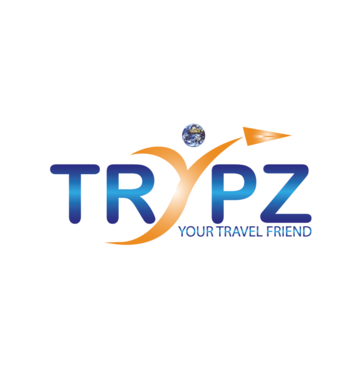
Business Logo
TRYPZ
Your Travel Friend
Yes
The website is going to be a social network for travelers. Users will be able to create profiles, upload pics and videos of their travels, blog, book hotels, car rentals, etc. The main purpose of the site [the social networking aspect] is for people to be able to search and meet other people traveling to the same places at the same time and meet along the way. Initially, we're marketing to college students for spring break and study abroad.
Travel
Logo Type
![]()
Web 2.0
![]()
Unique/Creative
Industry Oriented
Fun
Playful/Cartoonish
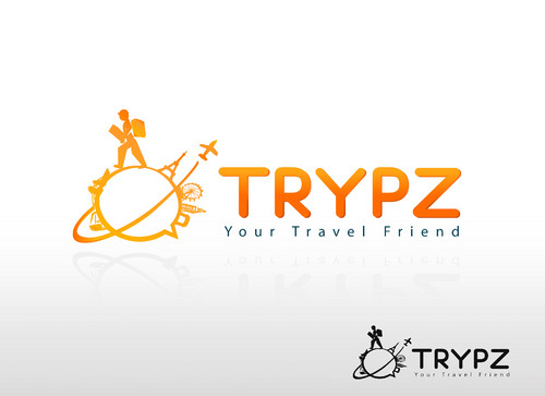
Something that goes well with the existing...However if we see a good color combination we would consider changing colors of our website Current logo is uploaded - please view to see color scheme. I want 2 to 4 colors in the logo
3
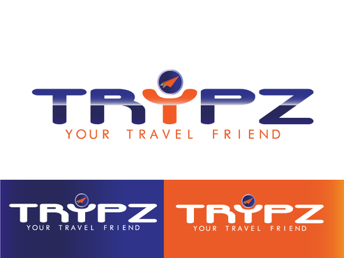
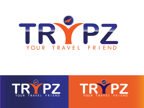
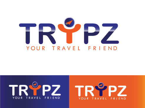
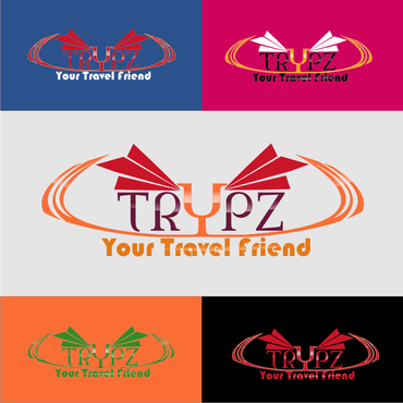
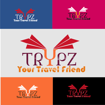
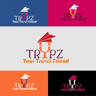
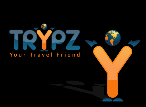
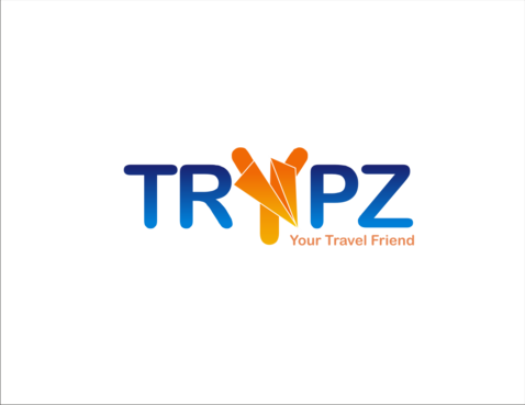
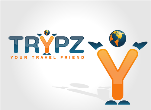
e think the logo we have now is a little boring. The font needs changed (maybe something softer/smoother like Arial Rounded, not necessarily italicized). We don't want to get into any cartoon figures or anything like that but maybe incorporate something creative that would depict a social network.
Also, something to keep in mind, we're going to be doing a lot of marketing on Facebook so we would need to incorporate a thumbnail image (i.e. the paper airplane) into the logo so we can use that as our Facebook pic/logo.
Related Contests