SALES / SUPPORT : +1-877-525-5646   |  


Business Logo

QuickCode

Contest Holder nthiele7332 ?

Last Logged in : 4355days9hrs ago

Concepts Submitted

3471

Guaranteed Prize
1100
Winner(s)

1

A Logo, Monogram, or Icon veildAll design entries can be viewed by other designers. Featured Featured Contest
tick_gray

Live Project

tick_gray

Deciding

tick_blue

Project Finalized


Project: Business Logo
Industry: Real Estate Logo
Contest Launched: Mar 30, 2011
Selected: 1 winning design from 3471 concepts
Winning Design by: aadesign
Close Date: May 21, 2011


Business Logo - Real Estate


Awarded as a winner
Project Report    

Sort by:


#3303

#2914

#2042

#473

#3083

#3068

#3049

#3046

#3028

#3019

#3017

#3010

#3003

#2961

#2843

#2778

#2690

#2684

#2409

#2405

#2377

#2370

#2333

#2116

#2077

#2075

#2069

#2061

#1964


Creative Brief


Business Logo

QuickCode

Yes

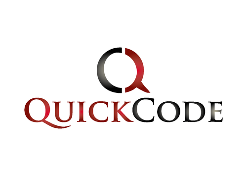
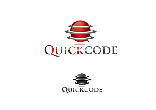
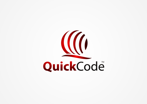
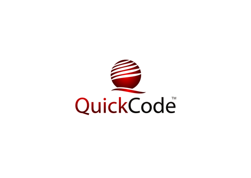
QuickCode is the name of a marketing tool that will be sold to Realtors. Realtors will use this software/product to integrate QR codes, short code texting, mobile virtual tours, automation of fliers, music slideshows, etc. into selling their client's properties. THIS LOGO IS GOING TO REPRESENT A NATIONAL BRAND, SO IT MUST LOOK GOOD ON A WEBSITE AND BUSINESS CARD, BUT IT MUST ALSO HAVE SOME TYPE OF SYMBOL IN IT THAT CAN BE USED SO THAT EVERYONE WILL KNOW THAT THIS IS A "QUICKCODE" SERVICE.

Real Estate

Logo Type
Logo Type

Symbolic
Symbolic

Abstract Mark
Abstract Mark


Cutting-Edge
Unique/Creative
Clean/Simple
Corporate
Industry Oriented
High Tech

See logo designs for Mobile Realty Solutions under the browse projects tab. A winner will be selected March 31st. The colors don't have to be the same, but it couldn't hurt.

not sure

This logo will be tied into the business of Mobile Realty Solutions, which I a currently having a logo created for through this company. You can search Mobile Realty Solutions under browse projects to get an idea from that logo. This logo will be a completely different site, so an exact match doesn't matter that much

Related Contests


Logo for a Real Estate Team
$225
Prize Money
108
Concepts
Logo for Maryland Real Estate Brokerage
$199
Prize Money
162
Concepts
Logo for our Escrow Company
$200
Prize Money
162
Concepts
Logo for Sellhon a real estate company
$200
Prize Money
78
Concepts

Discussion


Comments

  • November 05, 2011 9:49 PM
    RichardB RichardB
     
    Check out www.DesignCage.net its pretty awesome,you can win more contests.

    Like Icon 0   DislikeIcon 0
  • November 04, 2011 9:55 PM
    dena888 dena888
     
    Check out www.designcage.net

    Like Icon 0   DislikeIcon 0
  • May 29, 2011 3:07 AM
    aadesign aadesign
     
    Thanks, kugajevska! You and auraavatary are unique and great not only as the designers but also as persons.

    Like Icon 0   DislikeIcon 0
  • May 29, 2011 1:50 AM
    kugajevska kugajevska
     
    Congrats aadesign! Good professional work! Collegues! I understand your feelings: only one had to win...

    Like Icon 0   DislikeIcon 0
  • May 28, 2011 3:57 PM
    aadesign aadesign
     
    Guys! I understand your feelings, but what you do now (except auraavatary) is demonstration of envy. Try to lose with dignity! I wanted to ascertain if somewhere is logo similar to mine. I found kind of these: http://www.qualiacreative.com/Alt%20Front%20Page.html http://www.charliequirk.net/ http://paulhectort.deviantart.com/art/CQ-Business-Seminars-logo-194826738 http://qengineering.com.au/company.htm http://www.seeklogo.com/quad-city-logo-114258.html http://www.seeklogo.com/quality-logo-114358.html http://www.seeklogo.com/quarry-logo-114438.html http://www.seeklogo.com/quixo-logo-114742.html http://www.seeklogo.com/quintus-logo-114732.html http://www.seeklogo.com/quorporation-logo-114763.html http://www.qfoundation.com/ but didn't find mine. So, yes it is unique. And simple shapes are memorable. Dezinden, what for a "your" concept are you talking? The popular way to split Q? In the minimalistic logos important is also shape, proportions...we have different logos and don't worry about copying. I noticed your logo only after your comment. I know you all were working hard and I wish you to win in the next contests. But I wish you also don't became nasty in case of losing. Regards, aadesign

    Like Icon 0   DislikeIcon 0
  • May 28, 2011 6:53 AM
    dynamikdezyn dynamikdezyn
     
    worst choice sorry to say, is it memorable? is it unique? aah strange

    Like Icon 0   DislikeIcon 0
  • May 28, 2011 4:14 AM
    6point 6point
     
    bad choice..

    Like Icon 0   DislikeIcon 0
  • May 26, 2011 10:32 PM
    dezinden dezinden
     
    #3425 is copy of my concept #3389

    Like Icon 0   DislikeIcon 0
  • May 26, 2011 1:58 PM
    aadesign aadesign
     
    @bigred22 Before writing, you should pay attention to the previous works and numbers. I developed my #2422, #1692, #1696, #1703, #2406...

    Like Icon 0   DislikeIcon 0
  • May 26, 2011 10:38 AM
    bigred22 bigred22
     
    I didn't participate in this one, but I'd have to bet dezinden is a bit upset considering his #3389 is basically the exact same concept

    Like Icon 0   DislikeIcon 0
  • May 26, 2011 10:25 AM
    aadesign aadesign
     
    Thank you, auraavatary! And good luck to everybody in the other contests! Here were a lot of great logos. aadesign

    Like Icon 0   DislikeIcon 0
  • May 26, 2011 9:35 AM
    auraavatary auraavatary
     
    Congrats AAdesigns...

    Like Icon 0   DislikeIcon 0
  • May 26, 2011 9:09 AM
    courantdart courantdart
     
    Seriously? you spend 1100$ for a logo that looks like that? it is in NO WAY recognizable nor memorable.

    Like Icon 0   DislikeIcon 0
  • May 26, 2011 5:13 AM
    be4you be4you
     
    hello CH i think all your 4 stars logos not correct and not good. QuickCode-QC, no CQ thank you

    Like Icon 0   DislikeIcon 0
  • May 25, 2011 6:55 PM
    thepractice thepractice
     
    Many of you split the Q down the middle so it actually has a C on the left side of the Q. This may be the most realistic design for us. Yeah but the "Q' should be preceding the "C" which would make it read Quick Code, your name, the split "CQ' icon isn't correct.

    Like Icon 0   DislikeIcon 0
  • May 23, 2011 4:54 PM
    lucifer lucifer
     
    good luck guys... cheers

    Like Icon 0   DislikeIcon 0
  • May 21, 2011 1:00 PM
    firman firman
     
    It's a great contest. A lot of designers entered and an active project holder. Good luck to you all.

    Like Icon 0   DislikeIcon 0
  • May 21, 2011 3:42 AM
    courantdart courantdart
     
    Very confusing contest. One would expect that for 1100$ dollar you would want something good, out of the box, but most of all RECOGNIZABLE, which is I guess the most important for a logo.

    Like Icon 0   DislikeIcon 0
  • May 20, 2011 3:16 PM
    designer83 designer83
     
    #3047 is copy from #28

    Like Icon 0   DislikeIcon 0
  • May 20, 2011 7:56 AM
    nthiele7332 nthiele7332
      Project Holder
    Please keep to the simple and professional look. From the feedback I've received, it seems like having just a Q either in or out of a box seems to be a favorite idea. Many of you split the Q down the middle so it actually has a C on the left side of the Q. This may be the most realistic design for us. Thanks for sticking with me on this!

    Like Icon 0   DislikeIcon 0
  • May 18, 2011 10:10 AM
    nthiele7332 nthiele7332
      Project Holder
    Sorry. It's opened again. We haven't hit that perfect logo yet. You are on the right path ... please keep trying. I had some good feedback about simplicity and possibly having a technology feel to it.

    Like Icon 0   DislikeIcon 0
  • May 17, 2011 2:03 PM
    9bitesdesign 9bitesdesign
     
    #2843 is a great logo, very clean but I cant help but get the feeling of an airline company.

    Like Icon 0   DislikeIcon 0
  • May 15, 2011 1:01 PM
    mohnishmistry mohnishmistry
     
    please feedback #2928 .

    Like Icon 0   DislikeIcon 0
  • May 14, 2011 9:40 PM
    microuniquelogo microuniquelogo
     
    sir please again open project Thanks

    Like Icon 0   DislikeIcon 0
  • May 14, 2011 2:51 PM
    designer83 designer83
     
    please check #2491 , #2490 and #2493

    Like Icon 0   DislikeIcon 0