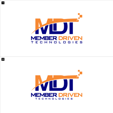
Business Logo Design for MDT
Member Driven Technologies (MDT)
|
Contest Holder
MemberDriven
?
Last Logged in : 4942days2hrs ago |
Concepts Submitted
133 |
Guaranteed Prize
400 |
Winner(s) | A Logo, Monogram, or Icon |
|
Live Project
Deciding
Project Finalized


Creative Brief
Business Logo Design for MDT
Member Driven Technologies (MDT)
Yes
Need a new logo for "Member Driven Technologies". Open to designs that include full name or abbreviation "MDT". MDT is a full service technology provider for Credit Unions. We are driven by service and security. Some IT services we provide include the hosting of core credit union financial systems, databases, email, websites in our full featured, state of the art Data Center. We offer a plethora of ancillary services (online banking, mobile banking, bill pay, and credit card processing, etc.).
MDT was founded 8 years ago and has grown from 2 employees to over 60 today. We currently have clients in 22 U.S. states. Some phrases we use to describe our company (these are not tag lines): "We host it … you maintain control", "A truly unique, hybrid approach", "Built by credit unions, owned by credit unions, serving credit unions". This logo will be used as our one and only corporate logo … on print, web, social networks, marketing materials (product sheets, brochures, trinkets), business cards, conference booth branding, clothing, name badges, etc.
Information Technology
Logo Type
![]()
Abstract Mark
![]()
Initials
![]()
Cutting-Edge
Unique/Creative
Clean/Simple
Corporate
Modern
High Tech
Serious
Geometric
No more than 3 colors. We like Primary or Secondary colors, black, white, and grey. We do not like yellow or green as a ‘main’ color.
not sure
Things to consider: (1) Logo needs to look good as multi-color (color on white) and reverse (white on black). (2) Please avoid drop shadow or 3-D effects. (3) Needs to be easy to embroider on clothing (i.e.; shirts). Things to avoid: (1) www.mdtmi.com – please avoid everything about MDT’s current logo (font, colors, shapes). (2) www.synergentcorp.com - don’t create a logo like this or use the color scheme. (3) www.symitar.com - don’t create a logo like this (or use this font).
Related Contests