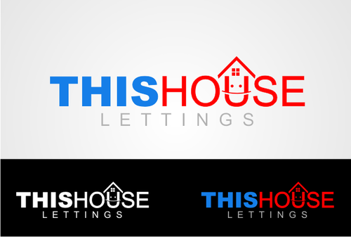
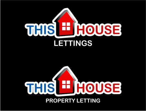
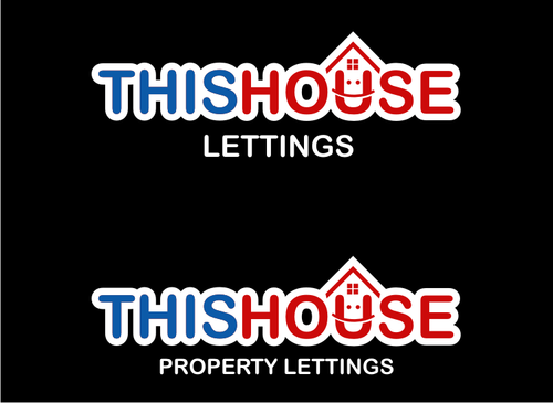
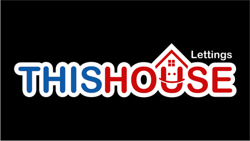
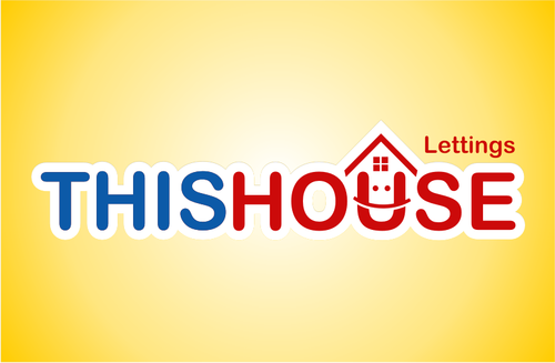
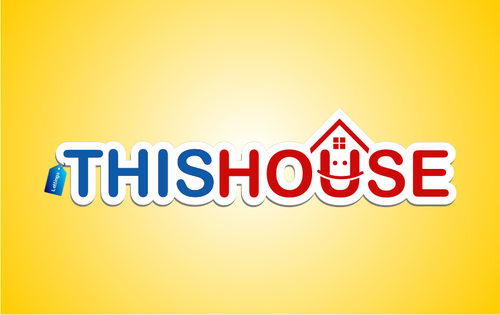
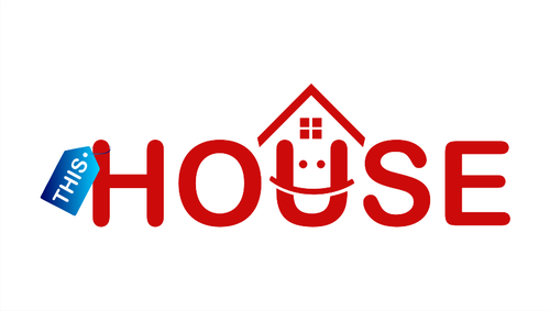
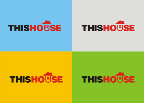
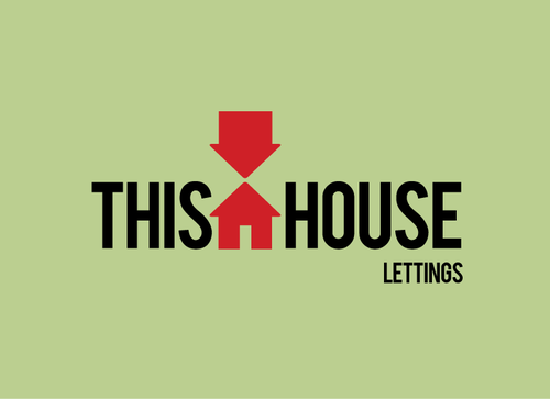
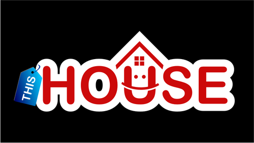
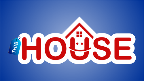
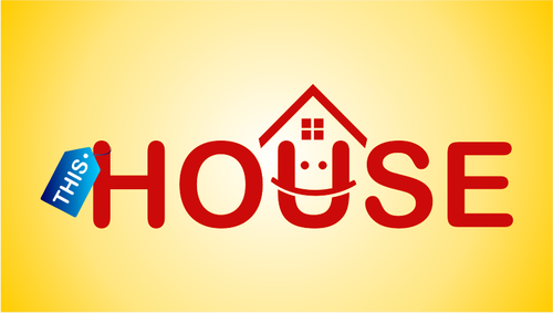
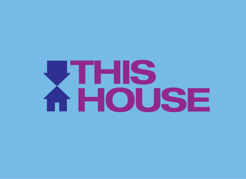
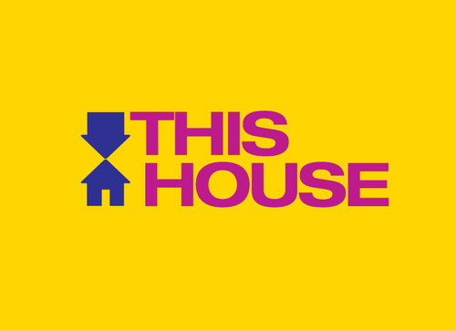
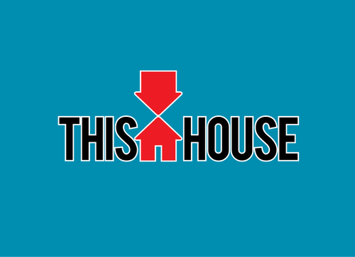
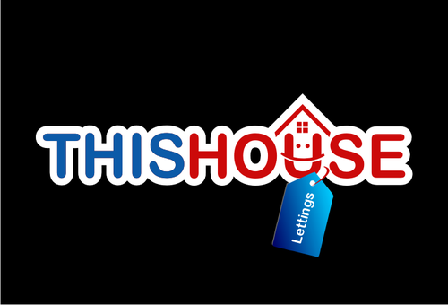
Business Logo for Letting Agent in UK
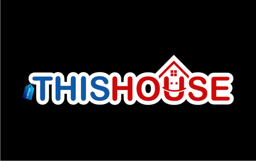
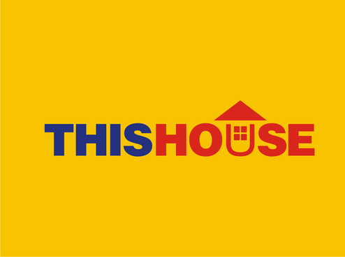
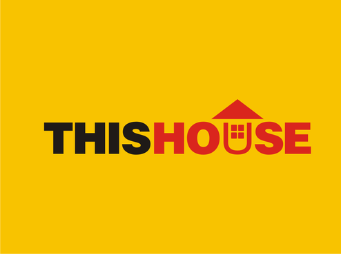
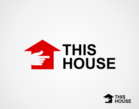
This House
|
Contest Holder
cannygood
?
Last Logged in : 5335days18mins ago |
Concepts Submitted
391 |
Guaranteed Prize
400 |
Winner(s) | A Logo, Monogram, or Icon |
|
Live Project
Deciding
Project Finalized


Creative Brief
Business Logo for Letting Agent in UK
This House
No
Design for a Letting Agency in the UK. The logo will be used as the shop front signage, advertising, stationary and sale/to let boards.
Real Estate
Logo Type
![]()
Symbolic
![]()
Abstract Mark
![]()
Illustrative
![]()
Any colours to begin with, i will leave feedback throughout to point you in the right direction.
not sure
Related Contests


