Business Logo for Trading company
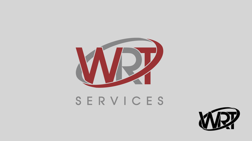
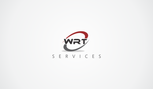
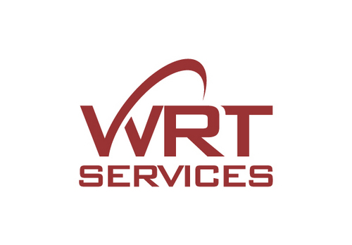
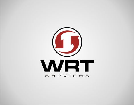
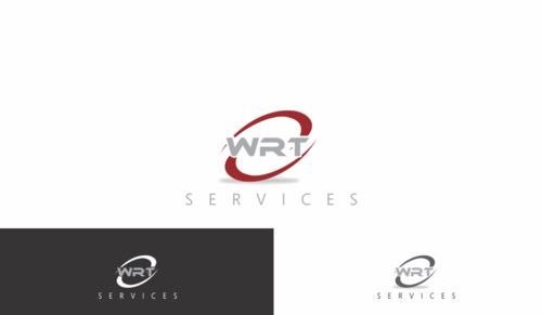
WRT Services
|
Contest Holder
wrtservices
?
Last Logged in : 4603days21hrs ago |
Concepts Submitted
223 |
Guaranteed Prize
215 |
Winner(s) | A Logo, Monogram, or Icon |
|
Live Project
Deciding
Project Finalized

Creative Brief
Business Logo for Trading company
WRT Services
Yes
WRT is a trading company specializing in imports and exports between africa and china. Our mission is to source for products, control the quality of the products produced as well as providing logistic transportation. We deal with food industry products most of the time.
Trade
Logo Type
![]()
Symbolic
![]()
Abstract Mark
![]()
Cutting-Edge
Unique/Creative
Clean/Simple
Modern
Industry Oriented
Abstract
The website have three main colors: white, light grey and "bordeaux red". Following is the color scheme of our website http://colorschemedesigner.com/#5B92e1BsOw0w0 What we would like is to use the red tone in the logo. Not compulsorily for the letters but for the abstract. The logo have to fit in white or light grey background.
2
I would like a logo that incorporates the name "WRT Services" and also a simple abstract design.
I like abstract designs that are not too squarish, the best would be something a little round.
Related Contests