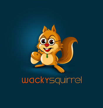
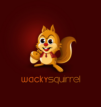
Business logo for wackysquirrel
wackysquirrel
|
Contest Holder
ckiewiet
?
Last Logged in : 2539days2hrs ago |
Concepts Submitted
94 |
Guaranteed Prize
433 |
Winner(s) | A Logo, Monogram, or Icon |
|
Live Project
Deciding
Project Finalized


Creative Brief
Business logo for wackysquirrel
wackysquirrel
Yes
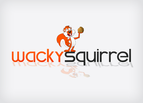
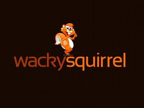
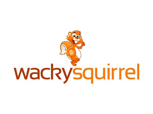
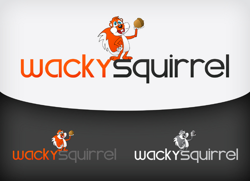
We are a relatively new Germany-based company of (web-)developers, it-consulters, creative writers and translators [to put it in a nutshell: we write a lot of text and code for websites]. We have picked wackysquirrel as our new name. In order to not influence your creativity we will omit our current name, website, et al. - let your imagination run wild!
Communications and Media
Character
![]()
Clean/Simple
Modern
Fun
Serious
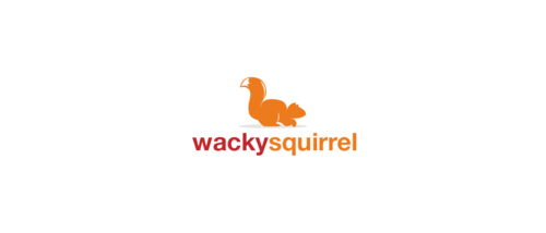
We did not have any particular colours in mind; as stated above, we'd like you to let your imaginations run freely (within the given parameters). We kinda like orange, though.
not sure
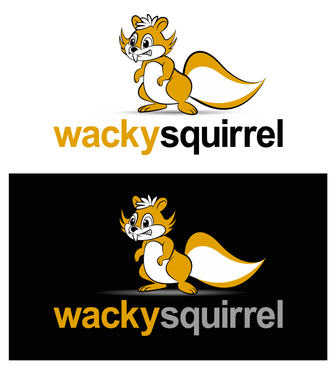
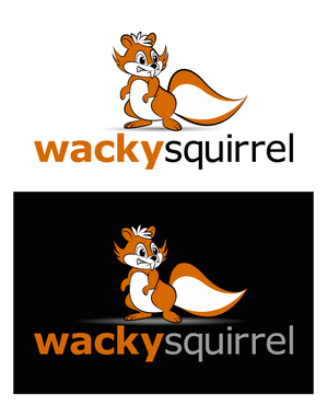
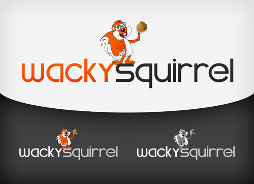
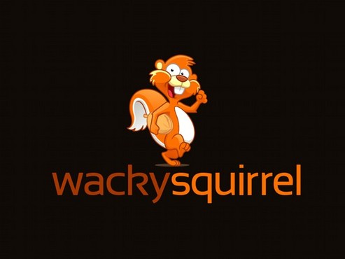
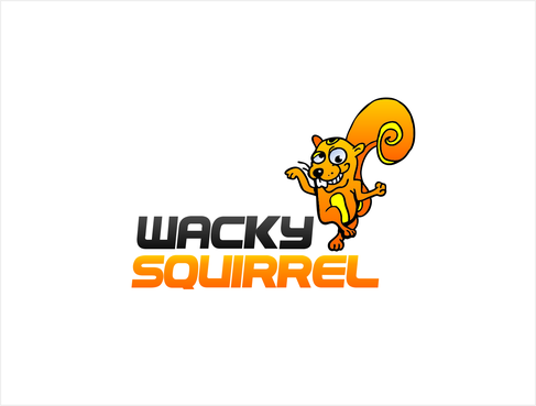
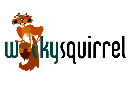
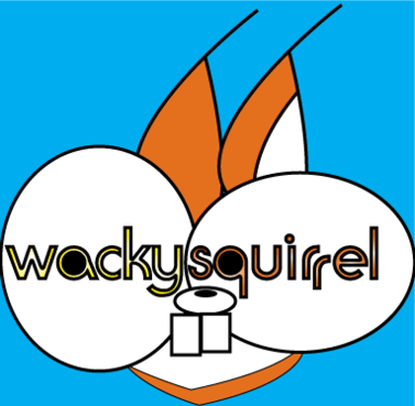
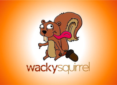
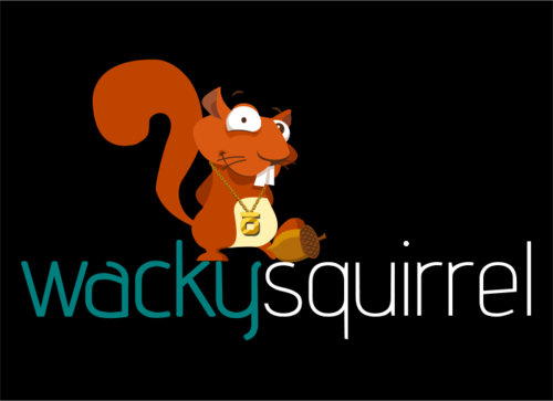
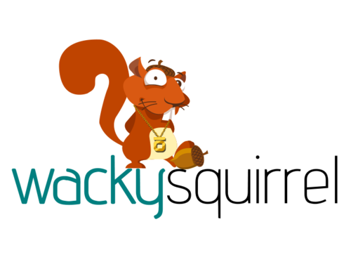
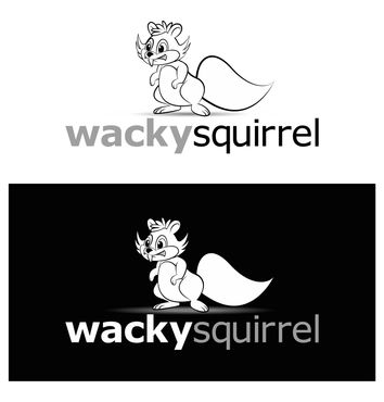
We have picked the squirrel as our mascot of choice, because we feel that squirrels have the necessary quirkiness about them that which we would like to represent :)
Related Contests