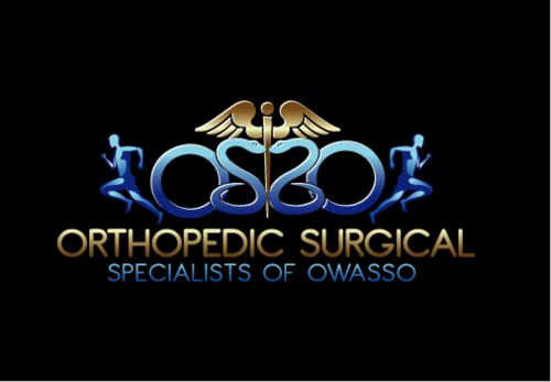
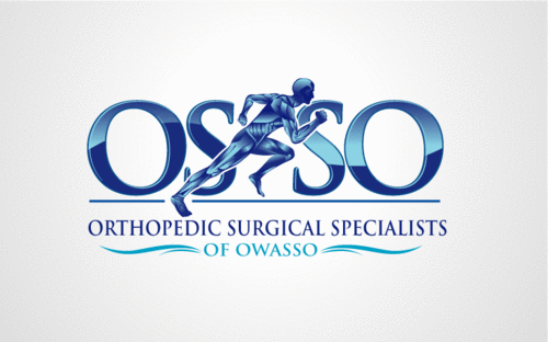
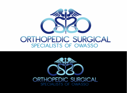
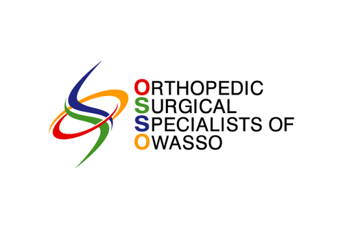
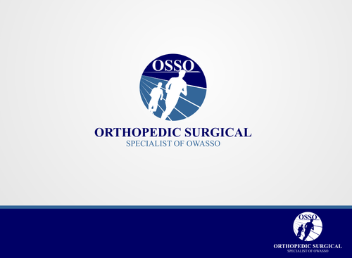
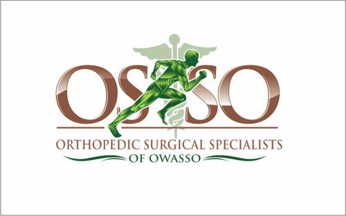
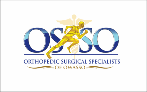
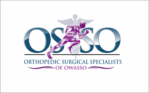
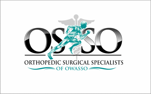
Business logo OSSO
Orthopedic Surgical Specialists of Owasso
|
Contest Holder
DrJon
?
Last Logged in : 5099days23hrs ago |
Concepts Submitted
125 |
Guaranteed Prize
475 |
Winner(s) | A Logo, Monogram, or Icon |
|
Live Project
Deciding
Project Finalized


Creative Brief
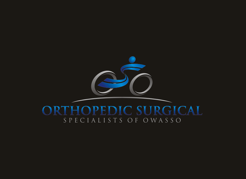
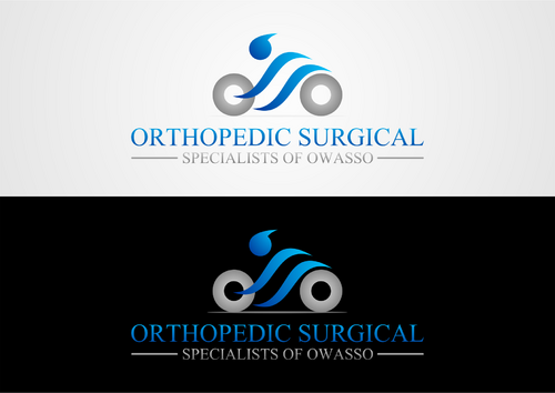
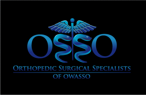
Business logo OSSO
Orthopedic Surgical Specialists of Owasso
No
Highly regarded orthopedic (bone and joint), sports medicine, and hand surgery clinic that utilizes the latest in surgical technology to produce great surgical outcomes.
Health
Symbolic
![]()
Initials
![]()
Illustrative
![]()
Character
![]()
Cutting-Edge
Sophisticated
Corporate
Local/Neighborhood
High Tech
Serious
Not sure, you decide
not sure
We are open to ALL ideas, but our "non-artistic" minds were thinking about incorporating the OSSO into something "sportsy" (running, cycling, weight training, discus throwing etc) or medical (skeleton man, caduceus, bones, joints, etc.) We love the "OSO" logo depicting a cyclist here: http://www.hitupmyspot.com/s/index.php?q=Oso%20Logo. Something similar but with two riders (for the two S's) would be neat.
Related Contests


