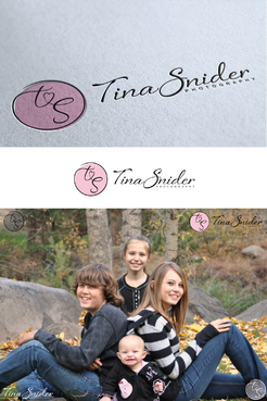
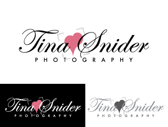
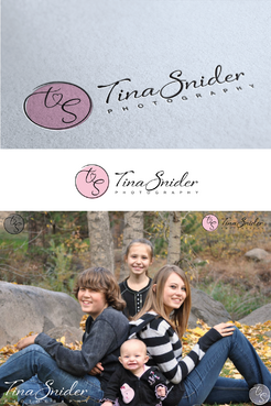
Business Logo - Tina Snider Photography
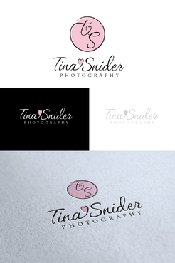
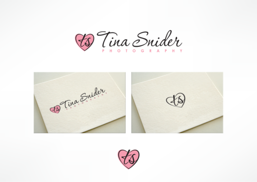
Tina Snider Photography
|
Contest Holder
TinaSniderPhotography
?
Last Logged in : 3745days10hrs ago |
Concepts Submitted
102 |
Guaranteed Prize
200 |
Winner(s) | A Logo, Monogram, or Icon |
|
Live Project
Deciding
Project Finalized

Creative Brief
Business Logo - Tina Snider Photography
Tina Snider Photography
Yes
I am a Family & Child Photographer. Here is a link to a business card I designed. http://www.heritagemakers.com/projectBrowserStandAlone.cfm?projectID=2110371&productId=435&sponsorID=307822
I have another company, a storybook company called Stories with a Heart and that is why I stuck with the heart around my name for my photography business.
I tend to be more country in my designs that I like. It will be used as my logo and the watermark for my pictures. My photography website is tinasniderphotography.com
If you visit my Tina Snider Photography Facebook page, you will see my current watermark that I designed.
Photography
Logo Type
![]()
Symbolic
![]()
Abstract Mark
![]()
Initials
![]()
Cutting-Edge
Unique/Creative
Sophisticated
Modern
Fun
Illustrative
Playful/Cartoonish
Youthful
I was thinking red or pink if a heart is included, but I am open to anything...
not sure
I don't want a camera included in my logo.
Related Contests