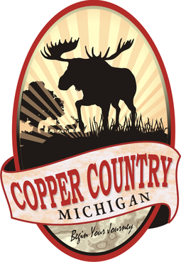
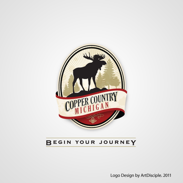
Business/Website Logo for CopperCountry.com
Copper Country / Michigan
|
Contest Holder
ccountry
?
Last Logged in : 4949days7hrs ago |
Concepts Submitted
36 |
Guaranteed Prize
300 |
Winner(s) | A Logo, Monogram, or Icon |
|
Live Project
Deciding
Project Finalized


Creative Brief
Business/Website Logo for CopperCountry.com
Copper Country / Michigan
Begin Your Journey
Yes
What we’re looking for is a logo that we can used to rebrand and redesign the site coppercountry.com.
This logo is for a site that is an information portal to what is known as the “Copper Country.” The Copper Country is an area in the Upper Peninsula of Michigan in the United States, including all of Keweenaw County, Michigan and most of Houghton, Baraga and Ontonagon counties. The area is so named as copper mining was prevalent there from 1845 until the late 1960s, with one mine (the White Pine mine) continuing through 1995. In its heyday, the area was the world's greatest producer of copper.
Travel
Illustrative
![]()
Unique/Creative
Outdoors/Natural
Local/Neighborhood
Fun
Illustrative
Geometric
See use color palette at http://www.coppercountry.com/logo/Copper-Country-Logo-Samples.jpg You may also download http://www.coppercountry.com/logo/Copper-Country-Logo-Samples.psd
not sure
See sample sheet of logo styles we like at http://www.coppercountry.com/logo/Copper-Country-Logo-Samples.jpg
We’re not a beer company but love the beer logos as an idea, we favor the Killigans logo.
Please keep in mind there are no mountains in our area. However we live on Lake Superior, that’s one of the things we’re known for as well as pine trees.
Think Canada or deep northern America.
Key: We’d like to see a moose somewhere in the logo
Related Contests