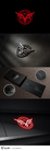
Crimson Moon Entertainment - Company Logo
Crimson Moon Entertainment (Entertainment is likely a sub-text which could be dropped later)
|
Contest Holder
CrimsonMoon
?
Last Logged in : 5274days16hrs ago |
Concepts Submitted
131 |
Guaranteed Prize
300 |
Winner(s) | A Logo, Monogram, or Icon |
|
Live Project
Deciding
Project Finalized


Creative Brief
Crimson Moon Entertainment - Company Logo
Crimson Moon Entertainment (Entertainment is likely a sub-text which could be dropped later)
No
Crimson Moon creates application for the iPhone and Android hand sets. We currently just make entertainment applications, but we plan on expanding into games as well.
Entertainment
Logo Type
![]()
Symbolic
![]()
Abstract Mark
![]()
Web 2.0
![]()
Cutting-Edge
Unique/Creative
Sophisticated
Modern
High Tech
Masculine
Red (Crimson) and whatever other colors you prefer.
not sure
Related Contests