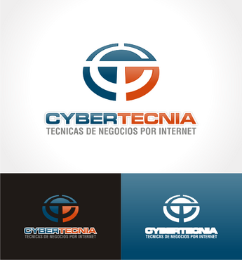
CYBERTECNIA logo with monogram/symbol
CYBERTECNIA
|
Contest Holder
cybertecnia2012
?
Last Logged in : 4487days16hrs ago |
Concepts Submitted
354 |
Guaranteed Prize
199 |
Winner(s) | A Logo, Monogram, or Icon |
|
Live Project
Deciding
Project Finalized
Creative Brief
CYBERTECNIA logo with monogram/symbol
CYBERTECNIA
TECNICAS PARA NEGOCIOS POR INTERNET
Yes
DEFINITION OF THE NAME ------
CYBERTECNIA is composed of 2 words: CYBER and TECNIA.
CYBER - English word derived from the Greek word (kybernaō) meaning Steersman – director, one who steers – a member of a ship’s crew who is responsible for steering.
TECNIA - Spanish word also derived from the Greek word τέχνη (technē) meaning technique – a procedure used to accomplish a specify activity or task.
In few words – CYBERTECNIA, as a name, completely defines what the business is all about: the art of directing, teaching and controlling techniques (delivered electronically and remotely).
And thus, a simple definition of the site is:
CYBERTECNIA™ – a remotely-operated business focused on sharing technical knowledge – electronically”.
VALUES -----
Modern, Leading-Edge, Innovative, Technical and Creative.
SYMBOL/MONOGRAM SHAPES TO CONSIDER AND REASONING -----
1. Circle - Circularity Effect with C or T initials (Monogram)
2. Computer Screen - To convey delivery medium "internet" and Mouse - To convey idea of "techniques"
3. Computer Screen - To convey delivery medium "internet" and Pointer (mouse, or any other idea) - To convey idea of "techniques"
LOGOTYPE REQUIREMENTS -----
1. Distinguish the 2 words by using 2 colors. CYBER in dark blue and TECNIA in orange. (Although the colors pallette are set, use your colors to see if a better combination is achived. You can use other colors if they enhance the message better).
FONTS:
1. You can use any type of fonts for the logotype and the tag line. This will help us to see other alternatives. We do have a preference for the logotype (EuroExt,MicrogrammaDMedEx,Gotham Bold,Tunga) and for the tag line (Helvetica Bold, Condensed), but again...we would like to see other alternatives.
Internet Services
Logo Type
![]()
Symbolic
![]()
Abstract Mark
![]()
Initials
![]()
Cutting-Edge
Unique/Creative
Clean/Simple
Sophisticated
Corporate
Modern
Industry Oriented
High Tech
Serious
Geometric
1. Blue (PANTONE: 302, CMYK 93,65,40,24 RGB: 24,77,104 HEX: 184D68) 2. Orange (PANTONE: 173, CMYK 11,82,100,2 RGB: 213,82,39 HEX: D55227) or Green (an optional color if you think the design will benefit from using this color - I am open to suggestions)
2
1. Use the concept of "Negative Space" to incorporate the white space as part of the logo design. Use the white background as part of the monogram/symbol design.
2. Use a 2 dimensional design (flat) not 3D, beveled - not ideal for printing and complicates things.
3. Use fonts that complement the monogram/symbol. They should have a similar shape. Use non-serif fonts, clean, modern, tecnical, etc. BUT, if you think using different concept will help, I am open to that as well.
4. To get an idea on how the sites may look with the colors I am thinking would be appropriate, visit the following testing sites:
http://www.cybertecnia.com (blue/green)
http://www.cibertecnica.com (blue/orange)
These testing sites may help you get a better feel for what this logo will be used for.
I am open to any suggestions and will provide constant feedback. In the project folder, I will include design ideas to help you in your creative process. You can take a look at what I have designed and have an idea what I am looking for.
Thanks for taking on this project and hope to get as many designs as possible.
IMPORTANT NOTE: Depending on the quality delivered on this project, I will allocate additional work for other logo and branding design for related brands in which I am working on.
Related Contests


