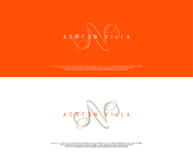
SALES / SUPPORT : +1-877-525-5646   |  


Dating Logo

Real Dating

Contest Holder realdating ?

Last Logged in : 4606days9hrs ago

Concepts Submitted

84

Guaranteed Prize
250
Winner(s)

1

A Logo, Monogram, or Icon veildAll design entries can be viewed by other designers. Featured Featured Contest Expedite Expedite Contest
tick_gray

Live Project

tick_gray

Deciding

tick_blue

Project Finalized


Project: Dating Logo
Industry: Wedding Logo
Contest Launched: May 31, 2011
Selected: 1 winning design from 84 concepts
Winning Design by: MaxGraph
Close Date: Jun 10, 2011


Dating Logo - Wedding


Awarded as a winner
Project Report    

Sort by:


#48

#49

#28

#27

#84

#83


Creative Brief


Dating Logo

Real Dating

Realdating.dk

Yes

We are a new Danish and Swedish dating site, so we need a new logo design, there are no webdesign yet, that will be made after the logo, so there are free hands in this one. Industry is not wedding, but dating, we could not choose dating or love

Wedding

Symbolic
Symbolic

Abstract Mark
Abstract Mark

Initials
Initials

Web 2.0
Web 2.0


Unique/Creative
Clean/Simple
Modern
Serious
Feminine

We don't have a finished webdesign yet, so you can choose the colours almost in any direction that you want.

not sure

If it is possible to make the D in Dating like a heart - se example here http://realdating.dk/rddesign/realdatingdk.png we like that logo in some way, but it is to borring no wow effect. But there are no restrictions to use any thing like that, we need a new logo, you have free hands, make us say wow.

Related Contests


Logo for a rustic wedding and event decor company
$200
Prize Money
83
Concepts
Logo for wedding photography / videography studio
$200
Prize Money
172
Concepts
Ashton Villa
$250
Prize Money
418
Concepts
Wedding Logo
$250
Prize Money
247
Concepts

Discussion


Comments

  • June 06, 2011 3:54 PM
    ojsgraphix ojsgraphix
     
    sometimes people just can't take critique and feedback too well. it's just how this field of work is everyone... if they don't like your design, they don't like it, just move on. do other projects. they are always gonna have a certain look they are looking for, no matter what you try, otherwise they'd pick more than one winner. your design will come that will blow them out of the water and you are chosen. don't take it the wrong way. they are the ones paying so if it's not exactly how they like it, then just move on! :)

    Like Icon 0   DislikeIcon 0
  • June 04, 2011 8:22 AM
    mangozie mangozie
     
    to all... remember, we're just people. we never know when we do mistakes, but we have to appreciate what the PH said later... cheers..

    Like Icon 0   DislikeIcon 0
  • June 04, 2011 8:14 AM
    realdating realdating
      Project Holder
    And some times when you are going from one language to another, it'ssome times hardere to come out with the right words. But if i have insulted some one, then i'm sorry.

    Like Icon 0   DislikeIcon 0
  • June 04, 2011 8:10 AM
    realdating realdating
      Project Holder
    logospecialist and artsie9324 Well first of all, your are completly right, i don't have any rights to be disrespectfull or anything like that! But that was not my intention to be or sound like that, I have written what I saw and did it short and direct, and on text if you don't put smileyes or something like that on it comes out and are read in a diffrent way, from what i ment when i wrote it. So no matter what you read is maybe not the itention to sound like that

    Like Icon 0   DislikeIcon 0
  • June 02, 2011 4:07 AM
    realdating realdating
      Project Holder
    #15 #17 #18 and #20 have u even read the brief? Rea Dating? I can't see why you are making anything like that? I can't see an L in any of your designs?

    Like Icon 0   DislikeIcon 0
  • June 01, 2011 10:46 AM
    realdating realdating
      Project Holder
    #5 to #8 It's to easy to see that the D is put in the heart and then the rest is written afterwards, they are not in line. And there are missing something unique

    Like Icon 0   DislikeIcon 0
  • June 01, 2011 1:51 AM
    realdating realdating
      Project Holder
    Update #1 To Carton, and the style is not something that we are looking for #2 It's look's a like it's an apple, and the same fonts are used from the example logo #3 & #10 First we got number 3, it looked great and unique, we came withe some modefications and that ended in #10 and thats even more great in my opinion. #9 I don't know what, but i seems like something i have seen before, and reminds me of some chat, and it's not just a casual chat logo we are looking for.

    Like Icon 0   DislikeIcon 0
  • May 31, 2011 4:27 PM
    realdating realdating
      Project Holder
    There is no need to use the same font's that are used in the logo example we have descriped ind the brief. Be creative, we don't like the logo example we have provided. We need something unique and great looking :P

    Like Icon 0   DislikeIcon 0