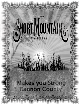
Design our distillery's first t-shirt
logo files provided
|
Contest Holder
BillyBTW
?
Last Logged in : 5194days12hrs ago |
Concepts Submitted
83 |
Guaranteed Prize
250 |
Winner(s) | Marketing collateral |
|
Live Project
Deciding
Project Finalized

Creative Brief
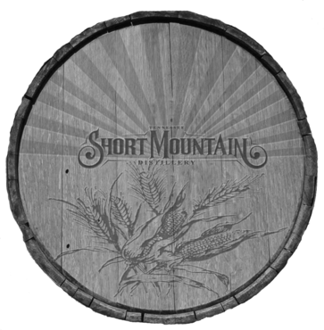
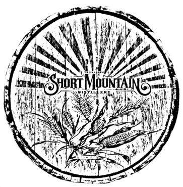
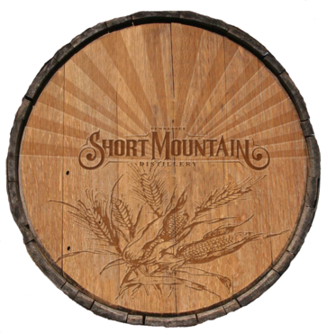
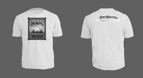
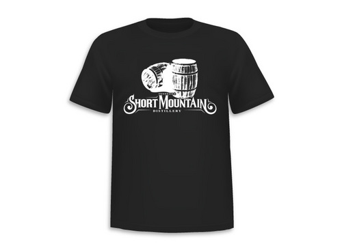
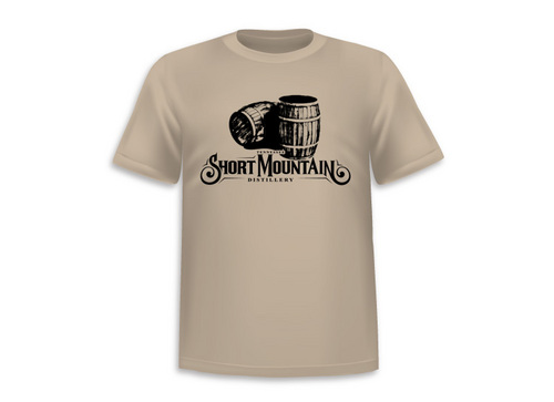
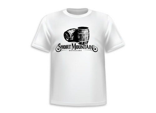
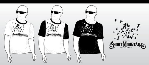
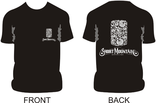
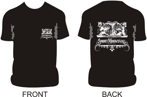
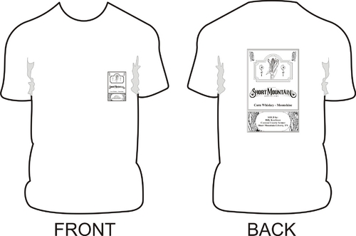
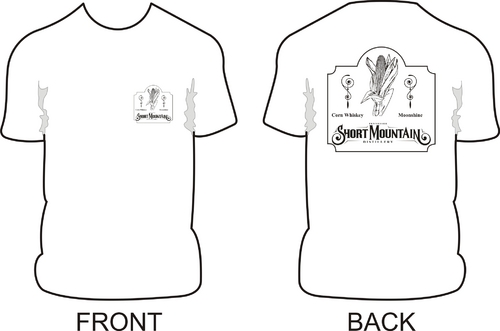
Design our distillery's first t-shirt
logo files provided
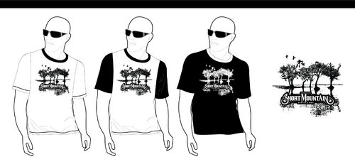
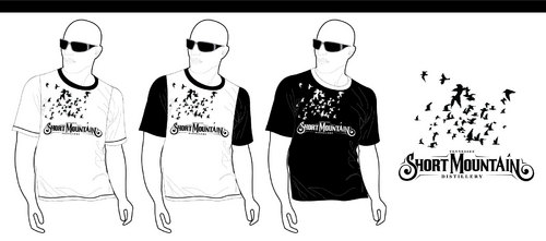
These will be used to market our company to our local community and maybe beyond.
The images you create are for screen printing on both light and dark color t-shirts. The image for the back of the t-shirt should be as wide as the logo provided (8 - 8.5 inches) and up to 8 - 8.5 inches tall. The front image (for the left chest) should by 3 inches wide x up to 3 inches tall. Files must be on transparent background, 300dpi, saved in editable layers in a .PSD file and any other standard graphics file formats. Each file should only use one color (white or black respectively) Design should use these two files for each respective color. We also have .eps. .tif or .ai files if needed. http://shortmountaindistillery.com/images/logoBlackBG.psd http://shortmountaindistillery.com/images/logoWhiteBG.psd