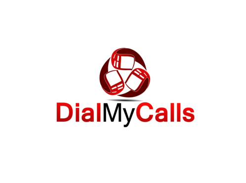
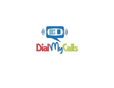
SALES / SUPPORT : +1-877-525-5646   |  


DialMyCalls.com

DialMyCalls

Contest Holder dbatchelor ?

Last Logged in : 4567days20hrs ago

Concepts Submitted

146

Guaranteed Prize
300
Winner(s)

1

A Logo, Monogram, or Icon veildAll design entries can be viewed by other designers. Featured Featured Contest
tick_gray

Live Project

tick_gray

Deciding

tick_blue

Project Finalized


Project: DialMyCalls.com
Contest Launched: Sep 15, 2011
Selected: 1 winning design from 146 concepts
Winning Design by: bbb99
Close Date: Sep 27, 2011


DialMyCalls.com - Telecommunications


Awarded as a winner
Project Report    

Sort by:


#125

#95

#46

#45

#111

#44

#115

#107

#144

#141

#134

#132

#130

#88

#85

#84

#70

#22

#20


Creative Brief


DialMyCalls.com

DialMyCalls

No

This logo is for our business, we're looking for something eyecatching that we can used to brand our company as we continue to grow into the future. It will be used on our website at DialMyCalls.com and on our business cards and other printed materials.

Telecommunications

Logo Type
Logo Type

Symbolic
Symbolic

Abstract Mark
Abstract Mark

Character
Character


Unique/Creative
Clean/Simple
Modern
Industry Oriented
Fun

Our main background color on the website is blue, so something that goes well with that. We're open to ideas.

3

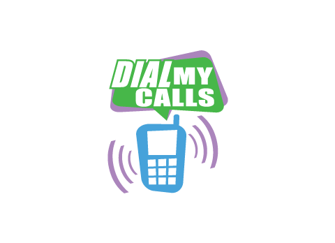
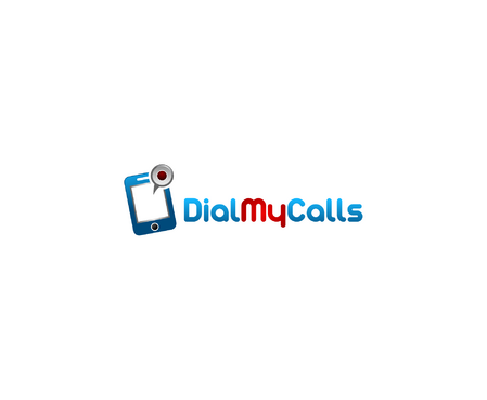
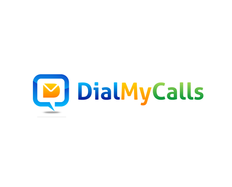
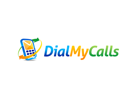
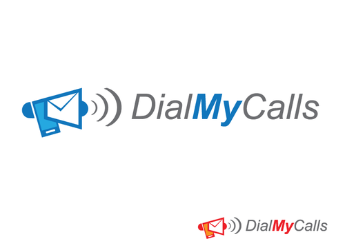
A couple ideas we were thinking of, is a phone holding a megaphone showing it sending messages through it. We want to keep it simple so it would definitely be an abstract logo, it doesn't need to be in super detail.

Related Contests


Logo
$200
Prize Money
259
Concepts
Logo for mobile operator
$1000
Prize Money
1473
Concepts
Bermuda Regulatory Authority
$200
Prize Money
77
Concepts
(expedite) Logo For Radio Staton
$250
Prize Money
109
Concepts

Discussion


Comments

  • September 27, 2011 8:10 AM
    dbatchelor dbatchelor
      Project Holder
    acaspring I know we like the phone too. However it's been about 5 years now and decided to change it up a bit. Which logo do you like best so far? Thanks for being a DMC user!

    Like Icon 0   DislikeIcon 0
  • September 27, 2011 8:09 AM
    dbatchelor dbatchelor
      Project Holder
    #125 can you follow the same color scheme as #21 with the phone in blue instead of black. and also add the little lines like you have in #123.

    Like Icon 0   DislikeIcon 0
  • September 25, 2011 8:51 PM
    dbatchelor dbatchelor
      Project Holder
    #21 really torn on this logo, I like it alot but some people say the phone looks like a calculator. Maybe you could make the phone look more like the one in #23 & also have those things coming off the top.

    Like Icon 0   DislikeIcon 0
  • September 23, 2011 2:43 PM
    dbatchelor dbatchelor
      Project Holder
    #23 could you do a version with a dark grey instead of yellow?

    Like Icon 0   DislikeIcon 0
  • September 21, 2011 12:01 PM
    dbatchelor dbatchelor
      Project Holder
    #18 - can you do yellow instead of the red? We dont really use red anywhere on our site or promo materials.

    Like Icon 0   DislikeIcon 0
  • September 21, 2011 11:58 AM
    dbatchelor dbatchelor
      Project Holder
    #20 can you do it in blue instead of red?

    Like Icon 0   DislikeIcon 0
  • September 21, 2011 11:56 AM
    dbatchelor dbatchelor
      Project Holder
    #19 - can you change the red to blue?

    Like Icon 0   DislikeIcon 0
  • September 21, 2011 11:41 AM
    dbatchelor dbatchelor
      Project Holder
    Really like logos 10 & 11 so far, that's along the lines of what we're looking for. #10 - Could you do a version with blue instead of red. Also a version of what it would look like on a blue BG color. #11 - We like but it has too many colors, ideally it would be 2-3 colors with no shading. This way we can get it printed easier. Also would like to see what this would look like on a blue BG color. The reason for the blue BG color is because our sites BG color is blue so the logo will be sitting over top of that. Thanks, Dave

    Like Icon 0   DislikeIcon 0
  • September 20, 2011 3:35 PM
    dbatchelor dbatchelor
      Project Holder
    logo #2 is getting closer to what we're looking for.

    Like Icon 0   DislikeIcon 0
  • September 19, 2011 11:45 AM
    dbatchelor dbatchelor
      Project Holder
    Don't really like the envelopes since we do both voice & text messages. It's a decent start though.

    Like Icon 0   DislikeIcon 0