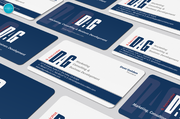
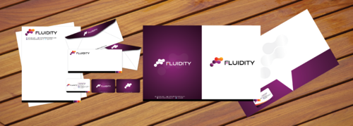
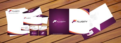
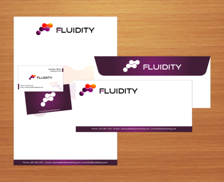
Digital Marketing Co. - Business Cards
Fluidity Marketing
|
Contest Holder
FMSilver
?
Last Logged in : 5329days20hrs ago |
Concepts Submitted
109 |
Prize Money
150
|
Winner(s) | Business Cards and Stationery |
|
Live Project
Deciding
Project Finalized


Creative Brief
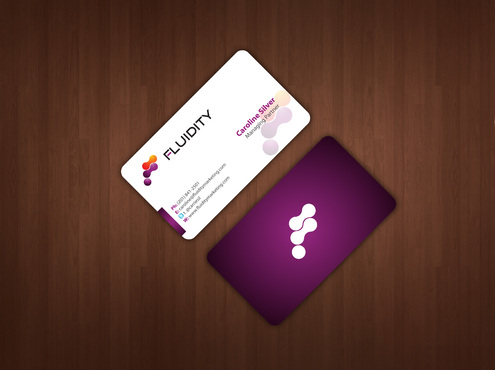
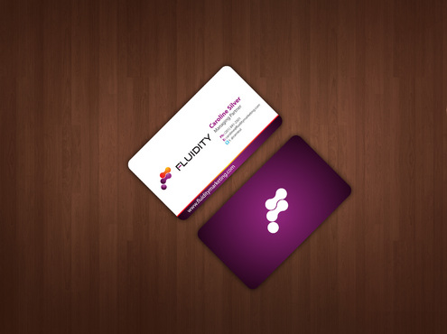
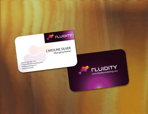
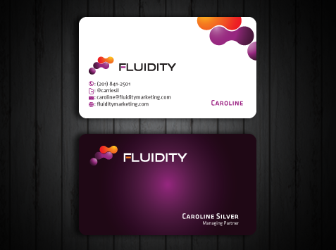
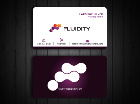
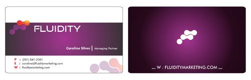
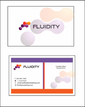
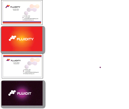
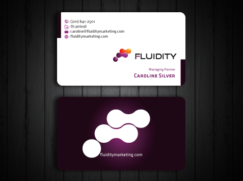
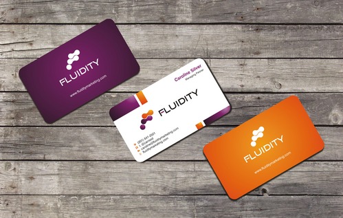
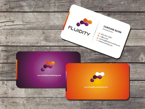
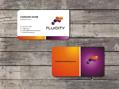
Digital Marketing Co. - Business Cards
Fluidity Marketing
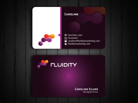
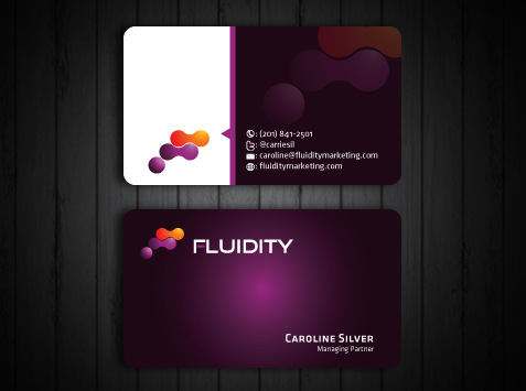
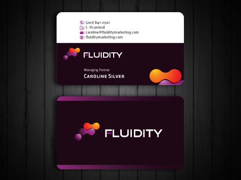
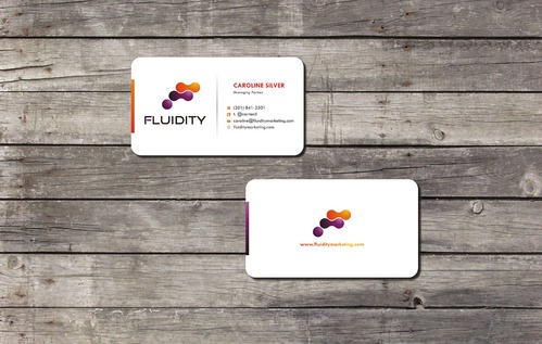
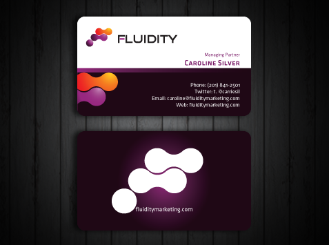
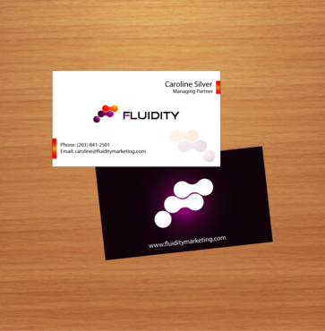
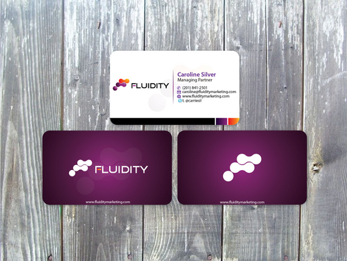
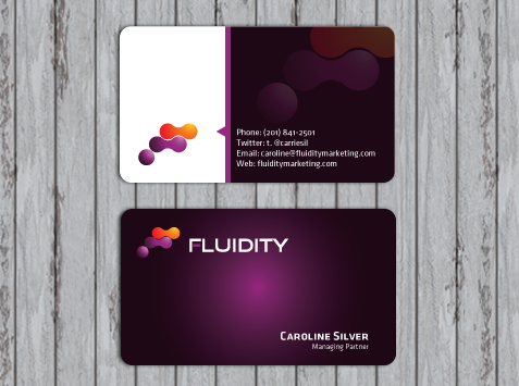
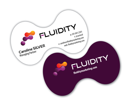
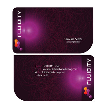
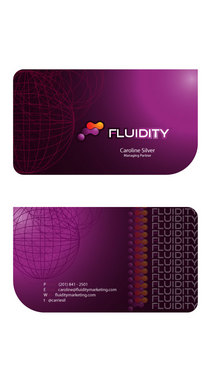
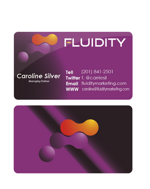
I need double sided standard sized Business Card [3.5" x 2"]
Use specific fonts
be creative
Cutting-Edge
Modern
Caroline Silver
Managing Partner
no street address
(201) 841-2501
caroline@fluiditymarketing.com
fluiditymarketing.com
It's a digital marketing company that is dealing with companies worldwide, so we don't have a lockdown street address. I would however like a twitter info area on there. t. @carriesil
Open to different ideas... just web address or perhaps logo. show me some different options and can see what works best. Thanks!
Marketing
Related Contests