Don't miss out! Business Logo: teamICONIC
teamICONIC.com
|
Contest Holder
pollorball20000
?
Last Logged in : 4032days15hrs ago |
Concepts Submitted
340 |
Guaranteed Prize
300 |
Winner(s) | A Logo, Monogram, or Icon |
|
Live Project
Deciding
Project Finalized


Creative Brief
Don't miss out! Business Logo: teamICONIC
teamICONIC.com
Yes
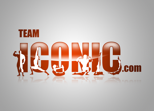
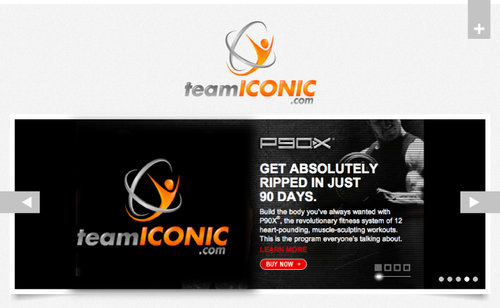
We are a company that promotes health, and fitness. through eating right and working out. we plan on using the winning design on our website, t-shirts, stickers, water bottles and other apparel.
it is very important for us to have a logo that is not gender specific. We want to reach males and females. We want both genders to look at the logo equally and say, that is an amazing logo, we want them to connect with it.
We want to reach a certain type of person not necessarily a specific gender. Our audience is both the stay at home mom or dad who wants to get in shape, to the athletes who want to take their training to the next level. Busy businessmen and women. Our audience is motivated, passionate, believers and driven, with strong team pride.
age range is middle age from 18-49
www.teamICONIC.com
the website is still being created but you can get a good Idea of where we are going.
Health
Logo Type
![]()
Abstract Mark
![]()
Web 2.0
![]()
Cutting-Edge
Unique/Creative
Clean/Simple
Modern
Industry Oriented
High Tech
Serious
Masculine
Abstract
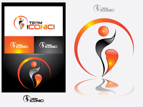
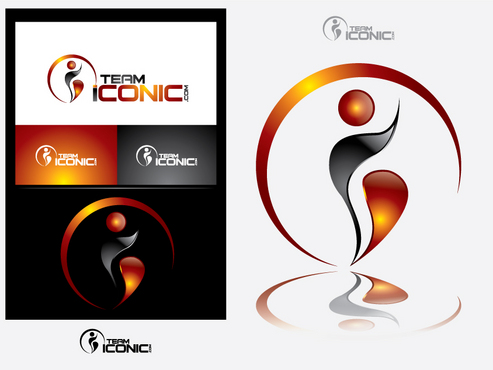
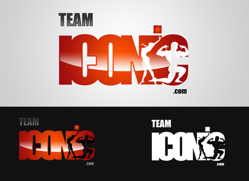
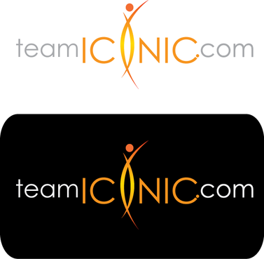
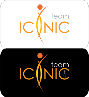
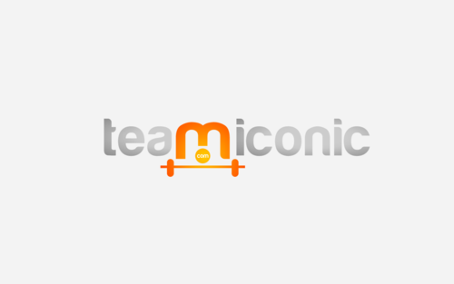
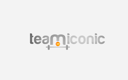
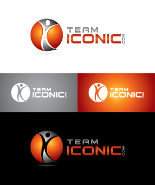
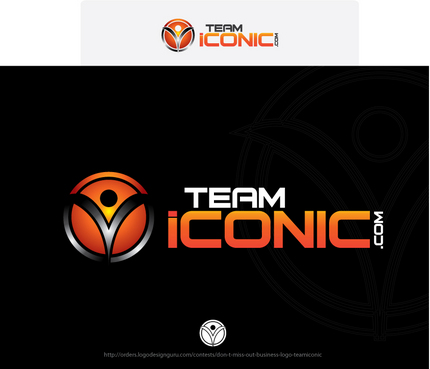
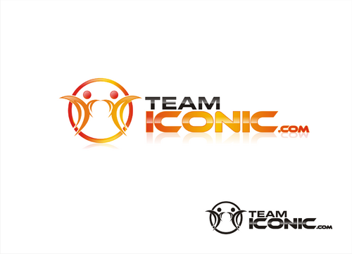
You can choose from this color palette. Use the colors as you see fit . If your design calls for only 2 colors use 2. It it requires 3 or more feel free to 3 or more -Black -White -Silver or metallic silver, you can choose to best for your design -Orange- # FF5300 ( if your design calls for a few shades darker, you can go a few shades darker) If you look at our website teamICONIC.com all of the orange links will match the color orange you use in your design, so we want them to still pop, without being to muted or dull.)
3
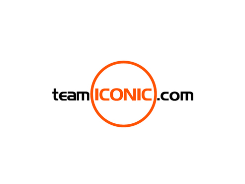
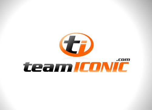
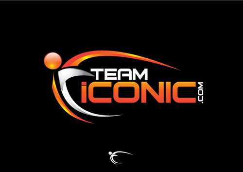
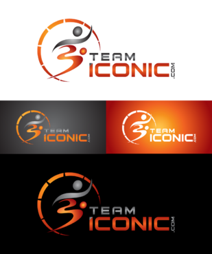
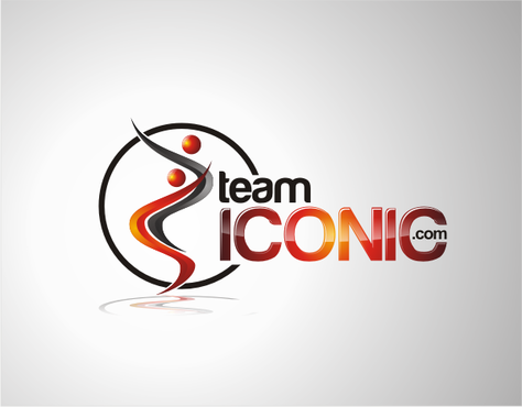
We would like the design to be more horizontal than vertical. I really want to "ICONIC" to pop out. "ICONIC" has be a different color (orange) and sized bigger than "team" or ".com", but try to not make it seem unporportional.
Please present the logo on a white background or on the website background color #F3F3F3
If you click on www.teamripped.com..... The logo has the concept that I do like where the RIPPED stand out. However I do not like the muscle man he has, I believe it favors the male gender, where our goal is to market to both sexes.
We really want your design to speak for itself.
http://teamripped.com/partnercoaches has a list of logos I want to definitly avoid. I believe these are horrible designs and am looking for something thats amazing, unique special, has character and is clean.
I want to our audience to love the design, I certaintly want to love the deisngn and I feel this will all steam from the time and effort you put into developing the logo.
Thank you
~ Demitris W.
Founder of teamICONIC.com
Related Contests


