E-Cyrano Online Dating Profile Writing
E-Cyrano
|
Contest Holder
EMK2012
?
Last Logged in : 5009days21hrs ago |
Concepts Submitted
277 |
Guaranteed Prize
300 |
Winner(s) | A Logo, Monogram, or Icon |
|
Live Project
Deciding
Project Finalized

Creative Brief
E-Cyrano Online Dating Profile Writing
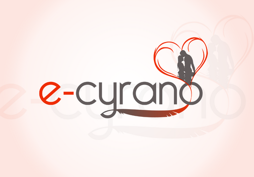
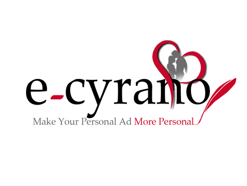
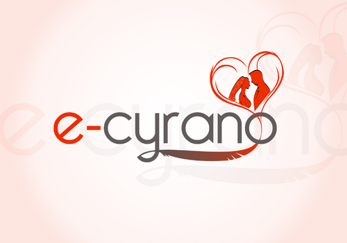
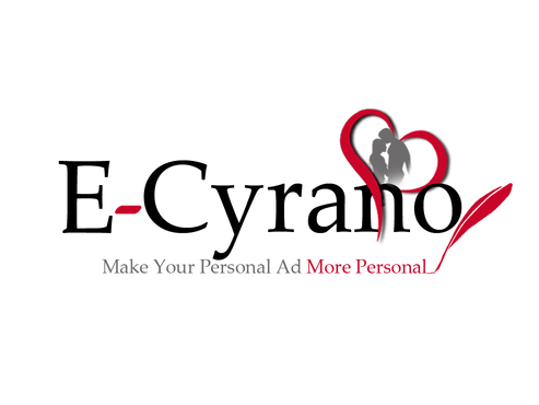
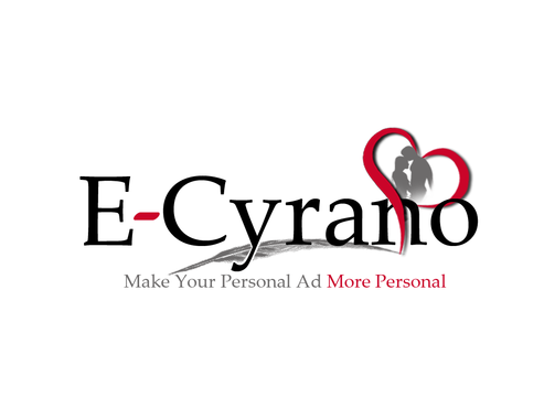
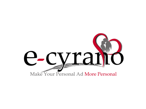
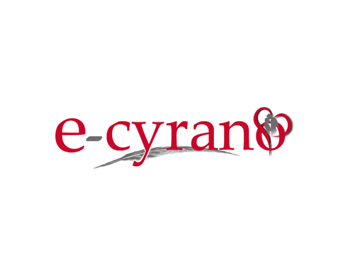
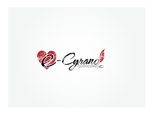
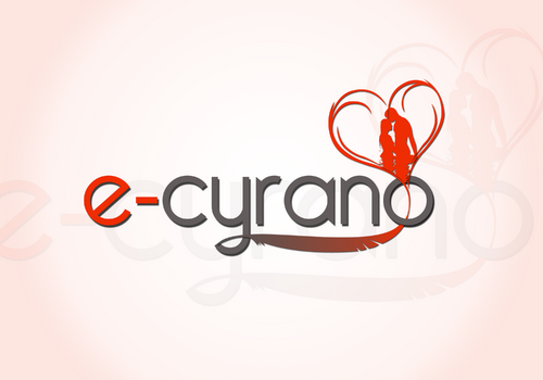
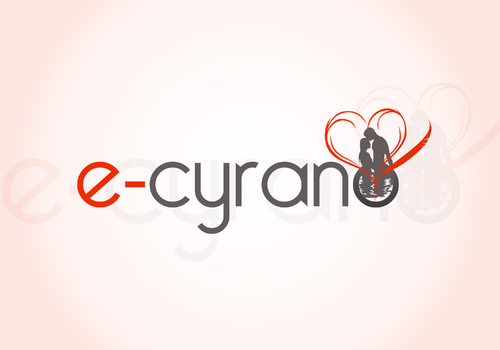
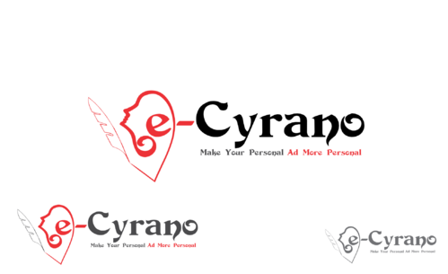
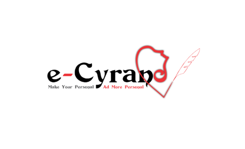
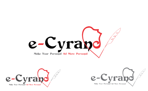
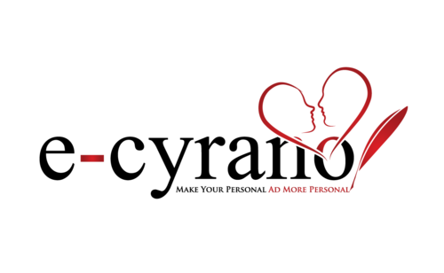
E-Cyrano
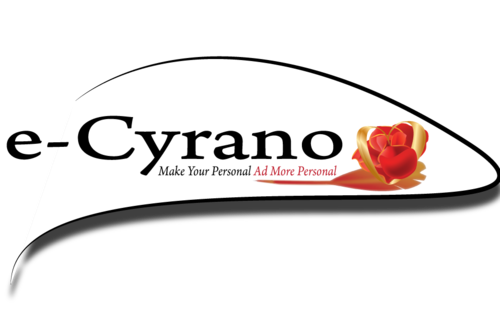
Make Your Personal Ad More Personal
No
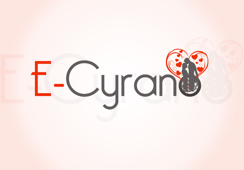
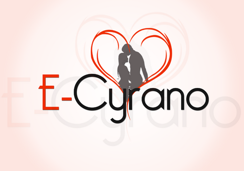
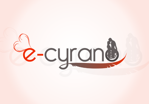
E-Cyrano is a 9 year old company that writes unique and professional-quality online dating profiles for singles. The company name is derived from Cyrano de Bergerac - the man behind the scenes who tells other men how to charm women. For what it's worth, the majority of our clients are women, since I am a dating coach for smart, successful women (www.evanmarckatz.com) I'm rebuilding E-Cyrano now and it will look like this (http://it-dimension.ath.cx:10000/sites/cyrano/) but right now, it looks like this (www.e-cyrano.com) I think that the branding/color scheme should be consistent with the EvanMarcKatz site and new E-Cyrano site - red as a primary color, unless you think a different color would pop as a logo...
Writing
Logo Type
![]()
Abstract Mark
![]()
Illustrative
![]()
Character
![]()
Unique/Creative
Clean/Simple
Sophisticated
Fun
Illustrative
Red, probably. Here's the site: http://it-dimension.ath.cx:10000/sites/cyrano/.
not sure
http://it-dimension.ath.cx:10000/sites/cyrano/.
www.e-cyrano.com
www.evanmarckatz.com
Related Contests


