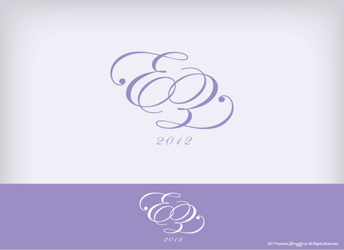
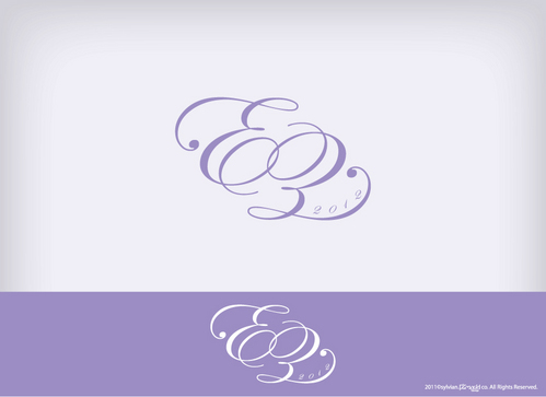
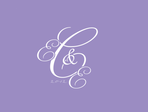
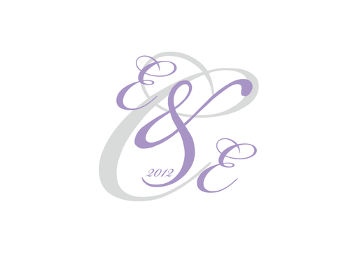
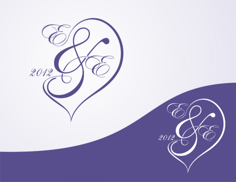
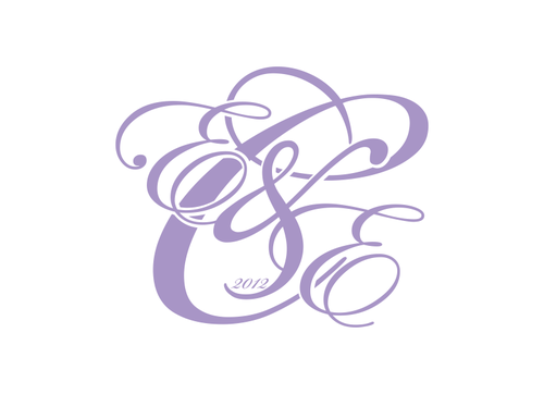
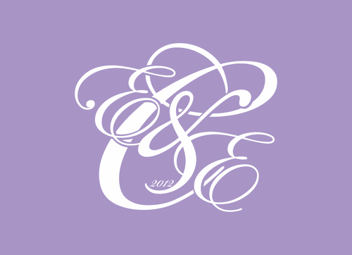
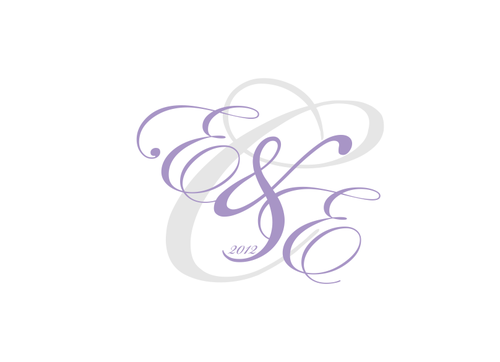
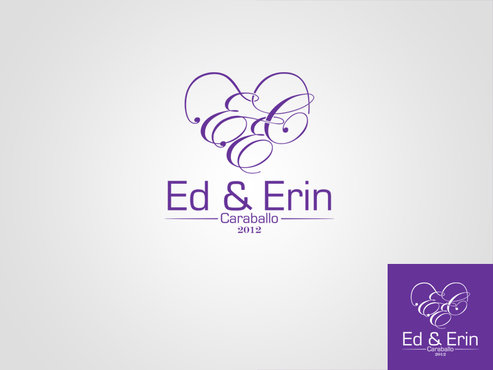
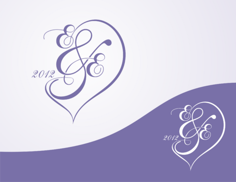
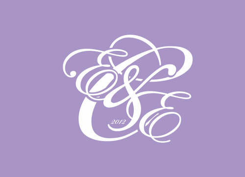
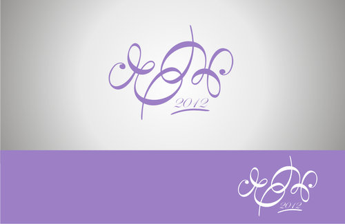
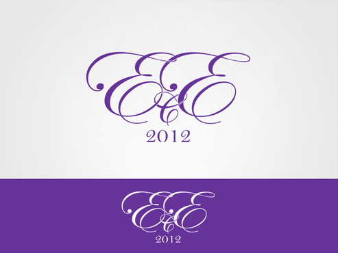
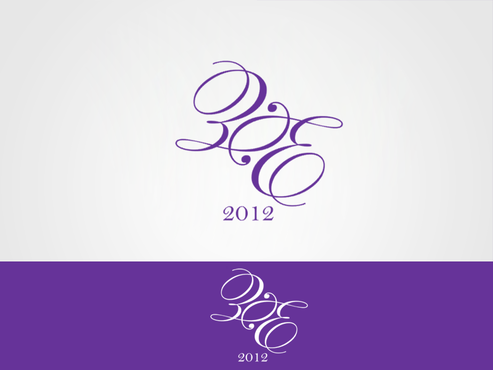
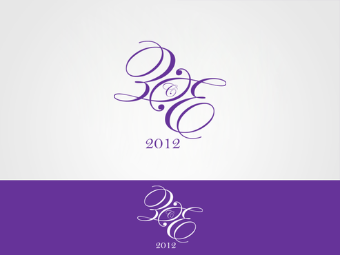
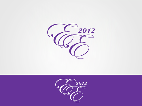
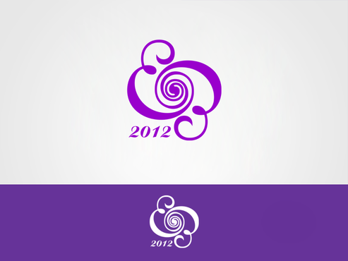
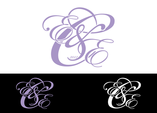
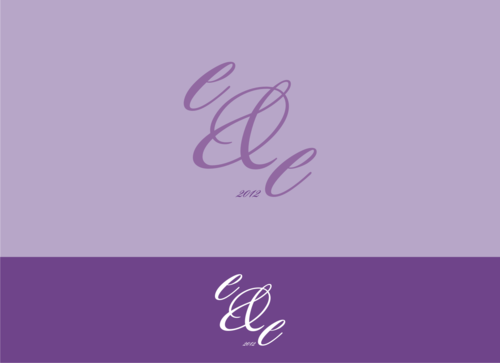
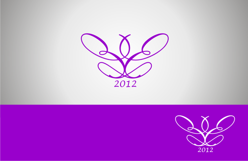
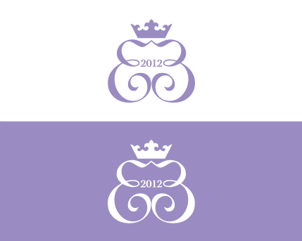
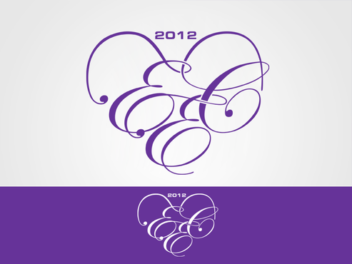
Ed and Erin Wedding Monogram
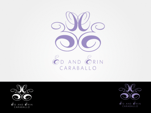
E E C (Ed and Erin Caraballo)
|
Contest Holder
ecaraballo
?
Last Logged in : 5308days18hrs ago |
Concepts Submitted
178 |
Guaranteed Prize
250 |
Winner(s) | A Logo, Monogram, or Icon |
|
Live Project
Deciding
Project Finalized


Creative Brief
Ed and Erin Wedding Monogram
E E C (Ed and Erin Caraballo)
Yes
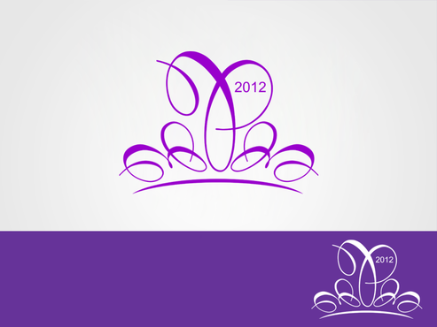
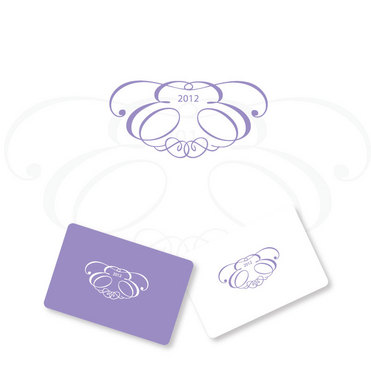
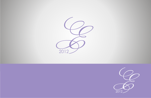
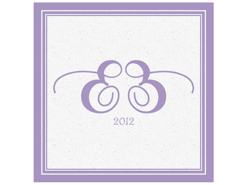
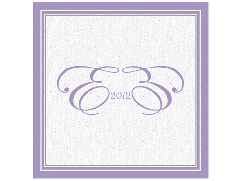
This will be a monogram for our upcoming wedding in 2012.
Wedding
Initials
![]()
Unique/Creative
Clean/Simple
Sophisticated
Traditional
Illustrative
We'd prefer Pantone colors but we do not have a chart with us so please keep the color around CMYK (C: 40 M: 45 Y: 0 K:0). Colors can be changed later. Please use this shade of purple, black and white.
2
None at this time. Additional ideas may come after a first round of concepts.
Thank you!
Related Contests