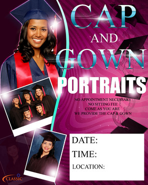
Event Poster
Advertisement for Portrait Photography
|
Contest Holder
classicphotography
?
Last Logged in : 5209days22hrs ago |
Concepts Submitted
92 |
Guaranteed Prize
400 |
Winner(s) | Marketing collateral |
|
Live Project
Deciding
Project Finalized
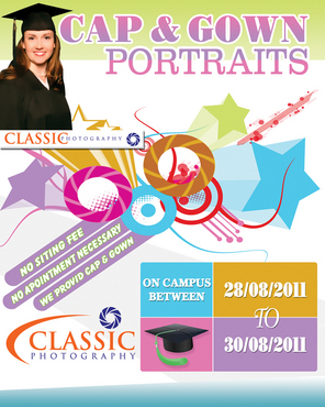
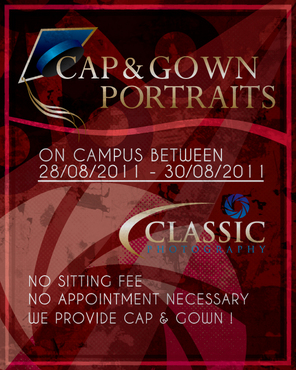
Project: Event Poster
Industry:
Photography Logo
Contest Launched:
Aug 26, 2011
Selected:
1
winning design from 92 concepts
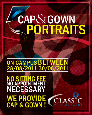
Winning Design by:
BDesign
Close Date:
Sep 02, 2011


Creative Brief
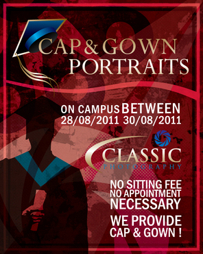
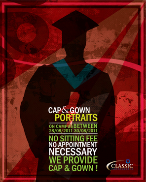
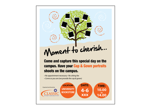
Event Poster
Advertisement for Portrait Photography
Photography
College Students. Fun, artistic, exciting.
Portrait / vertical orientation. Must be able to print a 16" x 20" poster at 300 DPI.
Related Contests


