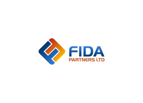
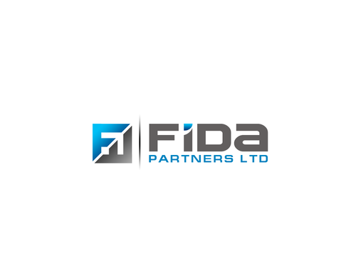
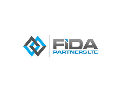
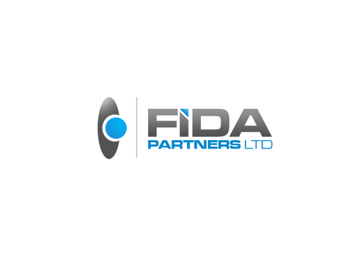
SALES / SUPPORT : +1-877-525-5646   |  


FIDA

FIDA Partners Ltd.

Contest Holder matthiasgleichmann ?

Last Logged in : 4477days5hrs ago

Concepts Submitted

203

Guaranteed Prize
500
Winner(s)

1

A Logo, Monogram, or Icon veildAll design entries can be viewed by other designers. Featured Featured Contest
tick_gray

Live Project

tick_gray

Deciding

tick_blue

Project Finalized


Project: FIDA
Industry: Consulting Logo
Contest Launched: Oct 09, 2010
Selected: 1 winning design from 203 concepts
Winning Design by: sway99
Close Date: Oct 16, 2010


FIDA - Consulting


Awarded as a winner
Project Report    

Sort by:


#162

#134

#113

#109

#93

#62

#51

#138

#136

#133

#132

#127

#65

#143

#126

#123

#118

#115

#114

#85

#84

#75

#74

#60

#59

#58


Creative Brief


FIDA

FIDA Partners Ltd.

No

Management consulting firm specialized for financial data analyzing, reporting

Consulting

Logo Type
Logo Type

Symbolic
Symbolic

Abstract Mark
Abstract Mark

Initials
Initials


Corporate
Modern
Traditional
Serious

modern, darker, sturdy blue, light, airy orange

not sure

our name FIDA can be included in the logo (but its not a must)

Related Contests


Discussion


Comments

  • October 16, 2010 4:09 PM
    sallu sallu
     
    @sway99 congrats. :)

    Like Icon 0   DislikeIcon 0
  • October 16, 2010 6:41 AM
    HAMZA HAMZA
     
    feedback plz

    Like Icon 0   DislikeIcon 0
  • October 15, 2010 11:51 AM
    SiteAdmin SiteAdmin
     
    Designers: Do not engage yourselves into arguments, if anyone has any rip off claims email us at report@mycroburst.com

    Like Icon 0   DislikeIcon 0
  • October 15, 2010 9:33 AM
    matthiasgleichmann matthiasgleichmann
      Project Holder
    Excellent work people !!!

    Like Icon 0   DislikeIcon 0
  • October 15, 2010 3:24 AM
    SiteAdmin SiteAdmin
     
    Design #2 and #3 by 'lovatodesign' are similar to: http://logopond.com/logos/9f805c73d448cf45bd986d6a4953410e.png

    Like Icon 0   DislikeIcon 0
  • October 14, 2010 4:43 AM
    matthiasgleichmann matthiasgleichmann
      Project Holder
    #51 would be our favorite so far, if it would be a bit more complete like #62. We like the middle dot in #51 !

    Like Icon 0   DislikeIcon 0
  • October 14, 2010 4:41 AM
    matthiasgleichmann matthiasgleichmann
      Project Holder
    Great work so far ! Thanks a lot. I would like to see #65 with a grey line and the logo the same size as the letters. The font of #65 is great !

    Like Icon 0   DislikeIcon 0
  • October 13, 2010 10:10 AM
    matthiasgleichmann matthiasgleichmann
      Project Holder
    I like #45 the grey line that distinquishes between font and logo, and the i-dot is nice !

    Like Icon 0   DislikeIcon 0
  • October 13, 2010 2:06 AM
    matthiasgleichmann matthiasgleichmann
      Project Holder
    Thank you all for this good work so far ! I like what I see. My feeling is that the logo should be "parallel" like in #20, not like #19. The logo appearing left from the FIDA letters, like in most drafts, I like most.

    Like Icon 0   DislikeIcon 0
  • October 12, 2010 5:18 AM
    matthiasgleichmann matthiasgleichmann
      Project Holder
    Our logo does not need to consist our of letters, it can be a full fresh new idea here. Everything modern and interesting is welcome !

    Like Icon 0   DislikeIcon 0