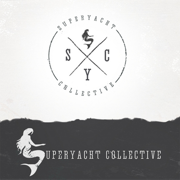
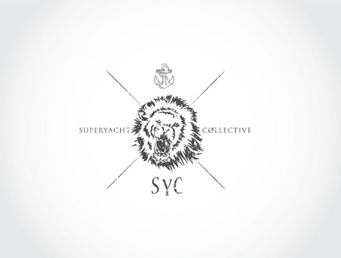
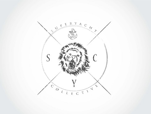
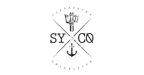
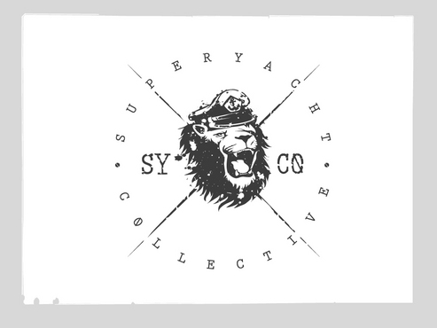
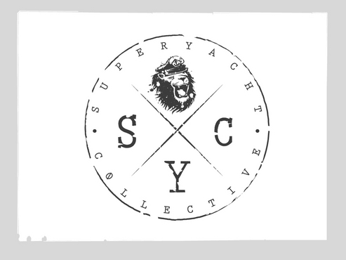
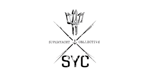
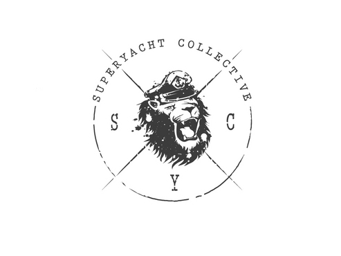
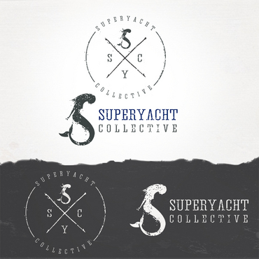
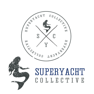
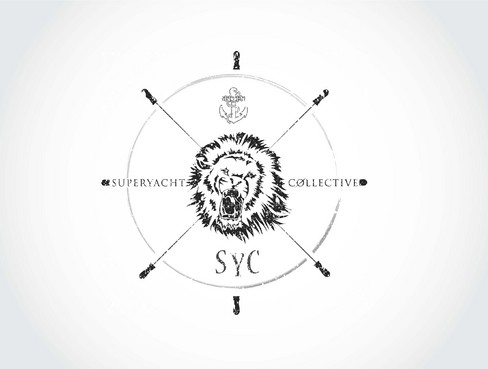
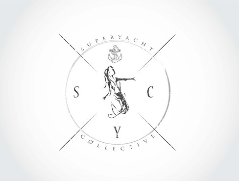
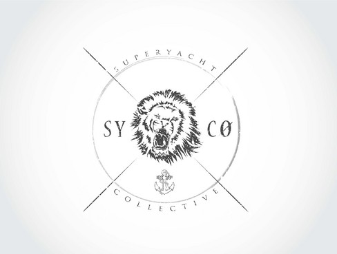
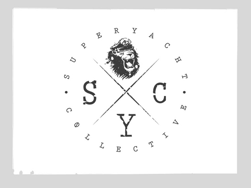
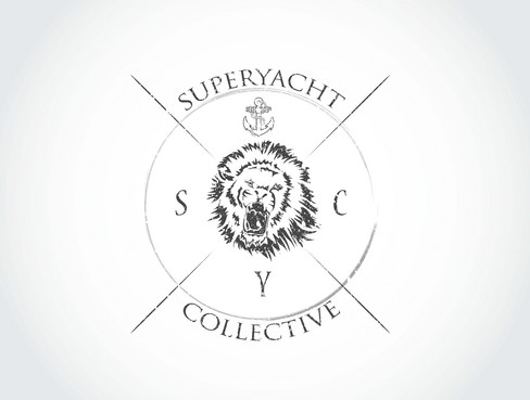
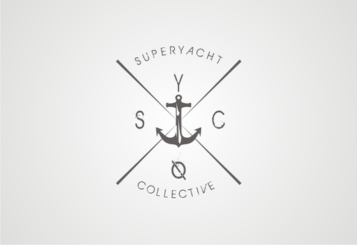
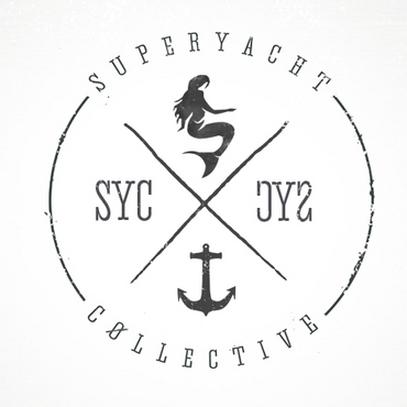
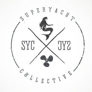
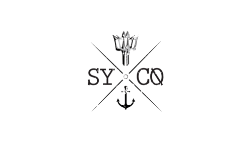
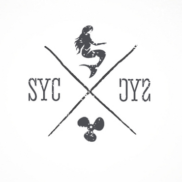
Hipster logo for a photo sharing blog called Superyacht Collective.
SYC
|
Contest Holder
dunedin
?
Last Logged in : 4973days19hrs ago |
Concepts Submitted
658 |
Guaranteed Prize
500 |
Winner(s) | A Logo, Monogram, or Icon |
|
Live Project
Deciding
Project Finalized


Creative Brief
Hipster logo for a photo sharing blog called Superyacht Collective.
SYC
No
We want the logo to represent and convey unity through travel, seafaring and the ocean.
We are a blog on which private yacht crew post photography from their world travels and experiences. A unique insight into a world not many people get to view.
The yachting industry culture is heavily influenced by surf, sailing and kite boarding culture. Our favorite magazine/website is: www.dslmag.com/v6/
The style and culture of the website are right up our alley. We hope designers can draw on some ideas from the site.
Blogging
Logo Type
![]()
Symbolic
![]()
Abstract Mark
![]()
Initials
![]()
Web 2.0
![]()
Modern
Retro
Youthful
Simple
Professional
not sure
Related Contests