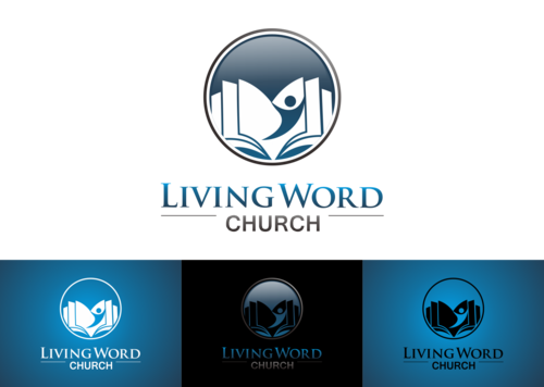
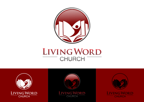
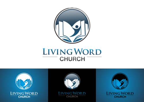
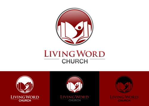
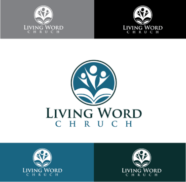
Living Word Church, York, England
Living Word Church
|
Contest Holder
DLavery
?
Last Logged in : 4636days5hrs ago |
Concepts Submitted
98 |
Guaranteed Prize
250 |
Winner(s) | A Logo, Monogram, or Icon |
|
Live Project
Deciding
Project Finalized


Creative Brief
Living Word Church, York, England
Living Word Church
No
We are a community church based in the beautiful city of York in the north east of England.
We are soon moving into our new building and we plan a complete re-brand of stationary, website, sign-age, advertising etc.. We need a simple effective logo that we can use on all these media types.
To get a feel for our church go to our website www.livingwordyork.org
Religion and Spirituality
Symbolic
![]()
Abstract Mark
![]()
Initials
![]()
Clean/Simple
Modern
Illustrative
Abstract
We are open to suggestions
not sure
We want to present a clean modern image without over used religious symbols such as crosses, doves or sunrises.
Related Contests