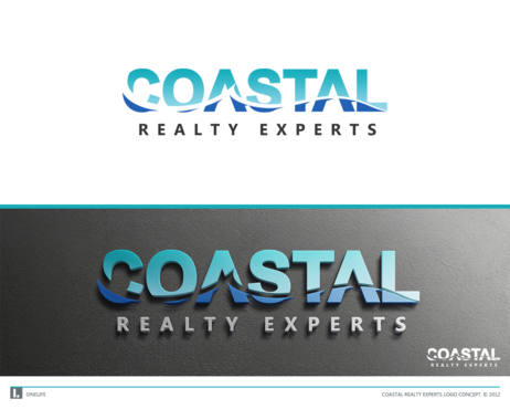
Logo Design for a Real Estate Company
Coastal Realty Experts
|
Contest Holder
clasikauto
?
Last Logged in : 1300days16hrs ago |
Concepts Submitted
77 |
Guaranteed Prize
200 |
Winner(s) | A Logo, Monogram, or Icon |
|
Live Project
Deciding
Project Finalized


Creative Brief
Logo Design for a Real Estate Company
Coastal Realty Experts
No
We are a Florida based realty company which as the name states, focuses primarily on beach and waterfront properties.
Real Estate
Logo Type
![]()
Symbolic
![]()
Abstract Mark
![]()
Sophisticated
Simple
Professional
Blue as the predominate color. Then grey, black, or white. Whatever looks good.
2
I am looking for a clean, professional look that is easy to recognize. We work in a beach area where we have high end homes but the people around here are not stuck up. So the logo must be a simple and beachy feel but not cartoonist, and professional & sophisticated but not elegant.
I am a child of the 80's and I always loved the quicksilver logo with that big wave. I'm thinking a wave for the "C" in coastal and incorporate that wave through the logo somehow.
I want the logo to be clean and simple so that it looks good lettered on a white vehicle and also so it embroiders on clothing easily.
Related Contests


