Logo design for social media site
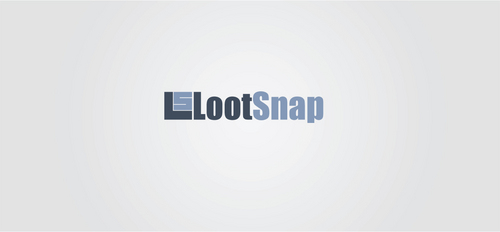
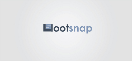
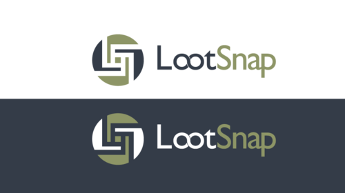
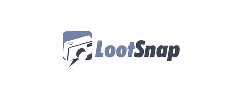
LootSnap
|
Contest Holder
clands
?
Last Logged in : 4816days16hrs ago |
Concepts Submitted
214 |
Guaranteed Prize
275 |
Winner(s) | A Logo, Monogram, or Icon |
|
Live Project
Deciding
Project Finalized


Creative Brief
Logo design for social media site
LootSnap
No
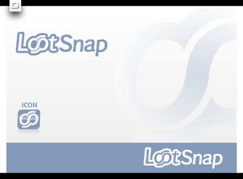
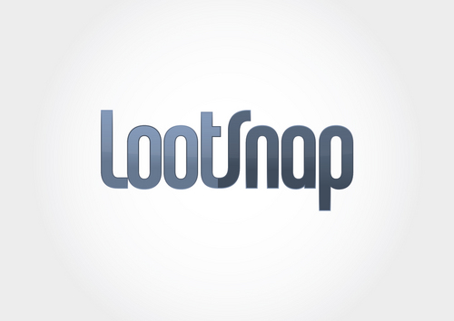
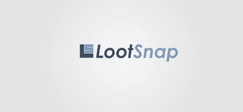
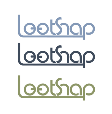
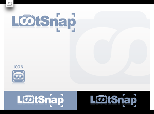
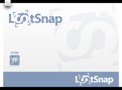
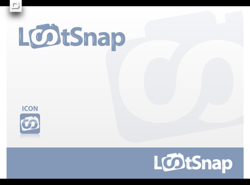
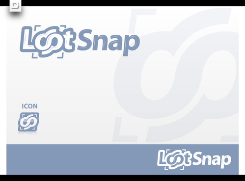
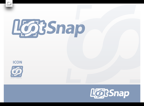
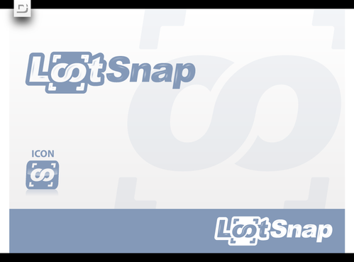
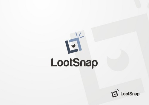
the snap portion refers to "snapping" a picture. The loot portion refers to a prize. What we're really looking for is something very simple however (think facebook, or twitter, or foursquare etc) that just has a unique typeface with stylized letters.
Social Media
Logo Type
![]()
Unique/Creative
Clean/Simple
#8d9566 and/or #8499b8 and/or #404c5c
not sure
something simple but unique. We're not opposed to seeing a logo that portrays what we're doing with the site (as outlined above), but leaning more toward just a textual representation of the word "LootSnap"
Related Contests