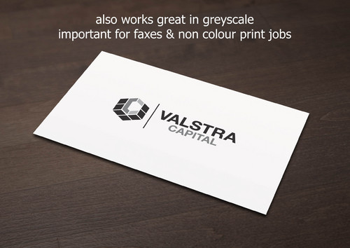
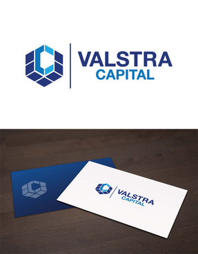
Logo Design - Valstra Capital Inc.
Valstra Capital
|
Contest Holder
junktopaul
?
Last Logged in : 3455days12hrs ago |
Concepts Submitted
663 |
Guaranteed Prize
200 |
Winner(s) | A Logo, Monogram, or Icon |
|
Live Project
Deciding
Project Finalized


Creative Brief
Logo Design - Valstra Capital Inc.
Valstra Capital
No
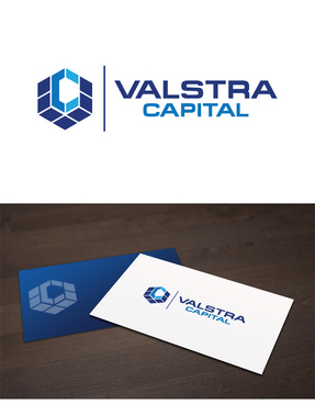
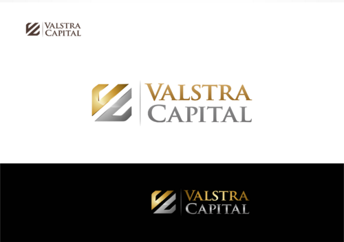
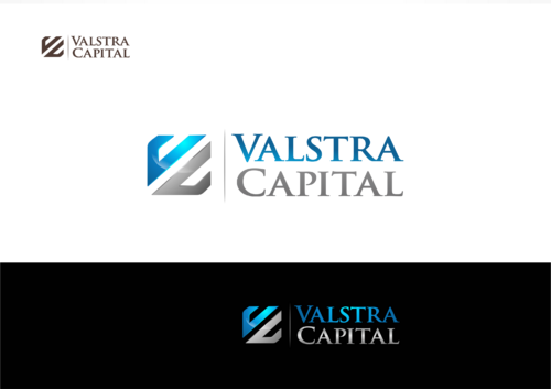
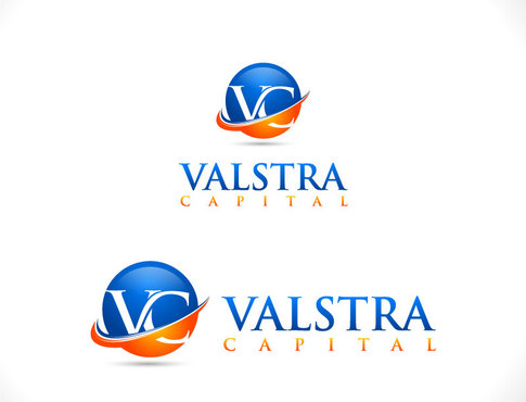
Valstra Capital Inc. is a private lender for real estate and business financing. The primary market will be residential real estate financing, followed by commercial real estate financing and business loans. The logo should be strong, professional, easy to understand and visually appealing.
Financial Services
Logo Type
![]()
Symbolic
![]()
Abstract Mark
![]()
Initials
![]()
Modern
Traditional
Sophisticated
Professional
Not sure but the logo should be professional and eye catching.
not sure
Our industry is finance so possible ideas are:
- creative use of initials
- a link to money (ex. unique historic coin shape, metals (gold/silver - colour or material))
- a creative word layout (colours, shape, colour swath, etc.)
Please do not let the above suggestions limit your creativity. You are the experts and you will come at this from a unique perspective that is likely to increase design possibilities. We are open to all of your ideas!
Related Contests