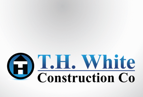
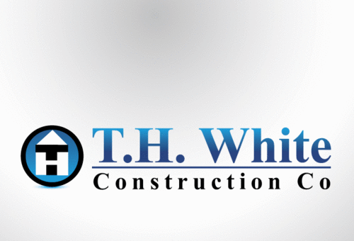
Logo for a construction company
T.H. White Construction Co.
|
Contest Holder
whitetomh
?
Last Logged in : 4575days6hrs ago |
Concepts Submitted
128 |
Guaranteed Prize
350 |
Winner(s) | A Logo, Monogram, or Icon |
|
Live Project
Deciding
Project Finalized


Creative Brief
Logo for a construction company
T.H. White Construction Co.
No
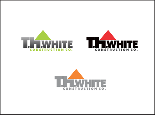
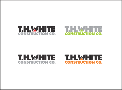
This logo is for a construction company specializing in residential additions, remodels, and new construction. The logo should convey professionalism, seriousness, strength, and simplicity. It must look good in color, black and white, and on a business card or the side of a truck. I do not want any obvious or cheesy graphics such as a hammer or a level, but am open to more subtle graphics (i.e. arranging the text in shapes, or outlining the text with shapes.
I want people to view this as a straightforward company that has been around a long time and will be around a lot longer.
Construction
Masculine
Traditional
Simple
Professional
not sure
Related Contests


