Logo for a research group/centre
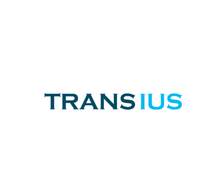
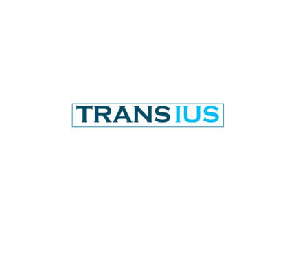
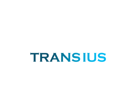
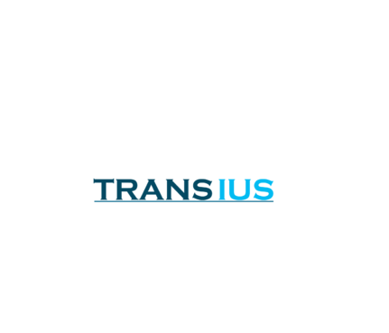
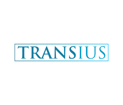
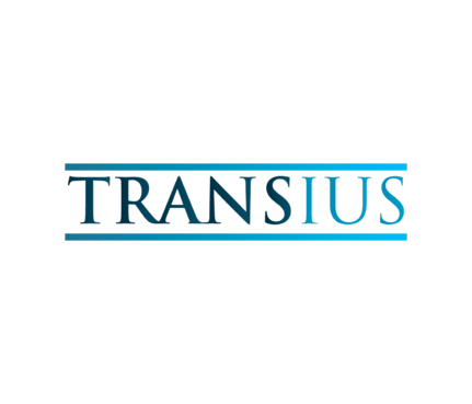
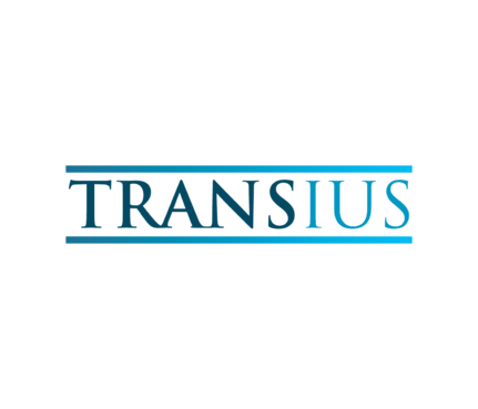
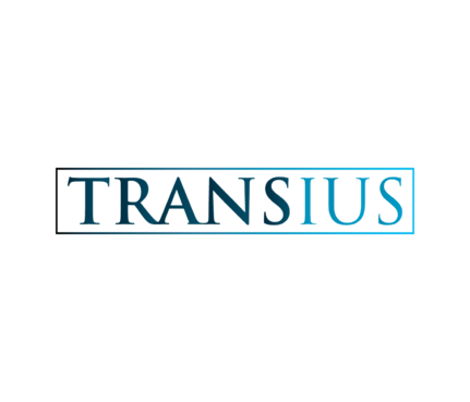
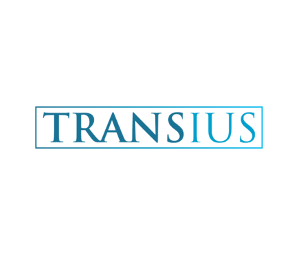
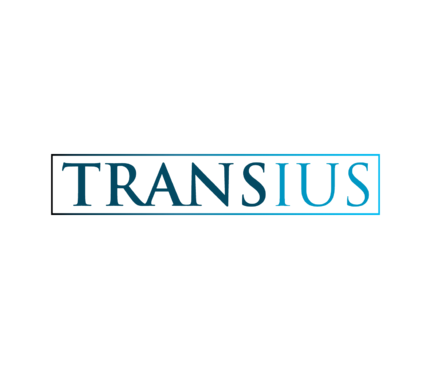
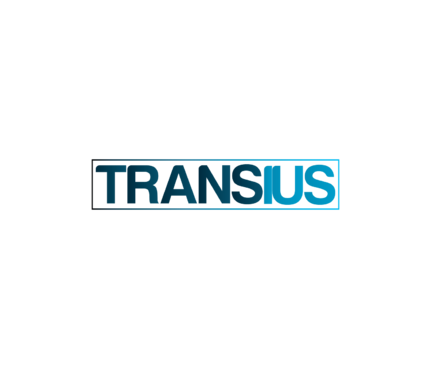
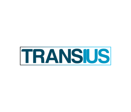
“TRANSIUS” (or “Transius” or “transius”)
|
Contest Holder
prietora
?
Last Logged in : 4751days13hrs ago |
Concepts Submitted
92 |
Prize Money
199
|
Winner(s) | A Logo, Monogram, or Icon |
|
Live Project
Deciding
Project Finalized


Creative Brief
Logo for a research group/centre
“TRANSIUS” (or “Transius” or “transius”)
No tagline
No
Transius is a recently created research group at the University of Geneva’s Faculty of Translation and Interpreting. As other research groups that already exist at our Faculty in other areas, we wish to promote the work done in our Faculty in the fields of legal translation, comparative law and institutional translation (i.e. translation in private, public and international organizations). We wish the group to become visible among our professional and academic colleagues with a view to consolidating it as a reference point in these research fields.
Research and Development
Logo Type
![]()
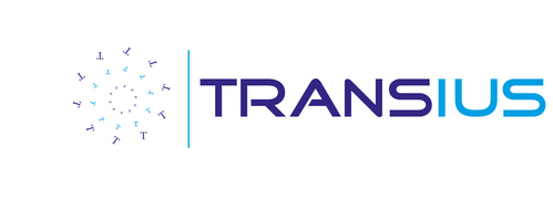
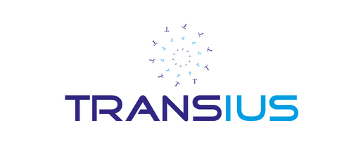
Clean/Simple
Sophisticated
Serious
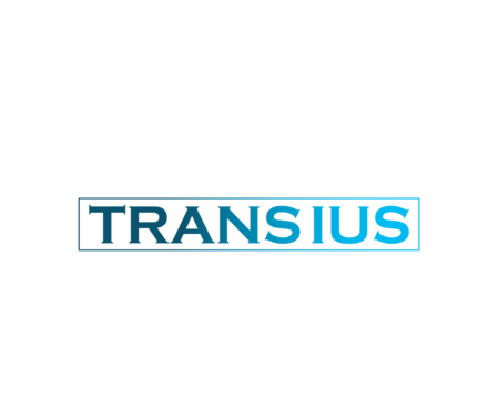
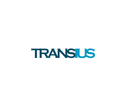
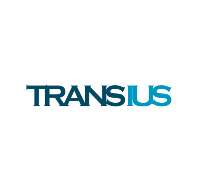
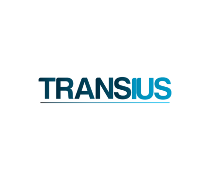
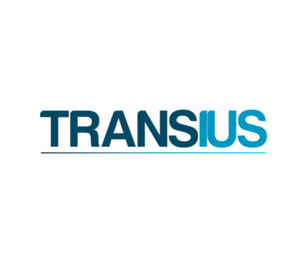
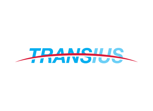
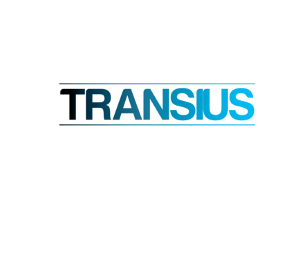
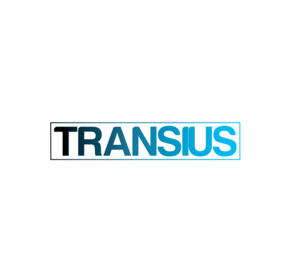
Two shades of blue: a darker blue for “TRANS” and a lighter blue for “IUS”.
2
At the University of Geneva, the Translation and Interpreting Faculty has orange as its color (see our website: www.unige.ch/fti). This is due to orange being related with the field of communication. Moreover, the Law Faculty has red as its color. Nevertheless, even if Transius is a part of the Translation and Interpreting Faculty, we would like our logo to state the fact that we are to some extent an independent entity. We would also like our logo to highlight the interdisciplinary nature of legal translation with the combination of two main components: translation (“TRANS”) and law (“IUS”), in a single word. Considering this, we think that the logo should be based on a color transition from a darker shade of blue for “TRANS” to a lighter shade of blue for “IUS” (see uploaded example).
We have not yet decided if the logo should use: (1) only capital letters, (2) only lower-case letters, or (3) if only the first “t” should be in a capital letter, although our preference for now is option (1). Therefore, we would mainly like to see proposals with only capital letters, but we would also very much appreciate a few logo proposals following options (2) and (3).
We would like to stress that our work and activities are mainly addressed to professionals in the fields of legal or institutional translation or comparative law, high profile academics in these areas, and graduate and undergraduate students. It is thus very important that the logo is elegant but dynamic. We wish our public to perceive Transius as a quality research group that moves constantly, not a stagnant research group. This is why the font used should not be too thick, and the resulting logo should be preferably rectangular-shaped.
Related Contests