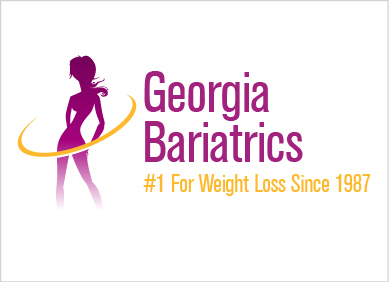
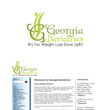
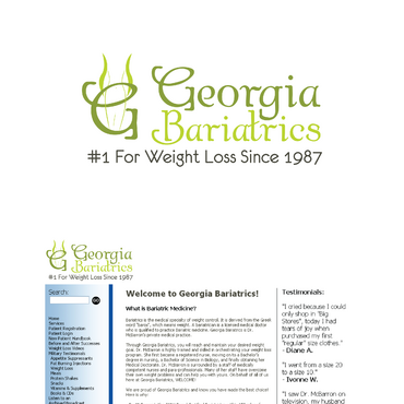
Logo for a Weight Loss Practice
Georgia Bariatrics
|
Contest Holder
gabinventorymanager
?
Last Logged in : 4766days19hrs ago |
Concepts Submitted
172 |
Prize Money
250
|
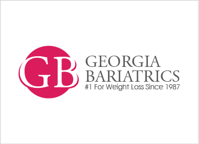
Winner(s) | A Logo, Monogram, or Icon |
|
Live Project
Deciding
Project Finalized


Creative Brief
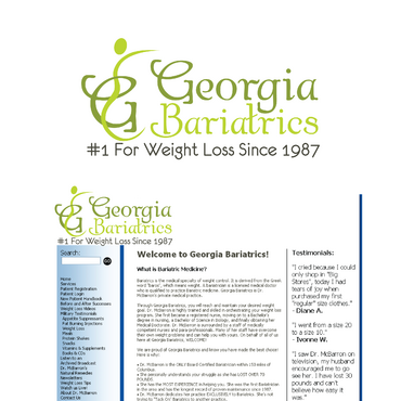
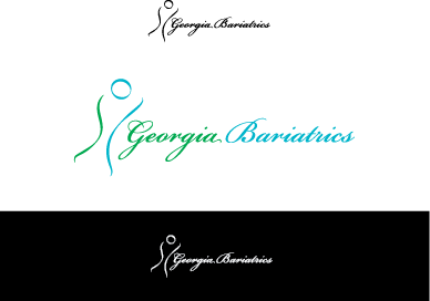
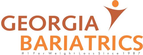
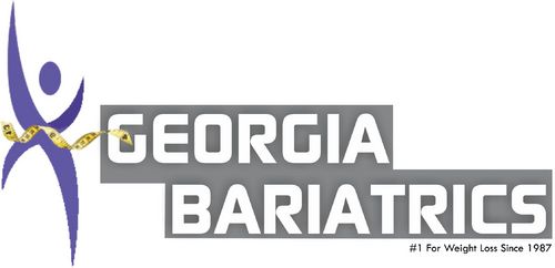
Logo for a Weight Loss Practice
Georgia Bariatrics
#1 For Weight Loss Since 1987
Yes
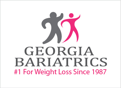
Its for a Bariatrics Doctor so wanting to show a transformation in the logo. So from bigger to smaller. The current logo is at georgiabariatrics.com if you would like to see it. She has had logo for 25 years so its time for a change. But basically anything that could be used for a weight loss clinic. Anything that could catch someones eye.
Medical
not sure
Related Contests