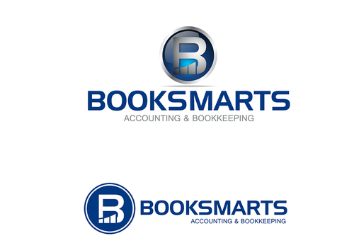
Logo for BookSmarts Accounting
BookSmarts Accounting (& Bookkeeping?)
|
Contest Holder
BookSmarts
?
Last Logged in : 5219days17hrs ago |
Concepts Submitted
248 |
Guaranteed Prize
225 |
Winner(s) | A Logo, Monogram, or Icon |
|
Live Project
Deciding
Project Finalized


Creative Brief
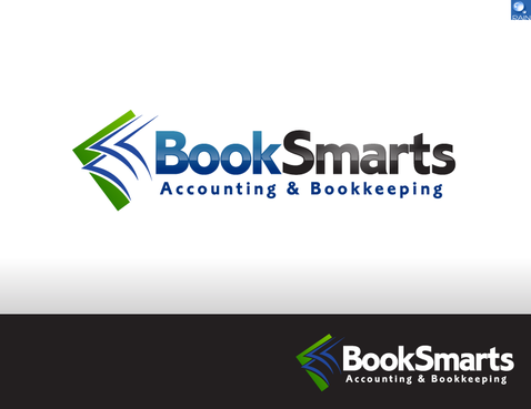
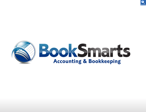
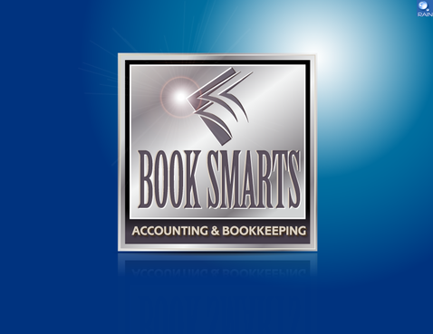
Logo for BookSmarts Accounting
BookSmarts Accounting (& Bookkeeping?)
Focus on what YOU do best, building your business...
No
I am an accountant and bookkeeper who helps small businesses track their earnings and expenditures so they know if they made a profit. I also do payroll for companies and their quarterly taxes. My website is http://www.booksmartspro.com/ but is being updated at the moment and the revisions can be found at http://www.maxcapitalcorp.com/booksmarts/ .
I am an expert at QuickBooks Accounting software and the link to my profile is http://proadvisor.intuit.com/referral/proadvisor_profile.jsp?id=bxEFYH%2BAswF3igMojM98HTBqp1OVVjJm#
Financial Services
Symbolic
![]()
Abstract Mark
![]()
Initials
![]()
Web 2.0
![]()
Cutting-Edge
Unique/Creative
Clean/Simple
Sophisticated
Corporate
Modern
Industry Oriented
I like blue, white, silver, green, black, yellow... I don't like purple, brown, red. My website is www.BookSmartsPro.com so I don't want it to "clash" with my website, but I want it to be able to stand on it's own on a business card or shirt. My current logo it too "homemade" and "scrapbooky".
not sure
I love the logo for Apple... a simple apple and for that matter, everything apple makes is very clean, classy and professional.
I like the "Saints to Sinners" logo which is a bike ride from Salt lake City Utah to Las Vegas Nevada (it incorporates an angel, a devil, the "S" shape and a bike) the url is: http://www.saintstosinnersbikerelay.com/ . I just want a logo that is professional but "smart" and clever, like my name.
Related Contests