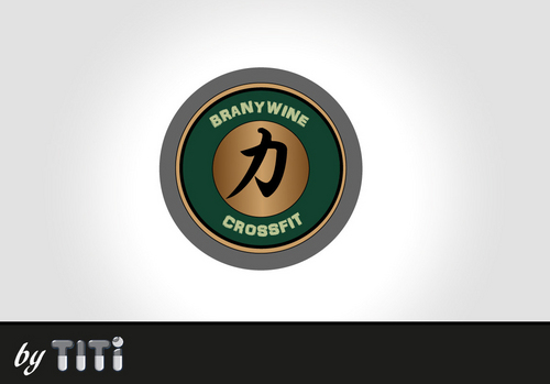
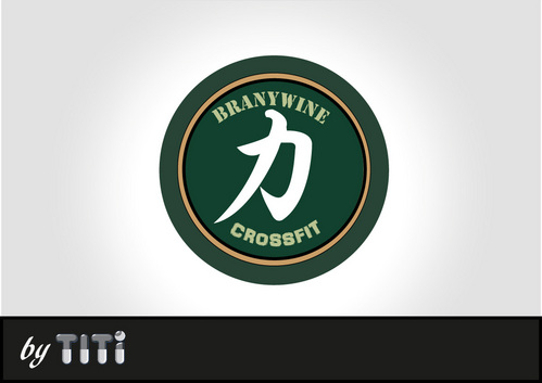
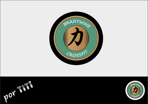
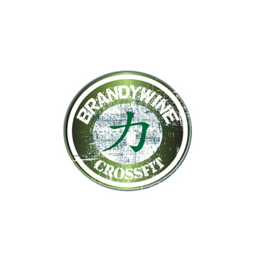
Logo for Brandywine Crossfit
Brandywine Crossfit
|
Contest Holder
clindquist1
?
Last Logged in : 5371days12hrs ago |
Concepts Submitted
86 |
Guaranteed Prize
200 |
Winner(s) | A Logo, Monogram, or Icon |
|
Live Project
Deciding
Project Finalized


Creative Brief
Logo for Brandywine Crossfit
Brandywine Crossfit
Enjoy the Pain
No
I currently have a strength training company called Centered Strength. One of our logos involves the chinese symbol for strength at the center of a circle. Centered Strength will be operating out of a new space called Brandywine Crossfit. This is a gym where people perform workouts including kettlebells, olympic barbells, medicine balls and bodyweight exercises designed by Centered Strength.com, Crossfit.com, and Sealfit.com. Since our demographic will be made up of primarily 30 to 50 year olds ranging from mothers to firemen to police to military personnel, my idea for the Brandywine Crossift logo is a meeting of the old Starbuck's logo and the Centered Strength logo. (Our demographic may include high school and college athletes as well). My thoughts are to have Brandywine (instead of Starbuck's) and Crossfit (instead of Coffee) in the circle and then the Centered Strength logo at the center. For color scheme, I was considering Ranger Green or perhaps camo. But, I could imagine using a variety of color schemes depending on the application (i.e general marketing material including business cards vs female tee shirt vs male tee shirt vs logo on the wall of the gym vs other use).
Sports
Abstract Mark
![]()
Illustrative
![]()
Clean/Simple
Serious
Consider military colors such as Ranger Green or camoflauge.
not sure
Refer to Centered Strength.com, Crossfit.com, and Sealfit.com.
Related Contests