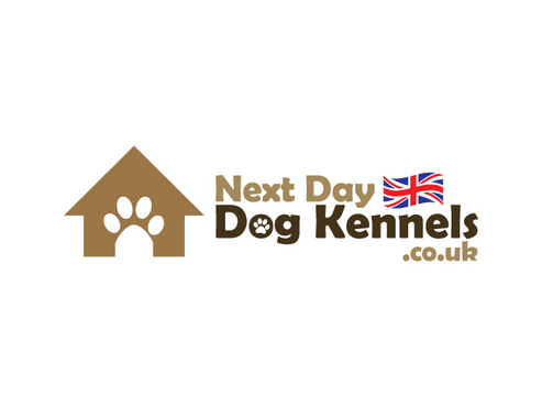
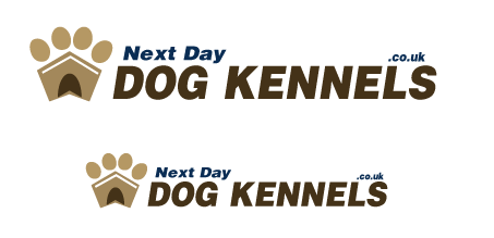
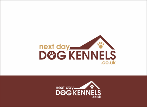
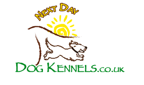
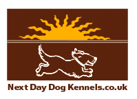
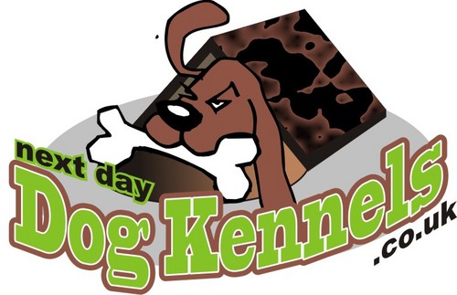
Logo For Dog Kennel Site.
next day dog kennels.co.uk
|
Contest Holder
adamnichols2005
?
Last Logged in : 5375days6hrs ago |
Concepts Submitted
73 |
Guaranteed Prize
200 |
Winner(s) | A Logo, Monogram, or Icon |
|
Live Project
Deciding
Project Finalized


Creative Brief
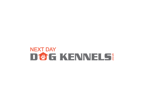
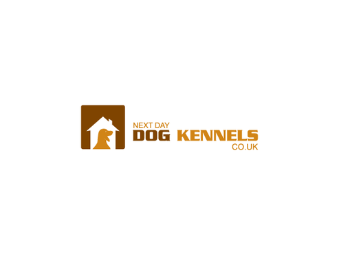
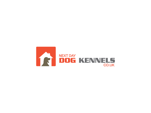
Logo For Dog Kennel Site.
next day dog kennels.co.uk
No
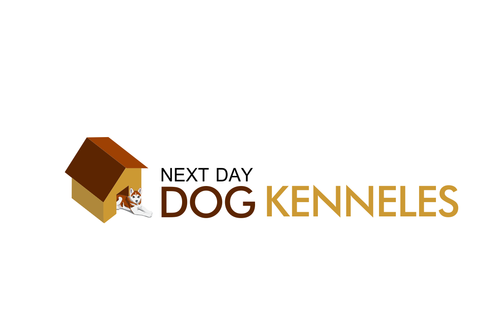
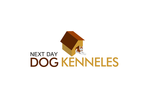
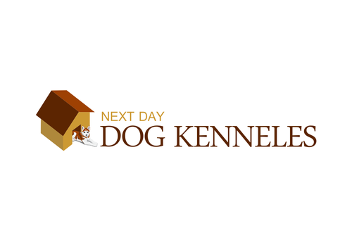
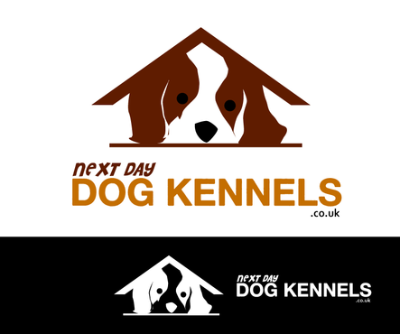
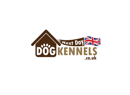
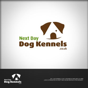
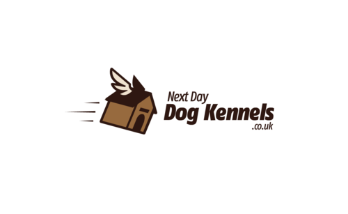
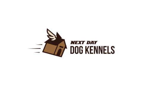
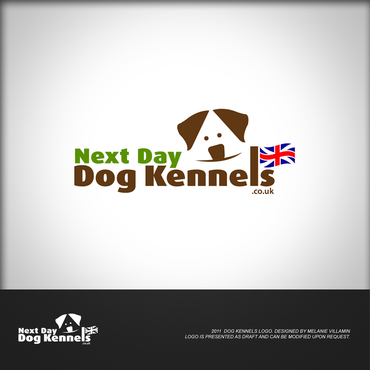
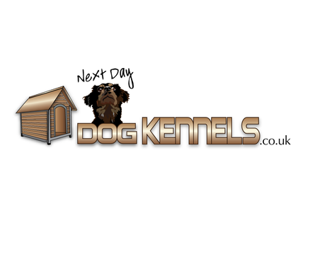
The logo is for a dog kennel website. See http://www.nextdaydogkennels.co.uk/1/ for the website design.
PLEASE IGNORE THE CURRENT LOGO it is not correct and is what I would call terrible.
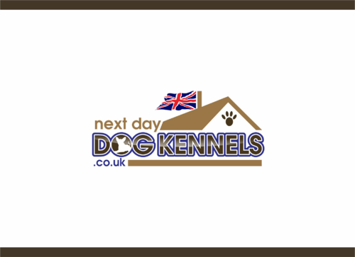
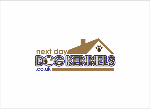
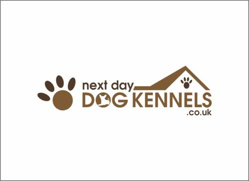
The new design should include in small NEXT DAY and in larger for DOG KENNELS then perhaps in very small .co.uk
I think a kennel or roof design would help the logo.
Animals
Logo Type
![]()
Abstract Mark
![]()
Modern
Serious
Browns would be good I feel. See url for sample of the new design and colour scheme.
3
Related Contests