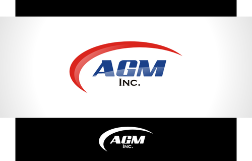
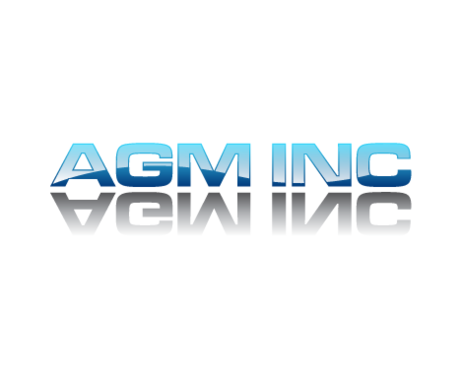
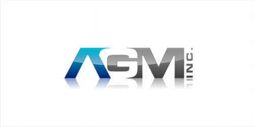
Logo for glass and mirror fabricator
AGM Inc.
|
Contest Holder
anatoliglass
?
Last Logged in : 4783days5hrs ago |
Concepts Submitted
83 |
Guaranteed Prize
250 |
Winner(s) | A Logo, Monogram, or Icon |
|
Live Project
Deciding
Project Finalized


Creative Brief
Logo for glass and mirror fabricator
AGM Inc.
No
Nike has a swoosh. Ralph Lauren has the polo player on horseback. This will be our company's symbol. It should contain AGM Inc. An Initial LOGO much like HP or LG.
Manufacturing
Initials
![]()
Blue, White, Black, Red.
3
Try to make a symbol out of AGM. Could be abstract. Letter within letter. Or, all 3 letters intertwined somehow with Inc either below, above or to the side. Use you're imagination. Review our colours and don't worry about font.
Related Contests