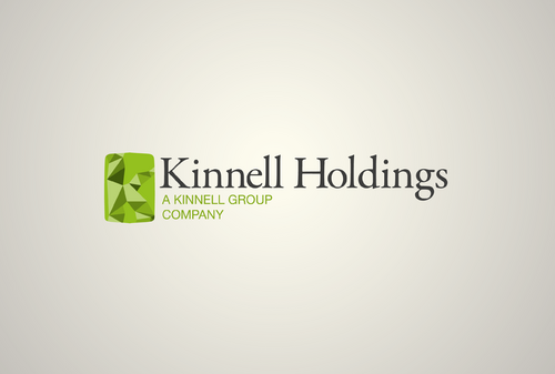
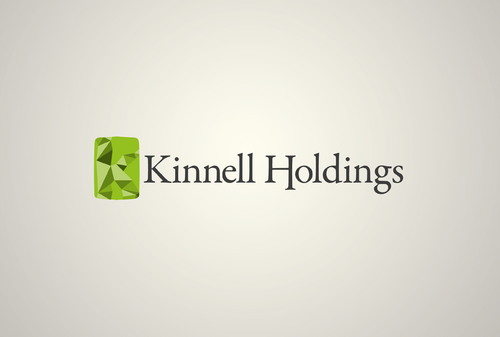
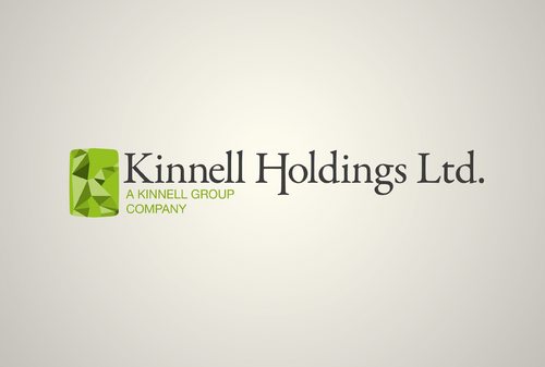
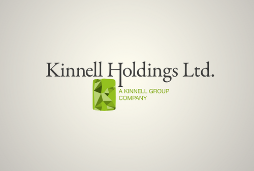
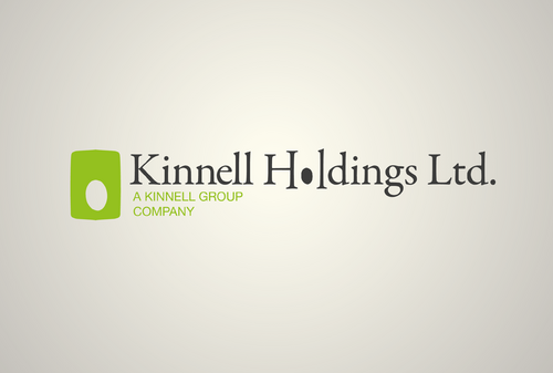
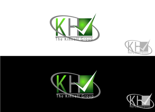
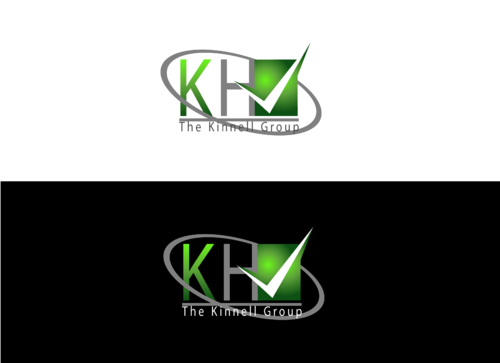
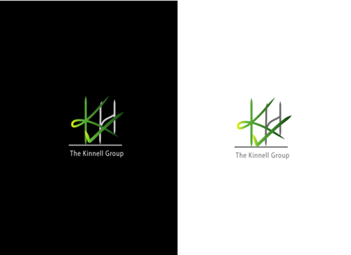
Logo for group company
Kinnell Holdings Limited
|
Contest Holder
stevemreid
?
Last Logged in : 4491days22hrs ago |
Concepts Submitted
106 |
Guaranteed Prize
149 |
Winner(s) | A Logo, Monogram, or Icon |
|
Live Project
Deciding
Project Finalized


Creative Brief
Logo for group company
Kinnell Holdings Limited
Yes
Kinnell Holdings Limited is a holding company which has several other companies under its umbrella. The main involvement is insurance for the building industry but we provide other services within this industry.
Construction
Logo Type
![]()
Clean/Simple
Corporate
Grey and Green - all ideas welcome!
not sure
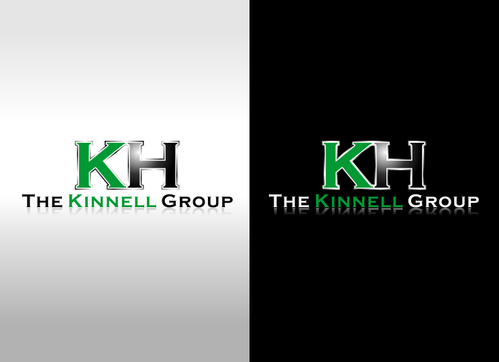
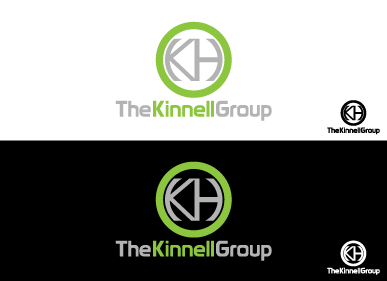
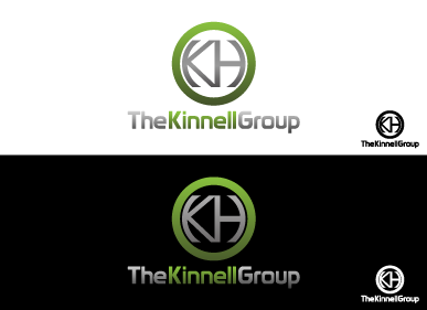
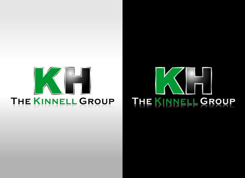
Here is our existing logo: http://www.kinnell.co.uk/ - it's the KH with the "Kinnell Group" underneath we are looking to redesign.
We feel it conveys the wrong message - not fresh enough.
Related Contests


