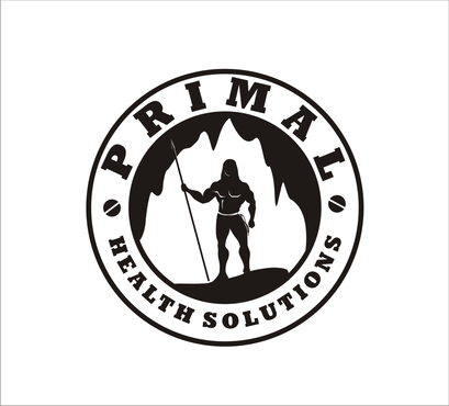
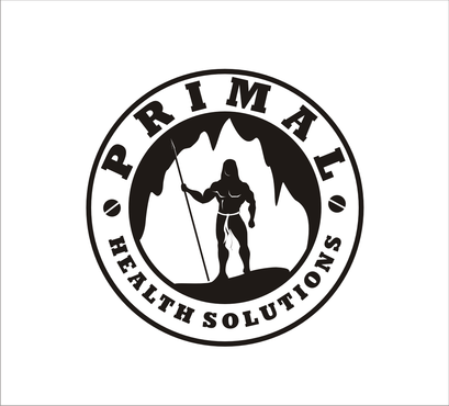
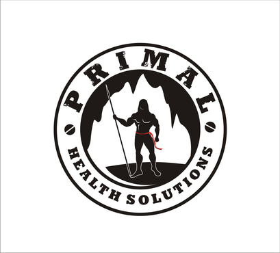
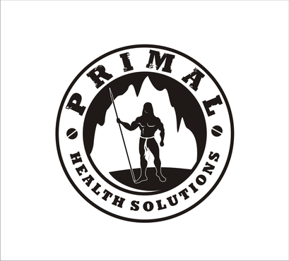
Logo for Health and Fitness Consulting Business
Primal Health Solutions
|
Contest Holder
primalhealthsolutions
?
Last Logged in : 4684days22hrs ago |
Concepts Submitted
75 |
Guaranteed Prize
275 |
Winner(s) | A Logo, Monogram, or Icon |
|
Live Project
Deciding
Project Finalized
Creative Brief
Logo for Health and Fitness Consulting Business
Primal Health Solutions
No
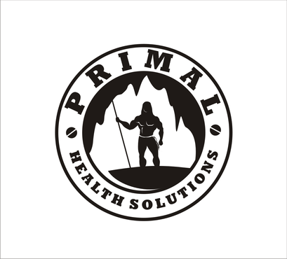
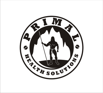
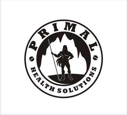
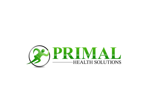
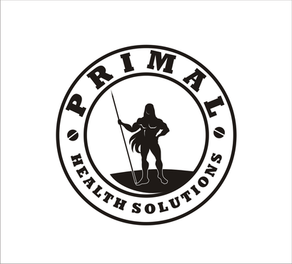
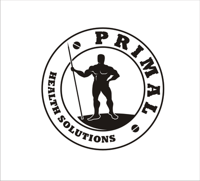
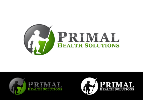
This is a health an fitness consulting company that focuses on the paleo and hunter/gatherer lifestyle. We have a website, primalhealthsolutions.com that shows what types of training/seminars we offer. We also do control tactics consulting but the health and fitness component is our primary purpose. We want to convey "hire these guys" to teach us how to be healthy, prevent degenerative disease and improve longevity and I want to "look like these guys (hunter/gatherer guys)". We also want to convey that our hunter/gatherer ancestors were fit, muscular, happy and free of degenerative disease all by following natures design. The website will give a lot more specifics as to what we offer. We operate under the belief that we are designed to be healthy, happy and fit and that by understanding some simple concepts we can remain that way. If it best suits the logo, the company name does not have to be in it...we are happy with just a symbol as well, but want to compare all options.
Health
Symbolic
![]()
Illustrative
![]()
Character
![]()
Masculine
Simple
Professional
We are open to suggestions on the colors, but something brings out the "feel" of the logo.
2
We were thinking about a silhouette type design, possibly incorporating a fit, lean, muscular caveman perhaps holding a spear or tool. We are not looking for an extremely detailed picture, but something that when the viewer sees it they think "that is cool, I want to look or be like that (the symbol in the logo) and gotta know what they are selling." Our website, blog and business cards use the "Georgia" font...we are not set in stone on that and if it suites the logo, the font can change, if words or business is in the logo.
Related Contests


