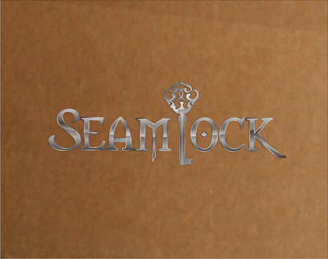
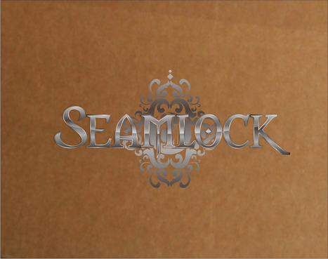
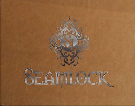
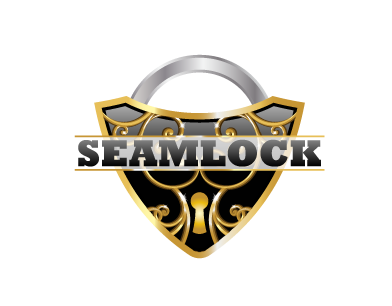
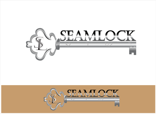
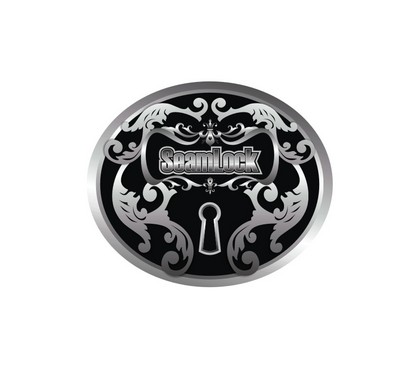
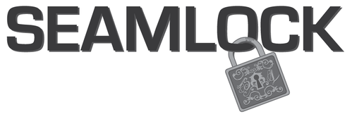
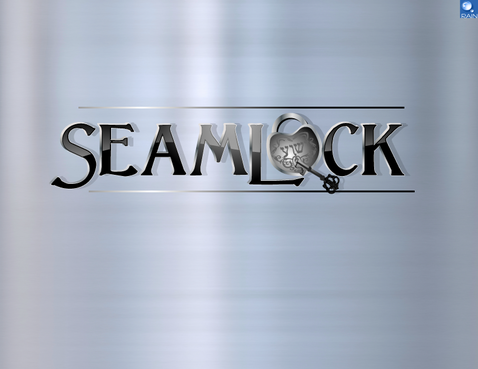
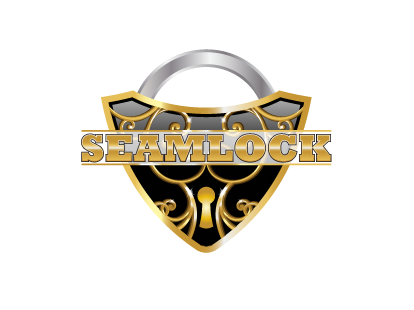
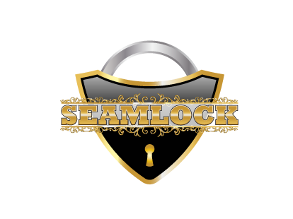
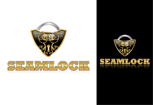
Logo for New Product launch "SeamLock"
SeamLock
|
Contest Holder
Locked
?
Last Logged in : 4689days10hrs ago |
Concepts Submitted
63 |
Guaranteed Prize
360 |
Winner(s) | Marketing collateral |
|
Live Project
Deciding
Project Finalized


Creative Brief
Logo for New Product launch "SeamLock"
SeamLock
Construction
Construction Products .... Audience would be the installation Trade Professionals. Men between the ages of 20 and 50. Keeping this in mind... I want a Logo that will look great on a Box or Tshirt but not too feminine. Inspiration should be like the Beauty of Antique Embossed Guns.... It was made for and appealed to Men .... But they were also Beautiful!
SEAMLOCK should be Very Bold. I really want the Hebrew symbol for Yeshua to be hidden in the scrolling. Other than that I am open to other concepts besides the Lock and Key concept that is in my head. I just really want the Logo to show Beautiful Strength..... Keep in mind the actual product will be in a 3 foot long box that is about 4 inches wide and 3 inches deep. So a linear design would work great for the boxes.
Related Contests


