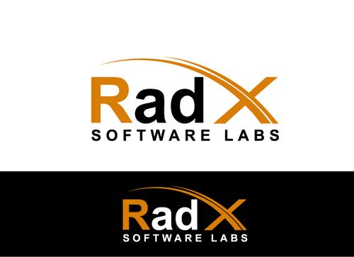
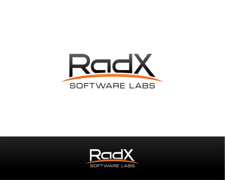
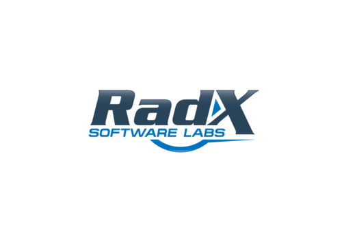
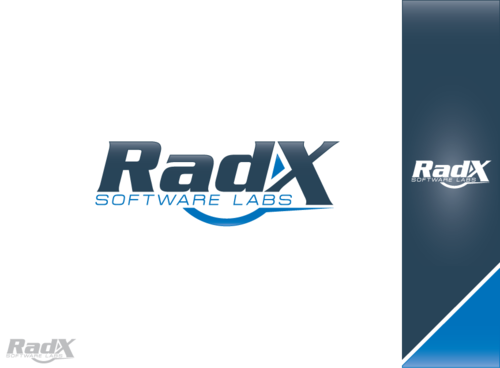
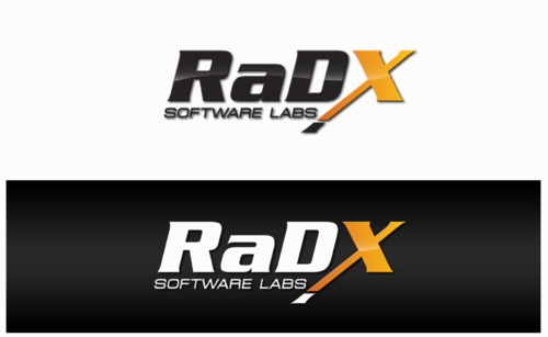
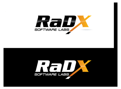
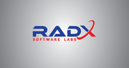
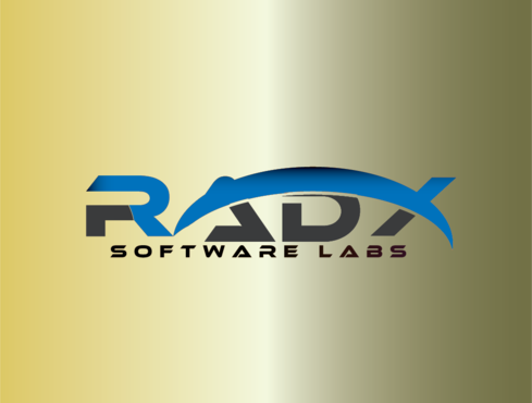
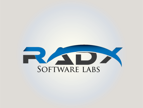
Logo for software company
RadX Software Labs
|
Contest Holder
restwzeasy
?
Last Logged in : 3929days22hrs ago |
Concepts Submitted
141 |
Guaranteed Prize
200 |
Winner(s) | A Logo, Monogram, or Icon |
|
Live Project
Deciding
Project Finalized


Creative Brief
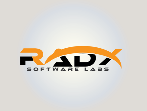
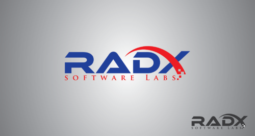
Logo for software company
RadX Software Labs
No
Trusted, reliable, and innovative software development company.
Here are some logos that we like:
https://orders.logodesignguru.com/drafts/display/contest/766646/draft/1c6c5aa8c3882bd1d00e1b94ba1f9fdf3872206
https://orders.logodesignguru.com/drafts/display/contest/664793/draft/67be595df2ed322bc7c398865c2b27733868168
Software
Logo Type
![]()
Abstract Mark
![]()
Initials
![]()
Modern
Cutting-edge
Sophisticated
Simple
Professional
High Tech
Black, yellowish-orange, blue, what else designer feels appropriate.
not sure
We like logos that are professional and simple. We feel that a curved line underneath the logo is nice. Clean and simple without too much graphics noise. Amazon.com logo is nice.
Related Contests