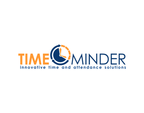
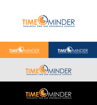
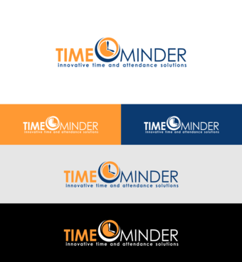
Logo for Time-Minder
Time Minder
|
Contest Holder
teebee7
?
Last Logged in : 4003days4hrs ago |
Concepts Submitted
108 |
Guaranteed Prize
250 |
Winner(s) | A Logo, Monogram, or Icon |
|
Live Project
Deciding
Project Finalized


Creative Brief
Logo for Time-Minder
Time Minder
Innovative time and attendance solutions
Yes
Fresh, Modern, Innovative, Accurate, Friendly, Australian made, safe (since 1992)
We make time and attendance systems for businesses of all sizes. we manufacture the hardware and the software in house.
Industrial Supplies
Logo Type
![]()
Symbolic
![]()
Abstract Mark
![]()
Initials
![]()
Illustrative
![]()
Character
![]()
Modern
Cutting-edge
Simple
Currently we use blue PMS 195 and Orange PMS 265
not sure
We have a current logo that has been in use for 15 years, we would like some connection to this logo however we want to drop the "AMS" and modernize it. We need a horizontal version as well as a square version.
Related Contests