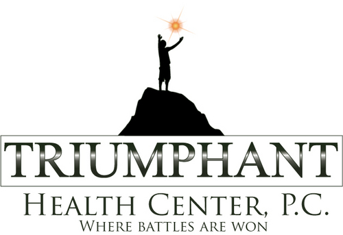
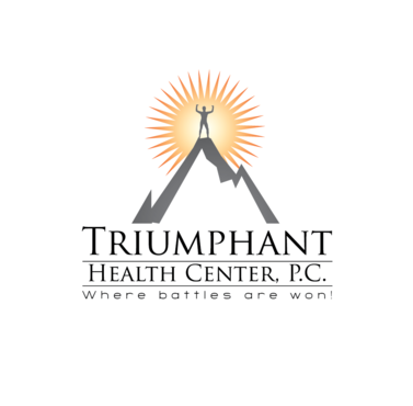
Logo for Triumphant Health Center, P.C.
Triumphant Health Center, P.C.
|
Contest Holder
nuccadoc
?
Last Logged in : 2942days21hrs ago |
Concepts Submitted
114 |
Guaranteed Prize
325 |
Winner(s) | A Logo, Monogram, or Icon |
|
Live Project
Deciding
Project Finalized


Creative Brief
Logo for Triumphant Health Center, P.C.
Triumphant Health Center, P.C.
Where battles are won!
Yes
This is for a new company. Triumphant health center is a multi discipline health care center that incorporates specific upper cervical Chiropractic, Nutrition testing, licensed counseling, and massage.
Health
Logo Type
![]()
Symbolic
![]()
Abstract Mark
![]()
Cutting-Edge
Unique/Creative
Clean/Simple
Sophisticated
Modern
Industry Oriented
Serious
Illustrative
Abstract
Geometric
Possibly green and silver/gray but open to different color schemes.
2
Thought of emphasising the letter "T" in Triumphant, also had image of someone on top of a mountain as if to have conquered it.
But open to new and fresh ideas!
Related Contests


