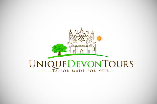
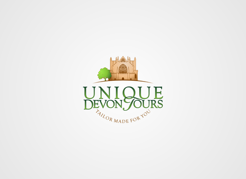
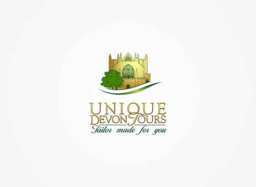
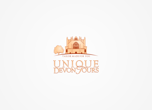
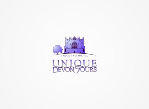
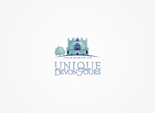
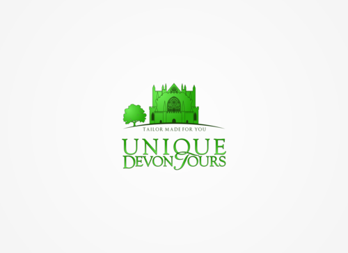
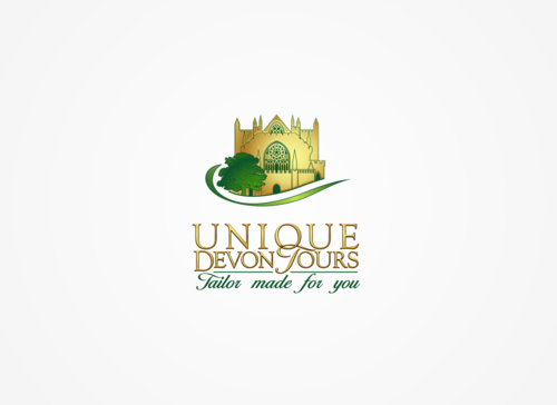
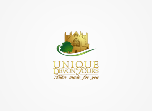
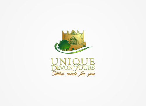
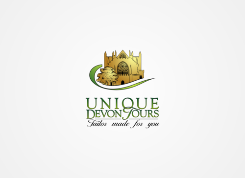
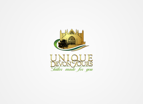
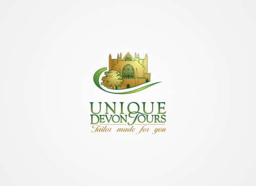
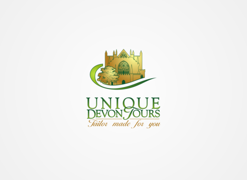
Logo For Unique Devon Tours, a Tour Guide Company
Unique Devon Tours
|
Contest Holder
rusticalex
?
Last Logged in : 1645days1hr ago |
Concepts Submitted
144 |
Guaranteed Prize
135 |
Winner(s) | A Logo, Monogram, or Icon |
|
Live Project
Deciding
Project Finalized


Creative Brief
Logo For Unique Devon Tours, a Tour Guide Company
Unique Devon Tours
Tailor made for you
Yes
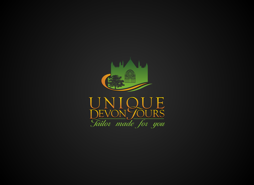
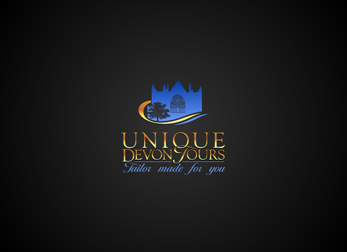
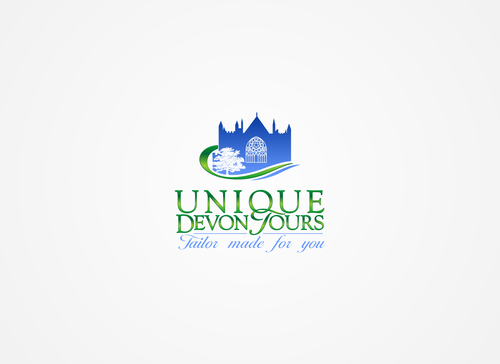
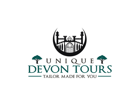
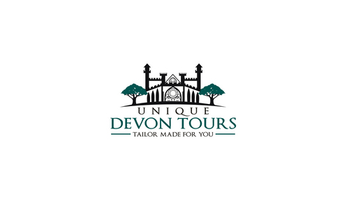
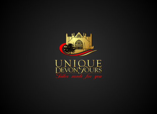
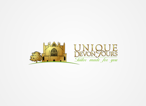
Unique Devon Tours is a new business providing tailor made guided tours for small groups around Devon, a beautiful part of the United Kingdom. The tours will be very much designed around the specific interests of my guests, so each tour will be unique. Customer service will be exceptional and the excursions very exclusive. I will also be organising high quality accommodation and meals, as well as providing transport and being the guide. When people see the logo I want people to think that I provide a high quality, bespoke service in a beautiful part of the World.
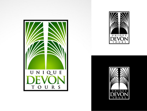
The logo needs to work on both a light and dark background, and will eventually be used on website, stationery, t-shirts, etc, and needs to be easy to adapt in all sizes.
Travel
Sophisticated
Professional
Largely open to suggestion, but I quite like rich, deep colours, or possibly metallic colours. No pastel colours, and not too much in the way of primary colours. The Devon flag incorporates green, white and black, so you can have a go with those colours, but I'm not too bothered. See what you can come up with!
not sure
One of Devon's most important and oldest buildings is Exeter Cathedral (you can find plenty of images online). You can subtly use an outline of the building if it adds class to the logo.
Traditional stereotypes of Devon are hills, beaches and the sea, but only use these with subtlety.
We do get sun here, from time to time, so a bit of sunshine in the logo would be appropriate, again if used with subtlety.
Good luck, and thank you in advance of your efforts.
Related Contests