SALES / SUPPORT : +1-877-525-5646   |  


Logo for Video Production Service

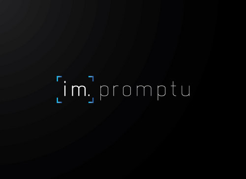
Im.Promptu

Contest Holder phillipim ?

Last Logged in : 4749days20hrs ago

Concepts Submitted

79

Guaranteed Prize
150
Winner(s)

1

A Logo, Monogram, or Icon veildAll design entries can be viewed by other designers.
tick_gray

Live Project

tick_gray

Deciding

tick_blue

Project Finalized


Project: Logo for Video Production Service
Industry: Video Logo
Contest Launched: Mar 16, 2011
Selected: 1 winning design from 79 concepts
Winning Design by: BDesign
Close Date: Mar 23, 2011


Logo for Video Production Service - Video


Awarded as a winner
Project Report    

Sort by:


#40

#35

#29

#16

#55

#9


Creative Brief


Logo for Video Production Service

Im.Promptu

Yes

For Wedding videography business/ corporate video production.

My last name is Im, hence the separation in the word impromptu in the company name. So I want some emphasis on the IM. - maybe by different color.

for an idea of the services I will be providing you can visit www.stillmotion.ca or www.joesimonproductions.blogspot.com/

Video

Logo Type
Logo Type

Symbolic
Symbolic

Abstract Mark
Abstract Mark


Unique/Creative
Sophisticated
Modern
Masculine

http://kuler.adobe.com/#themeID/782171 http://kuler.adobe.com/#themeID/60143 I'm not set on colors yet, but anything that looks more masculine should be fine.

not sure

Related Contests


(Expedite) Creative Logo for Video Site
$200
Prize Money
100
Concepts
Zooropa Video Production Agency
$200
Prize Money
149
Concepts
Logo for a company writing books and making TV documentaries
$220
Prize Money
71
Concepts
BREATHE PICTURES
$199
Prize Money
126
Concepts

Discussion


Comments

  • March 22, 2011 11:46 AM
    phillipim phillipim
      Project Holder
    @waqasss - Thank you for submitting to the contest. I didn't think your designs had that "polished" look. Maybe you can try with a simpler mark and different typeface.

    Like Icon 0   DislikeIcon 0
  • March 22, 2011 3:03 AM
    SiteAdmin SiteAdmin
     
    Source: http://www.prlog.org/10522792-freelancercom.jpg Draft #41 and its variation by logoon have been taken down.

    Like Icon 0   DislikeIcon 0
  • March 22, 2011 2:01 AM
    SiteAdmin SiteAdmin
     
    Draft #24 by BDesign is a derivative of #20 by mdsgrafix, therefore has been taken down.

    Like Icon 0   DislikeIcon 0
  • March 21, 2011 7:04 PM
    phillipim phillipim
      Project Holder
    @logoon - #38 can you move the mark to the right of the typeface?

    Like Icon 0   DislikeIcon 0
  • March 21, 2011 7:03 PM
    phillipim phillipim
      Project Holder
    @sembranidsgn -#56 not too fond of the colors - i see japan flag (maybe due to the recent media exposure of japan) and the mark seems overbearing.

    Like Icon 0   DislikeIcon 0
  • March 21, 2011 1:38 PM
    phillipim phillipim
      Project Holder
    @BDesigns - #35, can you try a different background? also any other typeface you think looks good. Thanks.

    Like Icon 0   DislikeIcon 0
  • March 21, 2011 1:34 PM
    phillipim phillipim
      Project Holder
    @mdsgrafix - can you make #29 mark opacity as #16

    Like Icon 0   DislikeIcon 0
  • March 21, 2011 1:30 PM
    phillipim phillipim
      Project Holder
    @mdsgrafix - #16 with the same background as #29

    Like Icon 0   DislikeIcon 0
  • March 20, 2011 11:25 PM
    phillipim phillipim
      Project Holder
    @logoon - #42 can you try with another typeface?

    Like Icon 0   DislikeIcon 0
  • March 20, 2011 11:25 PM
    phillipim phillipim
      Project Holder
    @logoon - #42 can you try with another typeface?

    Like Icon 0   DislikeIcon 0
  • March 20, 2011 11:20 AM
    phillipim phillipim
      Project Holder
    ok no more viewfinder focus marks. how about just im.promptu and an abstract mark of some sort.

    Like Icon 0   DislikeIcon 0
  • March 19, 2011 12:06 PM
    phillipim phillipim
      Project Holder
    @BDesign - I like the colors, but don't like the mark.

    Like Icon 0   DislikeIcon 0
  • March 19, 2011 12:05 PM
    phillipim phillipim
      Project Holder
    Ok if there is going to be an abstract mark, I don't want it to be "im." I just want the im. a part of the typeface.

    Like Icon 0   DislikeIcon 0
  • March 19, 2011 12:02 PM
    phillipim phillipim
      Project Holder
    @mdsgrafix #21 and #20, can you try it with the viewfinder around both the mark and the typeface?

    Like Icon 0   DislikeIcon 0
  • March 18, 2011 10:24 PM
    phillipim phillipim
      Project Holder
    @mdsgrafix - a la Focus Features company

    Like Icon 0   DislikeIcon 0
  • March 18, 2011 10:09 PM
    phillipim phillipim
      Project Holder
    @mdsgrafix - i like #16 and #18. the circles remind me of 'bokeh' look it up if you dont know, but it's part of photography. So it got me thinking, what if you border the logo with some sort of viewfinder graphic, like the focus indicators for cameras. So its like looking through a viewfinder and the im.promptu is in focus and the circles kind of resembles the part out of focus, or 'bokeh.

    Like Icon 0   DislikeIcon 0
  • March 18, 2011 3:40 PM
    phillipim phillipim
      Project Holder
    @mdsgrafix - #14 can you remove the im. in the mark?

    Like Icon 0   DislikeIcon 0
  • March 18, 2011 3:08 PM
    phillipim phillipim
      Project Holder
    @BDesigns - #11 I would like to keep the im.promptu together. #10, Don't like the offsetting diagonal structure of the accent marks.

    Like Icon 0   DislikeIcon 0
  • March 18, 2011 2:56 PM
    phillipim phillipim
      Project Holder
    Also I don't think the Abstract mark has to absolutely represent my name. I know I indicated emphasis on Im. but I also think the separation with the period may be subtle enough.

    Like Icon 0   DislikeIcon 0
  • March 18, 2011 2:51 PM
    phillipim phillipim
      Project Holder
    @mdsgrafix #7 can you try with the green i slanted the same way? #6, #5, I'm not really feeling the im combination there. Maybe a different font, maybe a handwriting script or something, as its the "personal" aspect of the logo. #13 don't really like the mark #12 looks like mountains. My clientele is more urban and city. But I really appreciate you taking my suggestions in stride and adapting to them.

    Like Icon 0   DislikeIcon 0
  • March 18, 2011 12:37 AM
    mdsgrafix mdsgrafix
     
    u mean draft #5 ? no probs get on to it asap cheers

    Like Icon 0   DislikeIcon 0
  • March 17, 2011 11:40 PM
    phillipim phillipim
      Project Holder
    @mdsgrafix - draft # 4 may I ask you to try other color combinations? Would you also mind bringing the Im down a bit - maybe a uniform font size for all the letters, but just different colors so the emphasis on the Im. is more subtle? Sort of feels unbalance.

    Like Icon 0   DislikeIcon 0
  • March 17, 2011 11:35 PM
    phillipim phillipim
      Project Holder
    @BDesign - draft #1 can you try this on a dark colored background and letters to contrast while the accents around the Im. be complimentary color of the background or the font? Thanks.

    Like Icon 0   DislikeIcon 0
  • March 17, 2011 11:33 PM
    phillipim phillipim
      Project Holder
    I think it would help to provide some inspiration. Here are some links to some logos I enjoy. http://helveticbrands.ch/images/paperboat.jpg http://helveticbrands.ch/images/tapmates.png http://helveticbrands.ch/images/fused.png http://www.dache.ch/images/mindberry2.png http://imgs.abduzeedo.com/files/articles/b9post/logoFinal.png http://dache.ch/images/sponsr.png

    Like Icon 0   DislikeIcon 0
  • March 17, 2011 5:06 PM
    phillipim phillipim
      Project Holder
    @mdsgrafix - draft #4; I'm not really feeling the play symbol. I just made a comment about it for draft # 2. may I propose you try a different approach? I think the design is too similar to draft # 1.

    Like Icon 0   DislikeIcon 0