Logo for Web Hosting Company
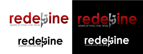
rede5ine
|
Contest Holder
ninad
?
Last Logged in : 4768days4hrs ago |
Concepts Submitted
99 |
Guaranteed Prize
200 |
Winner(s) | A Logo, Monogram, or Icon |
|
Live Project
Deciding
Project Finalized

Creative Brief
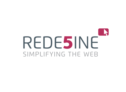
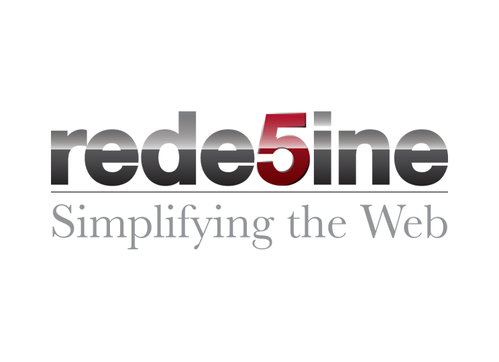
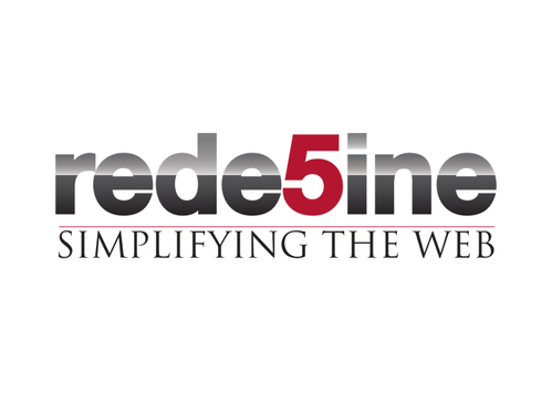
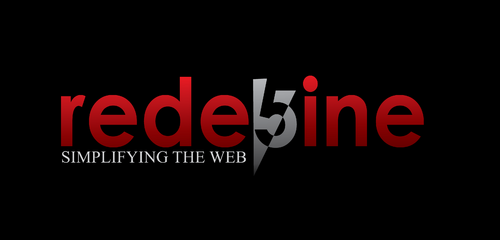
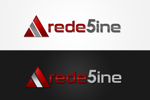
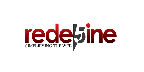
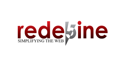
Logo for Web Hosting Company
rede5ine
Simplifying the Web
Yes
Logo should convey core values:
Integrity, Transparency, Experience, Customer orientation.
We are non-intimidating, simple, trustworthy, youthful, open, approachable and committed.
We are Value-for-money but not cheap.
Information Technology
Abstract Mark
![]()
Modern
Sophisticated
Red + Gray scale. Open to a little dash of more than 2 colors. Vibrant colors, using Web 2.0 color palette
3
Some ideas of my likes and dislikes: http://interpole.net/temp/logos.htm
This look is too casual and cheap http://www.bigrock.in/ and this is NOT what rede5ine will look like.
"5" should be depicted in a manner it is not mistaken as "S". Hence lowercase preferable.
Our website layout will be based on http://demowordpress.templatesquare.com/quickhost/
Hence, the logo should be usable on white as well as dark background.
I am looking at new-age Web 2.0 type of look and branding. The nature of designs is like what you would find among the many logos on http://www.go2web20.net/
The number of colors is flexible. Primarily 2 colors, but some design element can incorporate a dash of more colors. But I do not want an all out multicolour riot like Google.
Related Contests