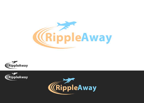
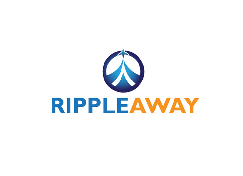
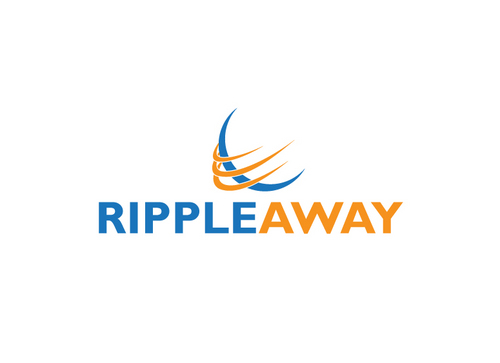
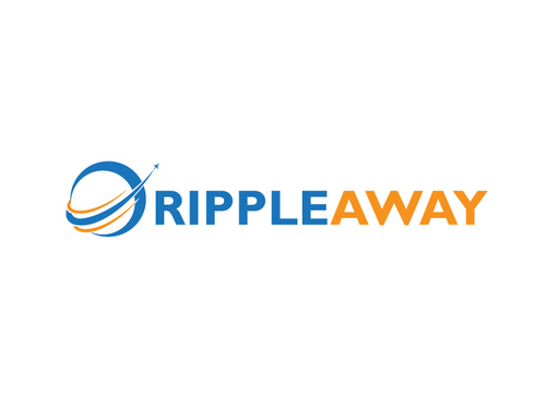
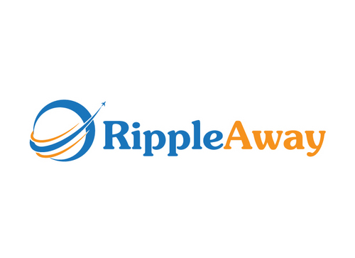
Logo - RippleAway Travel Startup
RippleAway
|
Contest Holder
alanseong
?
Last Logged in : 5037days2hrs ago |
Concepts Submitted
66 |
Prize Money
250
|
Winner(s) | A Logo, Monogram, or Icon |
|
Live Project
Deciding
Project Finalized

Creative Brief
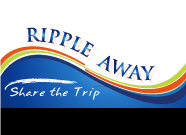
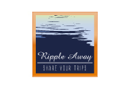
Logo - RippleAway Travel Startup
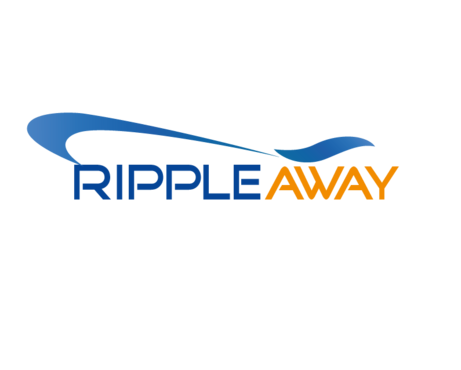
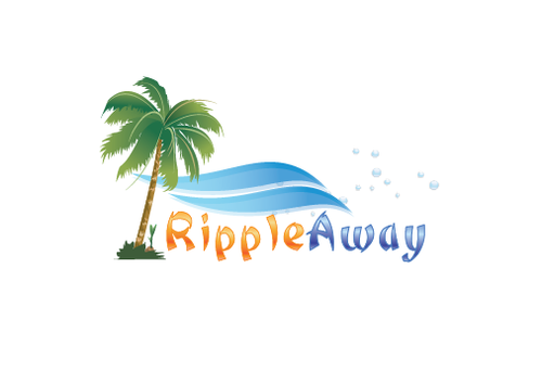
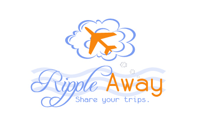
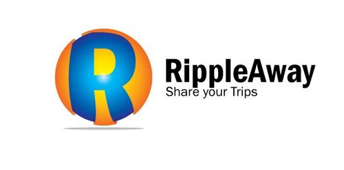
RippleAway
Share your Trips
No
We are a travel startup helping users to easily share and coordinate their trips with close friends and family.
Travel
Logo Type
![]()
Symbolic
![]()
Web 2.0
![]()
Unique/Creative
Clean/Simple
Sophisticated
Modern
Industry Oriented
High Tech
Fun
Youthful
blue, orange, (but yellow & green ok)
not sure
Would be nice to incorporate an image of wave/ripple + trip/getaway (thus rippleaway) but will leave it open for you guys to be creative!
Related Contests